Become a MacRumors Supporter for $50/year with no ads, ability to filter front page stories, and private forums.

archrider

macrumors 6502a
Feb 10, 2008
814
98
1. On your Iphone open the Apple watch App.

2. Hit the face gallery icon at the bottom.

3. Under Infogragh the second choice has a white circle with small circular complications in it.

4. Choose complications for that face that are mostly orange and white (the various world time complications fit the bill.)

5. Hit add and set it as your face.
 

xDKP

macrumors 68020
Feb 27, 2011
2,275
2,308
Denmark
Thank you so much, I should have seen that. So basically use a bunch of useless complications like four world clock complications to get this effect. I think Apple should work out a better way to do this since it's shown in their material.

They have done this in WatchOS 6 - it's now possible to make it two-tone entirely with different colours.
 

Strangedream

macrumors 6502a
Sep 15, 2019
661
545
London, UK
My album collection. I still wish Apple would let us choose the font and color of the date and time but oh well.

B45B46E1-157B-4A7C-8D00-F49520D13CED.jpeg
 
Last edited:

ReardenMetal

macrumors 6502
May 1, 2015
263
118
Los Angeles
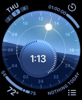
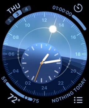
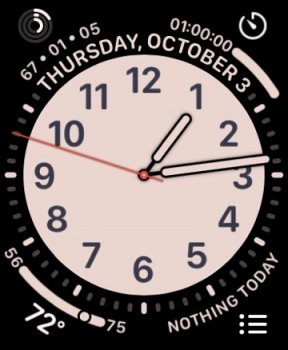
With a batch of new faces, this year a battle rages on my wrist for watch face supremacy. I actually like the options on WatchOS 6, unlike some understandable critics out there. Here are my latest configs. My daily driver is the new Solar Dial (still battling between analog or digital on that one) with Infograph Analog coming in second place and gets used most often if I‘m streaming content or messaging more often. California and the classic Solar Graph (not pictured) get honorable mentions. The Solar Graph on the Series Zero is one of the biggest reasons why I got the watch in the first place.

My California config strikes me as the heir to the Utility Face that never had its complications updated for the larger screens.

Which faces do you like this year?

Do you like the analog or digital better on the new Solar Dial face?
Been using the Digital more as it’s easier to read and looks good, but the Analog looks sharp too yet is harder to read against the backdrop of the 24-hour solar analog dial. A double analog whammy on the eyes.

My rule for complications is that it mostly shouldn’t be a static shortcut to an app. The Dock, Siri or the App Layout screen are best for that. A complication should reveal dynamic, useful data giving me timely information at a glance. My philosophy. Further, I think these faces excel when they are NOT trying to mimick physical/mechanical faces too closely. Why Solar Dial/Graph will always be my favorites.

0CA57745-B70A-48B5-95CE-DB3A4A1971AD.jpeg 383E3373-7CA9-48FB-89ED-D8095F406580.jpeg FB94F2A9-6572-4B73-862A-14B4B33B4E5A.jpeg C155B3BA-2574-42C7-94A4-9CD450BDA405.jpeg
 
  • Like
Reactions: CarolG and rtr1985

ledzepfan1981

macrumors 6502a
Mar 11, 2015
617
101
With a batch of new faces, this year a battle rages on my wrist for watch face supremacy. I actually like the options on WatchOS 6, unlike some understandable critics out there. Here are my latest configs. My daily driver is the new Solar Dial (still battling between analog or digital on that one) with Infograph Analog coming in second place and gets used most often if I‘m streaming content or messaging more often. California and the classic Solar Graph (not pictured) get honorable mentions. The Solar Graph on the Series Zero is one of the biggest reasons why I got the watch in the first place.

My California config strikes me as the heir to the Utility Face that never had its complications updated for the larger screens.

Which faces do you like this year?

Do you like the analog or digital better on the new Solar Dial face?
Been using the Digital more as it’s easier to read and looks good, but the Analog looks sharp too yet is harder to read against the backdrop of the 24-hour solar analog dial. A double analog whammy on the eyes.

My rule for complications is that it mostly shouldn’t be a static shortcut to an app. The Dock, Siri or the App Layout screen are best for that. A complication should reveal dynamic, useful data giving me timely information at a glance. My philosophy. Further, I think these faces excel when they are NOT trying to mimick physical/mechanical faces too closely. Why Solar Dial/Graph will always be my favorites.

View attachment 866262 View attachment 866263 View attachment 866264 View attachment 866265

I love these watch faces too. Shame I only have a S3 watch :(
 

UKapple73

macrumors 6502a
Sep 13, 2014
586
488
I can’t see the reason why Apple won’t allow third party watch faces, that are compatible with complications
 

CarlJ

macrumors 604
Feb 23, 2004
6,971
12,135
San Diego, CA, USA
I can’t see the reason why Apple won’t allow third party watch faces, that are compatible with complications
Likely three reasons:
One, watch faces are hard to get right - it doesn't just have to handle all the various complications, it has to do everything while sipping as little power as possible under all circumstances.
Two, if they open a watch face store, they're going to get tens of thousands of submissions that all have to be evaluated to see if they handle all those things/situations right.
Three, there are indications that the people in charge of the Watch think they have exceptional taste and are providing us with all the watch faces we need.

Not that I agree with these reasons, and I'd love to experiment with building my own ideal watch face, if they ever released WatchFaceKit. But I can imagine that they have reasons.
 

Strangedream

macrumors 6502a
Sep 15, 2019
661
545
London, UK
I like how your watch keeps reminding you you ain't got nothing to do today.
[automerge]1570422223[/automerge]
I can’t see the reason why Apple won’t allow third party watch faces, that are compatible with complications
I can think of a few; custom watch faces are reserved for special partners like Hermes and Nike.
If anyone could come up with their own watch faces, there would be no point in getting a Nike or Hermes AW, since these exclusive faces could be reproduced. Then there is the complication integration issue, especially with AOD being a thing now. Finally, using a custom AW face can increase your chances to brick your watch.
 

ReardenMetal

macrumors 6502
May 1, 2015
263
118
Los Angeles
Does anyone use or like the new monochrome color scheme on the Infograph faces? I haven't noticed anyone using them. I think they got the color mix wrong in terms of what elements are white and what elements get colorized on these. I like the idea behind them though.
 

xDKP

macrumors 68020
Feb 27, 2011
2,275
2,308
Denmark
Do you like the analog or digital better on the new Solar Dial face?
Been using the Digital more as it’s easier to read and looks good, but the Analog looks sharp too yet is harder to read against the backdrop of the 24-hour solar analog dial. A double analog whammy on the eyes.

My rule for complications is that it mostly shouldn’t be a static shortcut to an app. The Dock, Siri or the App Layout screen are best for that. A complication should reveal dynamic, useful data giving me timely information at a glance. My philosophy. Further, I think these faces excel when they are NOT trying to mimick physical/mechanical faces too closely. Why Solar Dial/Graph will always be my favorites.

I'm with you regarding the complications... They should provide information at a glance, and not just be shortcuts.

I haven't really used the Solar Dial, but will try it out... The analogue looks a bit out of place IMO and digital makes it way easier to read - going for that.
 
  • Like
Reactions: ReardenMetal

joski

macrumors newbie
Oct 3, 2014
7
4
Hi.
This is my watch face for monday :)
It sucks because it's a third app and cant customize complications or have the always on but it is pretty.

494B7042-C5BE-46DA-9982-F422B55C1903.jpeg
181632FB-B55E-4CD8-AD0E-87DA50BF7977.jpeg
 
  • Like
Reactions: Tikatika
Register on MacRumors! This sidebar will go away, and you'll see fewer ads.