That's fine. It should be an option to turn it off, or at least abbreviate it. Doesn't hurt anyone.Some people live in areas where they could accidentally roam onto another network e.g. Some travel a lot and find it useful to know which network they're currently connected to.
Become a MacRumors Supporter for $50/year with no ads, ability to filter front page stories, and private forums.
Signal bars or dots?
- Thread starter jabingla2810
- Start date
- Sort by reaction score
You are using an out of date browser. It may not display this or other websites correctly.
You should upgrade or use an alternative browser.
You should upgrade or use an alternative browser.
The theory behind the signal bars return is to save space should that iPhone X design render prove correct with the camera / speaker / sensor cutout of the screen at the top.
Last edited:
I think the carrier text should be replaced with icons that can only be a certain size... @ least I have AT&T so it’s short.
The dots are still in CarPlay... hopefully they switch to the bars and put a battery meter next to it.
I thought the dots were stupid when they first came out but I've grown to like them. They're unique and they look kind of cool. I'm going to miss them.
I personally like the bars better. This should also benefit people on the SE or 5S too as a majority of the left side of the bar is not taken up by the dots.
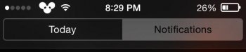
Not only that, instead of 5, there are 4!So looks like iOS 11 has moved back to signal bars. Which do you prefer?
The VPN icon is easier to see from a distance, and the battery icon has slightly changed it seems.
That all said, i couldn't care less, .. for all i care there's one dot, which is filled full when there's a proper signal, and automatically gathers up data and reports back the poor service to the telecom provider when it is not

Ehh I say dots because I don't like android and betraying what they made with dots it betrayal for me and iPhones are getting closer to android every year so f*** the androids
I prefer dots, the bars remind me of some flyblown android device.
I like the bars because it actually works when you ask someone how many bars they have. It was always weird asking someone how many dots they have. Also the bars make it seem like a mobile phone. Brings back that older feeling from phones that couldn’t play music and browse the Internet. I like it
Last edited:
I prefer dots, the bars remind me of some flyblown android device.
Were you not around for the six versions of iOS before iOS 7 or something?
Bars, and by a lot.
I don't care much for the design of bars vs dots, but one necessity for me is the fact that the dots needed to be blank when not filled in.
I'll show an example below.
My previous jailbroken status bar theme on iOS 8 (below):
![unnamed1-jpg.703445]()
Current iOS 8/10 dots:

I personally found the border of the empty dots to be kind of hard to read at a glance, with a small screen and crowded area up top. I like the jailbreak theme's implementation better.
Either way, I welcome bars back again, which to be honest is even better. I don't have terrible memories of super old android, so I'm not opposed to it.
I don't care much for the design of bars vs dots, but one necessity for me is the fact that the dots needed to be blank when not filled in.
I'll show an example below.
My previous jailbroken status bar theme on iOS 8 (below):
Current iOS 8/10 dots:
I personally found the border of the empty dots to be kind of hard to read at a glance, with a small screen and crowded area up top. I like the jailbreak theme's implementation better.
Either way, I welcome bars back again, which to be honest is even better. I don't have terrible memories of super old android, so I'm not opposed to it.
Attachments
Last edited:
I liked the dots better as I found them easier to read at a glance.
I think the dots use the available space more effectively. Or at least they used to. Now that there using that area for other things, it probably makes sense to use the much narrower bars icon.
Should've stuck with bars. Dots are overused in the UI:
- Multiple pages of icons were already represented by a line of dots.
- Updated apps already had blue dots beside them.
- Ellipsis buttons '...' are pretty common now.
Dots are less deceptive, but I use field test mode, so it's irrelevant to me.
Register on MacRumors! This sidebar will go away, and you'll see fewer ads.