Become a MacRumors Supporter for $50/year with no ads, ability to filter front page stories, and private forums.

Tozovac

macrumors 68040
Original poster
Jun 12, 2014
3,010
3,215
There are simple tests that designers can run to check if text and backgrounds pass accessibility guidelines, give it a google.
That page you linked to is pretty average to sub par but if you are having trouble reading that text I’d hazard a guess you have some sort of visual impairment, that doesn’t excuse the design though as the above mentioned guidelines are created to cater for folks like yourself.
When you talk about the glory days of design all you’re really giving is your unsubstantiated subjective opinion- “I liked this more”. It means nothing.
Designers these days are more aware of the need to test journeys, interactions and visuals on a variety of people, the site you linked does not look like one that has undergone such a considered design process.

Well, three things though — let’s say that even though I passed my annual eye exam perfectly this year I am really complain as much as I am looking at certain (too many nowadays) websites, I have a visual condition. Wouldn’t’t it make sense to target what works for most people? That site is far from the worst that I’ve seen, as far as light colored font.

Secondly, assuming for a second one’s unsubstantiated opinion shouldn’t mean much (is it the case that website should only be judged by those with “substantiated opinions?”), it is definitely the case that my unsubstantiated opinion has been unhappy much, much, much more than average starting around 2013 them before.

Third, that website is full of things I complain about at that site are very typical to what I consider to be problems with today’s websites. In other words, it seems like most websites and apps nowadays go through only one design process — to make it follow certain minimalist design cues started by iOS 7 and windows phone and google material design that, on the average, is less intuitive but just more consistent with what someone decided after 2013 to be the new norm, and then everybody felt they had to follow.

This fad of over-minimalism and flat design and the reinvented iOS interface that’s unfortunately bled over into website and computer app design using the excuse that people are distracted by detail and no longer need certain affordances like contrasty/clear text, buttons that look like buttons, borders and zones to better define things on the screen, etc., merely an unsubstantiated design opinion by Jony Ive and a few others. If the need for such minimalism for efficiency and less distraction were true, and the radical change around 2013 from before was definitely a functional improvement, why has so little changed in real life, on the walls of our home, outside of our house, everywhere? Why do we still have plastic siding that looks like wood siding? Why do we pay for fake stamped concrete pads behind our house? Why do we buy plastic fences that look like wood? Why are the sound lessening large concrete walls along highways made to look like handmade stone walls? Because people like it. Yet it was decided that people like an absolute dearth of intuitive detail on their phones and computer screens. Thank goodness Jony Ive is leaving Apple, there is hope again for an improved, enjoyable, intuitive, it just works experience!
 

Tozovac

macrumors 68040
Original poster
Jun 12, 2014
3,010
3,215
The design choice I HATE with more modern sites is the never ending scrolling design. HAAAAAAAAAAAAAAAAAAAAAAAAAAAAAAAATEEEEEEEEEEEEEEEEEEEEEEEEEEEEEEEEEEEEEEEE IIIIIIIIIIIIIIT.
It makes me physically ill. Want to puke.
I am not even kidding.

I love all the scrolling as much as when they put two flat "buttons" that lead to the same place but yards/feet away from each other after scrolling.

Do they perform the same function?

Different function?

Hmmmm why are there two, causing uncertainty. COuldn't that be fixed by, say, a smarter more efficient layout? Hmm.....

Indeed, bad design did not suddenly become endemic. It always was. People can argue as to if it's worse now or then. I don't know if that's something that can be conclusively answered, but does it really matter when ultimately the reality is that in our lifetimes there never was and never will be a shortage of bad design to enjoy?

That's not really saying anything though. There's been great and bad since forever. But for many of us, things were not this bad before ~2013.
 

Akrapovic

macrumors 65816
Aug 29, 2018
1,193
2,570
Scotland
I remember using Geocities and Angelfire sites back in the day. Things were a lot, lot worse back then. The world did not collapse in 2013.

Websites are now infinitely more complex and expected to do and deal with a lot more than they ever have been. The fact that a website is now interactive and responsive adapts to countless devices, deals with all these different browsers, and people are complaining about a duplicate button says a lot. We've increased the complexity 100 fold from when I first loaded Macromedia Dreamweaver in 1998, but the complaints are pretty minor.
 

Tozovac

macrumors 68040
Original poster
Jun 12, 2014
3,010
3,215
I remember using Geocities and Angelfire sites back in the day. Things were a lot, lot worse back then. The world did not collapse in 2013.

Sure, things got better since back in the day, with very little to complain about during the improvement ramp-up but instead lots to appreciate. But then they stopped trending towards the noticeably better but instead towards the arbitrarily different. Again, how is what's the norm now (significantly minimal UIx cues, flat design instead of "unflat design" -- and note, I did not say skeumorphic shiny buttons and woodgrain), pale colored font on white, and prioritizing the mobile experience at times to completely overlook the desktop/laptop experience better and not just different or appealing to taste?

Websites are now infinitely more complex and expected to do and deal with a lot more than they ever have been. The fact that a website is now interactive and responsive adapts to countless devices, deals with all these different browsers, and people are complaining about a duplicate button says a lot. We've increased the complexity 100 fold from when I first loaded Macromedia Dreamweaver in 1998, but the complaints are pretty minor.

It's always interesting to hear the "must do a lot more now than before" without any justification of how it makes sense to react by actually reducing time-tested UIx cues proven to promote ease and quickness of intuitive recognition. Why does it make sense to minimize to the point that new processing methods must be explored and re-learned rather than simply be reacted to by following UIx cues based on human nature?"

Or how does reducing legibility via pale text on stark white help counter these increasing complexities? What's the benefit to making every increasingly complex site look alike from 10 feet (suddenly the only options on color palletes is light blue, medium blue, darker blue, grey, and white?). How important is increasing complexities at sites/apps if it's not of value to prioritize available screen space when one abandons their iPhone or iPad and picks up their MB to get some real productivity work accomplished?

Worst of all (and the inspiration for me starting this thread) - it's one thing with a (former) UIx leader like Apple reinvents overnight a UIx system to the critiques of many, since they can at least provide enough clues to stumble thru, re-learn and adapt. But it's a complete other thing when the lemmings designers throughout the world who follow Apple blindly then attempt to reinvent to these new cues but with often less than desirable results. Thus, the noticeably more horrible web/app designs today than 6 years ago.

Who would approve the image and interface on their 70 inch television to be optimized for a 9 inch iPad? Why are we so quick to eacept a website on a 12 inch iPad to be optimized for a 5 inch phone?

Obviously things like this hold zero merit or deserve zero consideration:

https://medium.com/initialcommit/we-have-failed-604df0e1d3d4
 
Last edited:

Akrapovic

macrumors 65816
Aug 29, 2018
1,193
2,570
Scotland
I'm going to be honest, and you're not going to like it, but this thread seems to be an echo chamber for complaining about things you don't like rather than making legitimate points. There are these massive posts filled with words which don't really say anything, but keep using buzzwordy terms. Honestly, this thread reads like a one-man buzzword generator. Some of these are real terms that are being misused. There is a lot of misconceptions and poor understanding of many modern concepts. The list of things you hate seems to be - buttons that don't look like buttons. Links that don't look like links. Responsive design. White space. Scrolling. Landing pages.

By these criteria, Yahoo.com Circa 2001 is the ultimate in web design. The search button is a button. The links are obviously links. It doesn't scroll. It doesn't respond and re-order itself on a small device. It doesn't use much white space between sections.

Firstly, I'd not use the term "UIx" in these type of conversations. UI and UX are 2 different things, usually done by 2 different teams that work together. Ironically, companies who produce bad "UIx" are usually the companies who mash these 2 separate things into 1. To muddy things further, UIX is actually a specific technology by Oracle, used for creating web applications. If you google it, the top result is a UI and UX designer, and UIX is his brand. So let's be clear - UI and UX are 2 different things, and you need both to create a good product.

There also appears to be some misunderstanding on responsive design from earlier in the thread. Responsive design is when one page can generate a layout for a variety of screen sizes, without the need to reload the page. So you have 1 HTML page, 1 CSS file, 1 JS file (or rather, only require them, there are complex sites which share these across pages obviously). From those files, the page refactors itself to suit the correct screen - usually using @media queries in the CSS file. This is not purely for mobile, as it is used to adjust sites between HD and 4K monitors too. The example you used of the 12 inch iPad Pro isn't a great example. If you have a site that's displaying a small iPhone layout on an iPad Pro, then that isn't bad UI UX design, that's bad development. The resolution of an iPad Pro is large enough that it's on par (and sometimes exceeds) small laptops (not Apple ones, mind you). This site probably has the breakpoints for the @media queries set incorrectly. Bad development is not the same as bad design.

With that out of the way, let's look at "mobile-first" development. Another term that was used earlier in this thread, incorrectly. Mobile-first is when you're developing a responsive website, but start with the mobile version and then scale it up once that's complete. It actually has no bearing on the final result, it just dictates your workflow and how easy it is to code the website. Instead of using @media(max-width) in your CSS, you're using @media(min-width). The reason for that is it's easier (from a development point of view) to scale up the site, rather than try and scale down. Rearranging divs, grids, and flexboxes to fit smaller screens is a nightmare. Rearranging them up the way is easier. So "mobile-first" isn't about the experience at the end - it's how the developer goes about building it.

The reason mobile layouts are so important is they make up the majority of hits. Mobile browsing overtook desktop browsing in 2016 and has stretched its legs since then. In 2018 almost 60% of page views were from a mobile browser. So if you're a developer, and you're looking to prioritise development, are you going to develop for the 60% or the 40%? Obviously, there are exceptions to this - Mozilla MDN are hosting developer network information, and that's probably going to be more of a desktop thing as developers are on desktops (when I say desktops, I include laptops, obviously). However, for the vast majority of the sites, the point stands - most of the world moved to mobile devices 3 years ago. This is especially true for developing countries, where cheaper Android phones making up the majority of the mobile market.

When you merge these 2 things (mobile development and mobile browsing), you also get into talk over overheads and unrequired code. If you can have 1 site achieve the same thing, why are you building two? You're doubling your workload, but you're also increasing bandwidth costs and increasing loading times. Slow loading times due to complex and messy code is directly related to mobile bounce rates. With smart browsers (which we all have if we aren't on IE!) then the browser knows the screen resolution before it begins and will only download the required content, thus reducing bandwidth and loading times. Obviously, if the developer builds it wrong then that goes out the window, but that's back to bad development, not UX and UI. And then we can start talking about CPU and GPU useage, which is tied directly to power consumption, which for mobiles is a big thing, etc etc.

My own site is closer to 55% 45%, and that surprised me. I thought my site would be more desktop-based as it serves video streams and a detailed live timing system for endurance racing. It is a very niche site and can be quite complex. But even my site was getting 55% mobile hits. So that's not up for debate at this point - mobiles are the priority because they make up more of the hits, and the gap is growing.

As for complexity of sites, you've asked an odd question: How important is increasing complexities at sites/apps if it's not of value to prioritize available screen space when one abandons their iPhone or iPad and picks up their MB to get some real productivity work accomplished?

Websites don't exist to be websites. They exist to sell products, services, or information. UX designers prioritise reducing the bounce rate, increasing interaction, etc. There are studies into this, and some amazing tools such as Google Analytics which will tell you exactly how users are interacting with your site. That is the priority for UX designers, not "prioritising available screen space on a MB" because that person thinks they're doing some real work.

The oddest one in this thread was parallax scrolling. Saying Parallax Scrolling is change for the sake of change because Jony Ive didn't like 3D Buttons is like saying my neighbor crashed her Ford Focus into a lamppost because I went on holiday and bought a baseball cap. There is absolutely no relationship between these 2 items.

Moving forward, I would highly advise some UI and UX courses. Udemy sales would have them down to about $15. That way you'll get the correct terms used in the correct context.

Sorry if this post comes across as harsh, it isn't meant to be. But this thread can be summed up with:

297.png
 
Last edited:

Tozovac

macrumors 68040
Original poster
Jun 12, 2014
3,010
3,215
Sorry if this post comes across as harsh, it isn't meant to be. But this thread can be summed up with:

297.png

Thanks for your post, I'll digest it more later. Both of us are as valid in certain points as we can be proven to be flatly incorrect in others. The only one I'll comment on this morning/today is your above comment. Respectfully, you weaken your stance at times by being clearly wrong, since it's just not one lonely voice who has zero validity to his crowing and/or just can't move on. There are many users who don't like the trends I complain about. Many contributed to this thread, some write blog/twitter/online articles, including ex-Apple software employees, UI/UIx experts, "just" users (who, it could be said, might be the ultimate judges here), and "experts" in-between. Their online or print articles all hit a certain theme not about their personal feelings/preferences but rather: They recognize that the downsides to many of the arbitrary choices that shifted virtually overnight a well-working Apple iOS (and then helped shape website/app design since Apple sets the mark for now, like Microsoft used to and then Sony & others before them) far outweigh any possible improvements.

An anecdote only: I bought my mother a 1st-gen iPad and handed it to her, and she flew from there. The interface was designed rather well as were the apps, which rarely changed at each major iPad-OS/iOS iteration since they were set up well from the start. I rarely got calls for help. After iOS7, I started receiving calls for help trying to figure out how to do what used to be easy, especially after some of the iOS updates where Apple re-reinvented their crappy app that was (unnecessarily) overhauled at iOS7. That's real-life stuff, and not old people barking at clouds, unfortunately.

Life is all about trade-offs, nothing is perfect, but at a time when an industrial designer was permitted to re-craft the Apple software experience driven more by a certain appearance more than function, it resulted for many in a lot of bad trade-offs that far outweighed any good tradeoffs for many. Sure some things are better (responsive design for various sized small screens, or a fresh look for those who grew tired of too much of a good thing) but not without some noticeably bad trade-offs for many. I'll contend there may be many who love/like today's overall approach vs. what was common 2005-2013. And there may be many who just accept what's given. But there are clearly many who recognize a certain loss of efficiency and even enjoyment from the dozen mental papercuts received daily when navigating the flattened, function-hidden-beneath-hamburgers, frameless minimalist interfaces that we're stuck with for now. More later, fun stuff.
 
Last edited:
  • Like
Reactions: decafjava

YaBe

Cancelled
Oct 5, 2017
867
1,533
Why is website design so awful today, generally?
Because all site nowadays use templates, and many site share the same tempalte, hence, you make a "bad design tempalte" and bad design spreads faster.

Because it is cheaper now to have a "nice looking" site (see the above template issue), before you had to pay a designer, now "my nephew can do it for half of it"......

And because most people still thinkg that design is "what it looks like"... while instead design should be how it works.
 

Akrapovic

macrumors 65816
Aug 29, 2018
1,193
2,570
Scotland
Repetitive. Bad design. You could have just said "chamber" once, and used the rest of the space for something else :)

This post wins the thread. Actually lol’d.

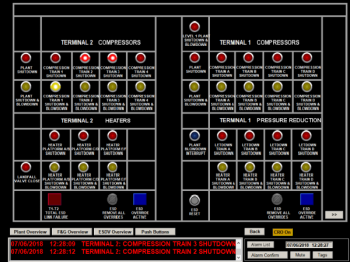
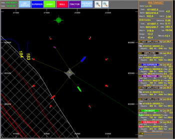
For reference, I design control room systems for the energy sector and specialise in Major Emergency Management. My systems are designed to be used under extremely stressful conditions (literally life or death), often by someone who is unfamiliar with the system, where the results can kill people.
 
Last edited:

Tozovac

macrumors 68040
Original poster
Jun 12, 2014
3,010
3,215
Repetitive. Bad design. You could have just said "chamber" once, and used the rest of the space for something else :)

There, you are wrong. He got his message across rather well I think. Good use of visual cues to relay his full message, like iOS used to do too before iOS 7. Plus, he used dark font, not hard to read but trendy light gray font on white, and he didn’t employ an unnecessarily large layout that required a lot of scrolling in order to get the message across quickly. If only today’s apps, websites and operating systems were more like his post.
[doublepost=1565105250][/doublepost]
This post wins the thread. Actually lol’d.

For reference, I design control room systems for the energy sector and specialise in Major Emergency Management. My systems are designed to be used under extremely stressful conditions (literally life or death), often by someone who is unfamiliar with the system, where the results can kill people.

If you have any non-proprietary representations of exactly what you speak of, I would be interested in seeing it.

I would think the same importance could be assigned to the intra-office management software that my doctor switched to, where the nurse was complaining about tiny light grey font on white background that was very hard to read, and having to search for functions that used to be out in front. Just because something’s important doesn’t guarantee it was designed well. ;)
 
Last edited:
  • Like
Reactions: adrianlondon

Akrapovic

macrumors 65816
Aug 29, 2018
1,193
2,570
Scotland
If you have any non-proprietary representations of exactly what you speak of, I would be interested in seeing it.

Unfortunately, I do not as my work is either bespoke to my company or is for clients. I wish I could show it off more as I'd have a better portfolio. It's hard to go to job interviews without this work to back myself up. I have many public examples of bad systems which I'll research tonight (only publically available screens, unfortunately). I'm in the process of moving us away from our SDK (it's a bespoke kit, which is quite old) to a JavaScript based system. Which will lend itself more portfolio as I will be able to use relevant code snippets.

I would think the same importance could be assigned to the intra-office management software that my doctor switched to, where the nurse was complaining about tiny light grey font on white background that was very hard to read, and having to search for functions that used to be out in front. Just because something’s important doesn’t guarantee it was designed well. ;)

I disagree because the effect of the Nurse inputting data into a form is neither immediate nor is it unsupervised. Whilst I do agree that such things should be better (for obvious reasons), a nurses form does immediately, upon pressing a single button, cause a patient to die, for example. It also would then be read by a human and interpreted. This, in risk management, is known as the Swiss Cheese model. A system may break down somewhere along the line, but as long as it's caught then that's ok. This is very common in health care systems - there have to be multiple failings on multiple levels before an incident occurs. This doesn't make the software good, but it does mean it is less important than the software I'm talking about.

With my systems, the actions are both immediate, and unsupervised. A control room operator (CRO) has the authority to carry out actions with his system without his managers approval, especially in an emergency. However, if the CRO is then confused between these highly detailed graphics between the sprinkler system and the CO2 system, when he releases the CO2 system, the people in that room die. So there must be zero ambiguity. The CRO must understand exactly what he's looking at, at all times, despite using a system he may be unfamiliar with and be under extreme levels of stress. What happens when this goes wrong? Well, Piper Alpha is what happens. At this point in the Swiss Cheese model, all else has failed and the CRO and his system are the last line of defence. It has to work.

Do you know what works well on these systems? Flat design. Limited colour palette. White space (actually black - I use black backgrounds on my systems, not white). Low contrast text for text which is not the most immediately important thing on the screen. Not all text is created equal.

The nurses system may not be good, and certainly not ideal, however in terms of immediate repercussions and the environment these actions are taken in, these vastly differ.
[doublepost=1565109721][/doublepost]I've attached a whole bunch of this post, and I've one more to attach to the next post. I recognise the majority of these screenshots from previous clients and developers I've worked with. Some of these are from real life systems and some of these are purely training systems. The ones that are real will be running in a training mode - nobody is taking screenshots during an incident.
 

Attachments

  • FA5-2-600x450.png
    FA5-2-600x450.png
    155.8 KB · Views: 134
  • FB1-600x450.png
    FB1-600x450.png
    167.4 KB · Views: 131
  • FC-6-1-600x450.png
    FC-6-1-600x450.png
    90.5 KB · Views: 142
  • front-screen-image.png
    front-screen-image.png
    976.4 KB · Views: 154
  • GGT-3-1.png
    GGT-3-1.png
    114.5 KB · Views: 139
  • GGT-4-1.png
    GGT-4-1.png
    154.4 KB · Views: 140
  • GGT-6-1.png
    GGT-6-1.png
    100.5 KB · Views: 145
  • GGT-5-1.png
    GGT-5-1.png
    230.8 KB · Views: 130
  • PEHE-4.jpg
    PEHE-4.jpg
    67 KB · Views: 145
  • PTS-pic-4-e1457368141865-1024x326.jpg
    PTS-pic-4-e1457368141865-1024x326.jpg
    93.3 KB · Views: 141

cyb3rdud3

macrumors 68040
Jun 22, 2014
3,263
2,019
UK
I can read the grey text perfectly fine, but it's still a crappy website with loads of wasted space and paragraphs of text all squashed into the centre for no reason. It seems as if people design a website for the iPhone SE and then call it a day.
I suspect it is more because they don't actually have much content. Whilst I totally agree that the main container for the body is too narrow, the site would seriously crap if that little amount of text was too spread out. I can imagine that who ever had to turn that content into something useable for the website was like '****, is that it?'...
 

Akrapovic

macrumors 65816
Aug 29, 2018
1,193
2,570
Scotland
I suspect it is more because they don't actually have much content. Whilst I totally agree that the main container for the body is too narrow, the site would seriously crap if that little amount of text was too spread out. I can imagine that who ever had to turn that content into something useable for the website was like '****, is that it?'...

Here's what it looks like when you take it to 100% width. Much less wasted space, but looks ridiculous.

Also, with monitors becoming larger, you should be limiting your text width. Graphics less so because that's added flare. But if you're turning your neck to read text then the site isn't well setup.
 

Attachments

  • Capture.PNG
    Capture.PNG
    93 KB · Views: 147
  • Like
Reactions: cyb3rdud3

patogen

Suspended
Aug 25, 2019
1
1
I don't understand the 'old man yells at cloud' platitudes.

This thread has a point which is not that hard to agree with. Web optimized for six inch screens has by nature become content-unfriendly. It's optimized for dumb consumers, not learners.

I have to scroll five screens worth of giant pictures to read five lines of 'are you looking for blahblahblah? This is the most fabulous blahblah blah that ever made you puke!' All of that is supposedly justified by another platitude such as 'one picture tells more than a thousand of words'.

Well, maybe. But it surely doesn't tell more than say, a hundred of carefully selected and on-point words. As a matter of fact, it tells nothing.

Browsing the current web is a painfully stupid experience. And I'm afraid there is nothing to do about it. It's ruined. It's an awesome place where mediocrity thrives. But we need Web 3.0 and prayers that it takes a while before idiots and marketing leeches catch on.
 
  • Like
Reactions: Tozovac

Akrapovic

macrumors 65816
Aug 29, 2018
1,193
2,570
Scotland
This thread has a point which is not that hard to agree with.

I agree. This thread has a point. That point is often lost through poor examples and incorrectly utilised terminology. You can argue that is good and bad, but you cannot argue what parallax scrolling is. Or what media queries are. Or the % numbers of phone users. That is the biggest problem with this thread - the incorrectly used technology examples.

Web optimized for six inch screens has by nature become content-unfriendly. It's optimized for dumb consumers, not learners.

"People who don't like what I like are dumb! They aren't learners!"

I mean really? Do we want the old man cloud image again?

Websites don't exist to be websites. They exist to sell products, services, or information. UX designers prioritise reducing the bounce rate, increasing interaction, etc. There are studies into this, and some amazing tools such as Google Analytics which will tell you exactly how users are interacting with your site. That is the priority for UX designers, not "prioritising available screen space on a MB" because that person thinks they're doing some real work.

It's hard to argue with results.
 

Tozovac

macrumors 68040
Original poster
Jun 12, 2014
3,010
3,215
Unfortunately, I do not as my work is either bespoke to my company or is for clients. I wish I could show it off more as I'd have a better portfolio.

Thanks for taking the time.

Reading your discussion about immediacy needs and usage implications and info prioritizations underscores to me at least that what might be best for one situation isn’t necessarily the best (or even good) for others. If flat design in your cases is best, then wouldn’t more flatter design be even better? Wouldn’t making every computer application, mobile operating system, and website look exactly like your examples above (which look like 1980s 8-bit interfaces) be best, regardless of whether their use is for entertainment, productivity, or critical system monitoring? Please with that last sentence re: 8-bit, I am not intending to insult or ridicule than try to drive home the point that today’s apparent war on detail, this stripping away of pixels and “once. rather obvious” interface cues, this minimalist and mobile-prioritized focus since ~2013 is worthy of questioning when a user like me feels that things are unnecessarily less obvious, less intuitive, less inefficient to where the interface often gets in the way of productivity or even fun.

Off the bat, I commend your examples for appearing to stick to the good basics of making key selectable actionable items look like available/pressable buttons. Lost in the bathwater with the baby by Sir Jony Ive is, that although we users no longer need to have something look like a button to know we can press it, that something should stand out "intuitively strongly" from other similar info-only items on the screen in order to know we can act on it. That's been lost in today's flat-design text-focused interfaces against which I harp.

I disagree because the effect of the Nurse inputting data into a form is neither immediate nor is it unsupervised.

Actually, her tasks should be considered as immediate (get my vitals and info, enter into the screen, the move onto the next patient quickly). In my case, she was having difficulty reading the newish software interface's light grey text on white and which included barely-discernible slightly-darker-grey text input areas on white and without even a pixel’s width of frame or shadow. The interface was very reminiscent of most every Apple e-interface after ~2012, especially iOS, and the complaints were very representative of mine and others towards "bad e-interface design" trending towards the minimalist since ~2012. Now, one could argue that her monitor could be adjusted to make the screen stand out. Wouldn’t it be better to have a design that’s more robust to cover a variety of users and hardware settings and situations? Especially for iPhones which, for the 4 models I’ve owned this far, are awfully hard to see in any sunlight to begin with.

I don't understand the 'old man yells at cloud' platitudes.

This thread has a point which is not that hard to agree with. Web optimized for six inch screens has by nature become content-unfriendly. It's optimized for dumb consumers, not learners.

Thank you for acknowledging how certain aspects in today's "e-interface design" have certain noticeably negative trade-offs that I feel are given too much of a pass in the name of "hitting high marks" in specific areas per Google Analytics or in the name of prioritizing quick in-and-out consumption and/or sales to an apparently mobile-centric user base.

Since we're all allowed our opinions, worse is that I still contend that the majority of "e-interface design" elements appearing since ~2012 that I take issue with are optimized to the minimalist ideals/whims a few key minimalist designers for how they think things should be, and no longer based on robust cues designed honed over decades that have the general user in mind first and foremost. Where it gets especially problematic is when the rest of the world (often including less talented or trained folk put in the position of designing a screen or interface) follows these "design leaders" off the cliff, adopting their minimalist borderless flat monochromatic vertical-centric presentation into things like printed food menus to where it's not inherently obvious whether a black boxed white font $20 applies to the fish above or chicken below without taking the time to scan up to the top of the list and verify where the first price is relative to the first food item. (true experience this past weekend in Quebec City at a ritzy restaurant with a tall single-column menu having identical spacing between prices & food items and no lines. I do not recall such frequent consternation before ~2012.)

I agree. This thread has a point. That point is often lost through poor examples and incorrectly utilised terminology. You can argue that is good and bad, but you cannot argue what parallax scrolling is. Or what media queries are. Or the % numbers of phone users. That is the biggest problem with this thread - the incorrectly used technology examples.

I assume you're largely referring to me. I'll try to stick to the term "e-interface" in case my occasional incorrect terminology results loss of message. Here, e-interface refers primarily to the user interface and content on the screen, but also secondarily to the device itself and even the ports/levers/sliders/keys/bezels/touchpad/touchbar (and buttons we still have, which Jony & co. haven't fully banished, thank God).

If I could go back in time, I would rename this thread "
Why are so many aspects of e-interfaces for websites, apps, and operating systems for both mobile devices & and desk/laptops so different than before ~2012 when it seemed things "just worked" a bit better IMHO, but more importantly, why are these e-interfaces so often noticeably less easy and less obvious now to where they have become for many less convenient and less fun to use than before, even if some statistics can prove they're better than before in certain instances like quick content intake and consumer sales using mobile devices?" (Subtitled: Why is website/app/operating system design so awful today, generally?)

In the most general of terms, my complaints started after a shift of seemingly arbitrary e-interface changes starting around 2012 that trended towards uber-minimalism, noticed first maybe with Microsoft's phone, Windows Metro interface, Google material design, and iOS 7. Though it really hit a head after the introduction of iOS 7 since Apple was and still is the leader of the pack to for which designer lemmings follow to this day for good or bad, where Jony's team completely reinvented "the norm" overnight, sometimes via still-confusing 180 turnarounds from the prior norms and which required a hard re-learning of "what's right."

And as it's been said often by many, we're asking more and more from our mobile devices. I've questioned often why is it a good idea to respond to increasing complexity by changing to more-minimal e-interface details, abandoning years-honed user-intuition-friendly e-interface cues?

Like everything in life, there are tradeoffs, some are pros and some are cons.

I've heard many defenses of the Pros for simpler, vertical-focused, adaptive/responsive interfaces, coupled with what sounds like acceptance of what I deem to be noticeable Cons especially when using anything but a small iPhone.

Anybody with 5 hours on their hands and nothing better to do can re-read the cons I've stated repeatedly in above posts. So who can stick up for pros/benefits of the following trends that are the root of my critiques? I'll completely avoid any talk of cons about scroll-heavy responsive design for now.

1) What are some strong pros/benefits to using text-only for an actionable item rather than differentiate more strongly an actionable item vs. info-only?

2) What's a strong pro/benefit to using light grey/brown/blue font on a white background?

3) What's a strong pro/benefit to having light grey text or buttons now be actionable/available compared to how before, a button or depression or even text was made light grey to signify it was "not available," often coupled with making the "not available" option flat-looking, in good contrast to nearby item(s) that were obviously available/actionable since they were brighter or darker (less grey) and "pressable looking."

4) What's a strong pro/benefit to the trend of making so many apps/screens/interfaces all light blue, medium blue, and white?

(Funny, Adobe Acrobat on my work computer has traditionally been red in the icons at the bottom taskbar. Microsoft outlook was gold. Microsoft Word's icon in the lower taskbar was blue. My work recently went to Windows 10, and now open Adobe Acrobat files are shown with a blue and white icon at the bottom of the screen, Outlook is now blue and white, MSWord is still blue and white, and even the resident Windows image view icon is blue and white with a two-mountain-peak image on the blue/white icon that looks exactly like Adobe Acrobat Pro's blue/white icon. Of course the majority of my work involves using Word, Outlook, Acrobat Pro, and the image viewer hourly if not all day. Some may say I can just change the icon colors, similar to how the nurse can just take the time to adjust the contrast of all the screens in the patient rooms. No I can't, it's locked down at work to the default provided settings. And even if I could change them, why should I need to. What was/is the benefit to trending to the blue & white in so many icons and even apps themselves? What’s the benefit in outlook now going blue instead of gold, and then looking like Word from 4 feet away, requiring more work than before to get work done?

5) What's a strong pro/benefit to stripping away borders and edges of windows, sliders, scroll bars, etc., in OSX/Microsoft/website/app e-interfaces?

(My work just "upgraded" to Windows 10, including a newer version of Adobe Acrobat Pro. First, Acrobat Pro's interface was completely redone from the version we had used previously, most notably with tools now hidden away under layers of menu clicks. It’s not better it’s just different. It took about 30 minutes to reconfigure the shown Tools to some semblance of its former usability. Secondly, in typical minimalist fashion, the available files open simultaneously are indicated by grey flat design tabs up top, all the same grey (whether selected or not) and with a minimum of border to define each tab such that if you had more tabs open than could fit on the screen at one time, it's visually nearly impossible to tell without stopping and staring if there are more tabs available to the left or right off screen w/o taking the time to go look and check. E-interface minimalism at its very best. Errr, worst. But worst of all, it's typical to today's flat/grey/minimalist e-interface awfulness and a solid example of how to design for a minimalism
design exercise and not for robust usage)

6) Similar to #'s 2-4, but apparently hard to answer for some, what's a strong benefit towards making the interface fade into (and not stand out from) "the content?" (Think: any mostly-white interface requiring text entry throughout but with a virtual minimum of "obvious data entry zones" and borders/lines/boxes.) Related is #4, what’s the string benefit of making apps/icons/sites look so alike from 5 feet?

7) Since the idea of a laptop is to provide portable productivity, why are ports/jacks/interfaces/keyboards trending to the very minimal, then resulting in having to tote an additional bag of dongles or port banks and cables just to regain the same portable productivity as before?

8) What's the strong pro/benefit to now hiding frequently-used tools offscreen under a hamburger or ellipsis or gear icon, when so much other space available, even in apps used on my iPhone 8, one of the smaller devices now available.

9) Since the last time I checked, real-life continues to value tactile wall switches, bath/kitchen faucet handles, toilet handles, door knobs, belt buckles, piano keys, shirt buttons, pants zippers, red lipstick, cloth basketball nets, pink-dyed salmon filets, footballs with laces, suits with ties, fake fingernails, hair extensions, different-colored toothbrushes....etc...what's the strong benefit to holding today's e-interface since 2012 towards the flat, monochromatic, buttonless minimal? Not missing green felt and leather stitching, but missing what used to feel like it just worked.

10) Now that the wow factor is gone for in-your-face hero images or hi-res hero videos that take up the entire screen space of a desktop presentation, why do they persist? What’s the benefits of a video of a happy family having a picnic or attractive mountain biking couple before using PayPal, or a glorious sunset photo before logging into my bank? (Beyond the web designers needing some stimulation)

It's hard to argue with results.

Who once said it's hard to define pornography but I know it when I see it?

I do my best to describe e-interface design elements that I consider to be awful over these past 6 years of minimalist folly to where efficiency and even joy is negatively affected. I’m not alone. But in case I still can't define awful e-interface design to some, it's interesting to sense that the frustration (or less joy) I feel interfacing in today's typical post-iOS7 e-interfaces during times I'm not in a hurry to take in content being "sold" to me nor looking online to buy something online quickly is not considered to be valid if these interfaces succeed with increasing sales or allow easier one-handed iPhone operation. Or, it’s interesting to sense that some key cons that overwhelm any pros are rather accepted by some.


Oh, and, the latest Apple TV remote. Enough said on that piece of #%¥€.
 
Last edited:

Tozovac

macrumors 68040
Original poster
Jun 12, 2014
3,010
3,215
The oddest one in this thread was parallax scrolling. Saying Parallax Scrolling is change for the sake of change because Jony Ive didn't like 3D Buttons is like saying my neighbor crashed her Ford Focus into a lamppost because I went on holiday and bought a baseball cap. There is absolutely no relationship between these 2 items.

Thanks for the thoughtful post if I didn’t already. But are we talking about the same thing? If parallax was introduced to indicate an interface sensation of a flat icon floating above a background for “pressability” in place of the former 3D bubble/shine appearance, how can they be as unrelated as you say?

Moving forward, I would highly advise some UI and UX courses. Udemy sales would have them down to about $15. That way you'll get the correct terms used in the correct context.

Thanks. If using the wrong terminology through clouds my general thoughts beyond comprehension, then that is something to consider. But I don’t think becoming an expert in interface terminology will fix the gross shortcomings and negative trade offs I feel daily since 2012 in interface design of apps, operating systems, websites, etc. Life is full of trade offs and that the many cons in interface design of late are so forgiven in light of certain pros still astounds me often.

To be told that pointing out what I and many others perceive as clear shortcomings in today’s re-imagined interface designs vs. what we felt worked really, really well before some arbitrary reinventing ~2012 is basically the same as yelling at clouds is fascinatingly closed-minded (or an indication I just can’t communicate).
 
Last edited:

Akrapovic

macrumors 65816
Aug 29, 2018
1,193
2,570
Scotland
I won't do a full post, because this thread is your thread for bad web design - not Akra and Toz face off in an internet battle lol. I'll make this my last post. I don't want to hijack it further. But a few things to consider -

Actually, her tasks should be considered as immediate

I did not say her tasks. I said the results. The result of a task is often not immediate. Again, I don't want to dive too much into risk management and all that but look at Deepwater Horizon. Decisions and tasks which were carried out did not have results for months after the decision. It is important not to confuse the task itself with the result of the task. The nurses task is immediate. The result of (for example) a badly carried out task is not immediate. It can be catastrophic. But it not immediate. Also, it is not made under extreme stress, which a CRO will often be.

1) What are some strong pros/benefits to using text-only for an actionable item rather than differentiate more strongly an actionable item vs. info-only?

One pro is larger text for the same tap target. You don't need a border or padding, which allows you to expand the text to the whole tap area.

2) What's a strong pro/benefit to using light grey/brown/blue font on a white background?

Not all text is created equal. Heavier weight text is used to highlight what is important, whilst lighter weight text is meant to be less prominent. I use this a lot in my work. A gas head tag is important enough to be on the screen, but has to be faded to allow it to blend in when it's not required.

What's a strong pro/benefit to the trend of making so many apps/screens/interfaces all light blue, medium blue, and white?

Basic colour theory. White and blue is professional and calming. White is also very neutral so works with a lot of other colours.

7) Since the idea of a laptop is to provide portable productivity, why are ports/jacks/interfaces/keyboards trending to the very minimal, then resulting in having to tote an additional bag of dongles or port banks and cables just to regain the same portable productivity as before?

Reducing the complexity of the mainboard and required hardware. Cost cutting. Lighter weight. Tighter packing for more portability.

What's the strong pro/benefit to now hiding frequently-used tools offscreen under a hamburger or ellipsis or gear icon, when so much other space available, even in apps used on my iPhone 8, one of the smaller devices now available.

Pro is less clutter, which allows larger tap targets. Remember that a tap target is often larger than the visual representation. See this for how keyboards dynamically adjust the targets https://www.macrumors.com/2015/04/02/swiftkey-updated-with-tap-map/

9) Since the last time I checked, real-life continues to value tactile wall switches, bath/kitchen faucet handles, toilet handles, door knobs, belt buckles, piano keys, shirt buttons, pants zippers, red lipstick, cloth basketball nets, pink-dyed salmon filets, footballs with laces, suits with ties, fake fingernails, hair extensions, different-colored toothbrushes....etc...what's the strong benefit to holding today's e-interface since 2012 towards the flat, monochromatic, buttonless minimal? Not missing green felt and leather stitching, but missing what used to feel like it just worked.

These physical switches provide physical feedback. A phone never will. Drawing the button does not achieve the physical feedback of the button.

Who once said it's hard to define pornography but I know it when I see it?

Results are not as nuanced as describing pornography. It is simply a case of which numbers are bigger. Did the new UX design improve throughput and click rates? Yes. We'll keep it. It actually is that simple.

If using the wrong terminology through clouds my general thoughts beyond comprehension, then that is something to consider. But I don’t think becoming an expert in interface terminology will fix the gross shortcomings and negative trade offs I feel daily since 2012 in interface design of apps, operating systems, websites, etc. Life is full of trade offs and that the many cons in interface design of late are so forgiven in light of certain pros still astounds me often.

You're right that you absolutely don't need to be an expert in teminology. But these courses aren't about learning words - they're about learning why things are done the way they are. Rather than assuming thousands or millions of designers are idiots, it might be worth taking a $15 course to learn why they are doing things this way. You seem like a person who'd like to learn things (you may not agree with the things - but you seem to want to learn). You'd enjoy these courses even if you aren't in agreement with what they teach.
 
  • Like
Reactions: cyb3rdud3

Tozovac

macrumors 68040
Original poster
Jun 12, 2014
3,010
3,215
Thanks for the post, it's ok you're moving on since we'd just go in circles.

I guess I appreciate hearing versions of rationales for current web/app/OS interface trends that stand out from pre-2012, but even if I posted them to my bathroom mirror and reviewed daily in the quest for understanding and acceptance, what remains and keeps getting brushed off are trade-offs that are noticeably negative to many, the majority of which, if reverted back to "before," would remedy all the extra taps and pauses and unnecessary accommodations needed to navigate thru the brave, new, monochromatic, flat, less-distracting minimalist "improvements."

Undoubtedly, some of the negative trade-offs that aggravate me have to be navigated by others, but it must just be the case that the trade-offs are accepted or not even felt, such as the extra time necessary to find functions now buried under a gear or elsewhere not on the screen, and THAT is something I suppose I will accept.

Such as, is the extra time needed constantly throughout the day due to now not being able to quickly pick almost subconsciously between the formerly different-colored Outlook, Word, Adobe Acrobat Pro, and image viewer icons must be worth it due the calming effect of blue and white?

Is the extra time taken to discern which open file in Adobe you need to use since they all look alike in the tabs, with their file names shortened up via ellipses just for an uncluttered interface is worth it for the pretty view? (this trend towards shortening a file name or piece of info/text by inserting ellipses in the middle just to fit into a smaller de-cluttered representation with more unused whitespace on the screen such that it's often impossible to understand the word/text without taking extra time to sort thru them all, whether it's Adobe Acrobat Pro, the LIFx smart home app, Simplisafe app, or a mail app which scrunches down all the folders into rows of same-looking names remains bafflingly frustrating)

So because a tappable, obvious interface cue on the screen doesn't move, it's certainly not worth utilizing certain time-tested accommodations for their time-saving "it just works" aids? So the lighter weight of a portless laptop is worth having to add back the weight of a dongle bag (and need to keep track of and spend extra time now connecting/disconnecting)?

Funny, when one attempts in threads like this to try to convince rationales with no recognition or at least acknowledgment for the negative tradeoffs, it feels an awful lot like pressing on a piece of text thinking it's a button and getting no action.

When encountering detailed rationales for some awful IMHO interface trends from those involved in "the business," it underscores the battle many of us face. Like any fad, time will pass and what's good should return and stick. :)

f8fb486871e8b4bd2f44ea2eb22ebe88.jpg
 
Register on MacRumors! This sidebar will go away, and you'll see fewer ads.