Become a MacRumors Supporter for $50/year with no ads, ability to filter front page stories, and private forums.

dogbone

macrumors 68020
Original poster
The particular problem is that the website and email addresses are really long, coupled with the requirement that I have the "s&k is a CPA..." which seems to only look right sitting at the bottom with the logo on the right.

The snk logo at top left seems OK and if I do that the only spot for the CPA logo that looks right is at the bottom right, especially as tag line has to go with it.

I've tried ranging the contact numbers left and placing them in various positions but then I have trouble where to put the CPA logo and tag line.

I've tried splitting up the email and web address from the numbers without much success.

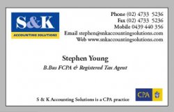
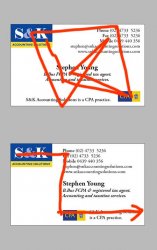
The best I could come up with is No.1 (top left)
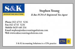
No. 2 is just the logo without bleeding off. (top right)
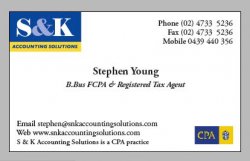
No. 3 looks a bit dicky (bott left)
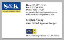
No. 4 (bott right) was a new attempt to solve the problem by combining the CPA tag line with the email and web addresses. It sort of looked OK but it seems a little too symmetrical with one object in each corner and one in the middle.

So at the moment I'm tossing up between 1 and 4. Which I'll send to the client for approval unless anyone wants to suggest anything else to try. I'm really at a loss here.

Thanks.
 

Attachments

  • 1.jpg
    1.jpg
    21.1 KB · Views: 126
  • 2.jpg
    2.jpg
    20.9 KB · Views: 96
  • 3.jpg
    3.jpg
    20.7 KB · Views: 113
  • 4.jpg
    4.jpg
    21.6 KB · Views: 102

ATD

macrumors 6502a
Sep 25, 2005
745
0
A quick alt, just felt that the type would be easier to read lined up.
 

Attachments

  • 5.jpg
    5.jpg
    60.7 KB · Views: 95

Bibulous

macrumors 6502a
Jan 19, 2005
716
0
Just a few thoughts, maybe leave the word "email" and "web" off, they don't add anything.

Also looking at #1, how about moving the web address below the tag line on the bottom.
 

dogbone

macrumors 68020
Original poster
Thanks for that, I did try that earlier on and although it looks ok from a distance I was a little bothered by having all the address stuff so close to the logo. But maybe I'm just being too particular about this.

At any rate it is worth submitting.
 

dogbone

macrumors 68020
Original poster
Bibulous said:
Just a few thoughts, maybe leave the word "email" and "web" off, they don't add anything.

Also looking at #1, how about moving the web address below the tag line on the bottom.


That's an excellent idea using the web address under the tag line. It didn't even occur to me but I can see that it makes sense to separate the web addy from the rest of the contact stuff.
 

dornoforpyros

macrumors 68040
Oct 19, 2004
3,070
4
Calgary, AB
dogbone said:
After removing the 'web' and 'email' it added enough room to make your layout look really nice. I'm starting to like this a lot.

I like what you did by removing the web/e-mail titles. However the blue www. and @ bug me a little.

if your going to use the blue like that I'd probably turn the .com 's blue as well just to even it out.
 

dogbone

macrumors 68020
Original poster
Yes I've sent a proof off with them in black as I realised that it may not be such a good idea to have small type print with 3 plates. And it also looked a bit out of character with the no nonsense look.


The key idea here was putting the CPA logo above the tag line, I would never have thought of that.

I feel certain that this will get the go ahead.

Thanks again to everyone who helped here.
 

AndrewWalz

macrumors newbie
Mar 2, 2006
1
0
more ideas...

I think the business card project has successfully evolved into some pleasing options. I have a few suggestions that might push it a bit further. I still see a lot of redundancy. Of the most recent samples you have submitted, I like the first one. It is much more balanced. The last one is awkward with the big block of white in the lower left corner and the phrase split into two lines in the lower right corner is awkward as well. The first card is weighted nicely with the colored logos in the lop left and lower right corners. Here are some of my thoughts...

1.) The word "accounting" is used five times.

2.) "S&K Accounting Solutions" is used four times.

3.) The phrase "Accounting and taxation services." seems redundant considering the name of the company implies that they offer services pertaining to those things.

4.) I do not like the use of periods at the end of short phrases, such as the ones used in these business card examples. Simply change the one phrase to "B.Bus FCPA & Registered Tax Agent".

3.) The phrase "S&K Accounting Solutions is a CPA practice." used with the CPA logo seems redundant. I would assume that the use of the CPA logo implies that the practice is CPA-based. The logo alone does the job on a business card. The phrase with the logo is too much. Lets face it, the first part of the phrase, that part being "S&K Accounting Solutions", has been stated in the business name and web addresses. The complete phrase could be stated on the company's website. Anyone interested in the company's services who is not already a client will surely investigate their website or request more information, which would contain more clarification on the company's details.

4.) I think the person's e-mail address is enough to indicate that the company has a website without including the company's web address. I mean, most people are savvy enough to know that the part after the @ symbol is the company's web address, especially given the fact it is the company's name. We already assume that people know what those items are, so we deleted the "e-mail" and "website" labels. It might make sense to delete the website portion as well. I would rather see the company's website address than the phrase "S&K Accounting Solutions is a CPA practice." But, I think the phrase and the website address might be better left out if the client would go for it.

5.) I think periods should be used in place of spaces and parenthesis in the phone numbers. The parenthesis and blank spaces between the numbers are awkward. Periods in those areas would be more visually appealing and connect the numbers in a way that makes them easier to read.

Let me know what you think.


AndrewWalz.com
myspace.com/andrewwalz
 

dogbone

macrumors 68020
Original poster
Thanks for taking the time to consider this.

I agree with most of what you have said about the redundancy. However this part is not under my control. When they added "accounting and taxation services" I almost couldn't believe it. There was even more stuff they wanted on it but I managed to talk them out of it.

The CPA logo at the bottom *must* appear with the approved clause, this is a CPA requirement. I got permission from them to break the clause and while I agree it looks better on one line, it won't work in the bottom layout, even more so now they have increased the size. However if I can get them to remove the second line under the name then I'll have enough room to go back to a single line under the cpa logo.

I will remove the periods as I agree with you on that.

Regarding periods in phone numbers, I'd never thought of that it's a bit too radical for this job but I will keep it in mind for the future.

Regarding (4) this is way too advanced a concept for these people. While it is obvious to you and me it is not so obvious to the many web illiterate souls out there.

The only thing I disagree on, is which layout is better. Sure the first one is traditional and safe but it just looks stale. I don't see the white space as awkward at all, in fact quite the opposite.

The top one in my eyes is trying so damn hard to be balanced that it succeeds to the point of having no intrinsic dynamic movement at all. It is not attractive to look at as your eye darts all over the place without resting anywhere.

The white space draws attention to the main logo and away from the secondary logo plus it has nice movement. You eye first goes to the logo then moves down the straight edge, hits the cpa logo and move right again. To me the bottom one presents a curious paradox; it seems that it *should* look unbalance but it doesn't and it forces one ponder why.

In short the bottom one make me happy the top one just looks boring.
 

Attachments

  • red.jpg
    red.jpg
    38 KB · Views: 87

makisushi

macrumors 6502
Jul 15, 2004
300
0
Northern VA
dogbone said:
The client added another line.

I've been given permission to split the clause after the CPA logo so here's the final submission, so we can have some closure on this.

I don't want to go over any design elements, because the deal is done.

BUT...

on the production side, you may have an issue with having the logo in the corner. Make sure you use a good printer, so that the negative space variations are kept to a minium when they cut the cards. You will want to make sure the printer is paying particular attention to this detail.

I have seen as much as 1/8" variation because of cutting. As a general rule, I keep important stuff at least 1/4" from the edge.
 

dogbone

macrumors 68020
Original poster
Thanks for the warning. Fortunately this job is for a client of the printer so it in his interest to make it perfect. He's just one man with a Heidleberg and his registration is exceptionally good.

1/8" cutting variation, man that is baaad. I would think1/32" would be the maximum acceptable variation.
 

ATD

macrumors 6502a
Sep 25, 2005
745
0
dogbone said:
Thanks for the warning. Fortunately this job is for a client of the printer so it in his interest to make it perfect. He's just one man with a Heidleberg and his registration is exceptionally good.

1/8" cutting variation, man that is baaad. I would think1/32" would be the maximum acceptable variation.


A while back I had to send out an ad to a small pub. It was a 8.5 x 11 page and they wanted 1" bleed on all sides. I still laugh about that wondering what the hell they were using to trim with. An ax? A hand saw? :D
 
Register on MacRumors! This sidebar will go away, and you'll see fewer ads.