Become a MacRumors Supporter for $50/year with no ads, ability to filter front page stories, and private forums.
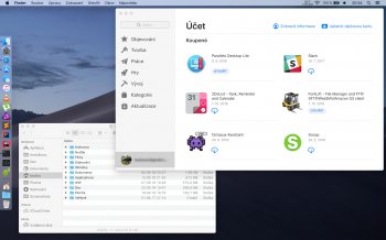
App Store absolutely huge
- Thread starter Toutou
- Start date
- Sort by reaction score
You are using an out of date browser. It may not display this or other websites correctly.
You should upgrade or use an alternative browser.
You should upgrade or use an alternative browser.
How was it messy before?I like that. It was so messy before.
I agree with OP and have already started a thread about it.
The font size is nasty large and needs to be adjustable. Likewise, with the sidebar.
Another thing I noticed was, if you click the menu bar items with a mouse it moves the app window. They allowed a clickable area to also move the window rather than opting to use the top of the sidebar or window itself, avoiding this scenario.
IMHO, it's bad! It disappoints me every time I use it. And if it is a clue as to how macOS is headed come the iOS app compatibility thing, I guess I'm out. Home, News, Stocks and Voice Memo's are equally as bad. iOS wrapped. And not wrapped well.
Register on MacRumors! This sidebar will go away, and you'll see fewer ads.


