Become a MacRumors Supporter for $50/year with no ads, ability to filter front page stories, and private forums.

Internet Enzyme

macrumors 6502a
Original poster
Feb 21, 2016
999
1,794
So in the Wallet app, one can view his or her monthly or weekly spending activity.

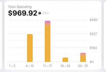
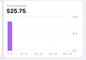
In the month view, there are pages that prominently display a bar chart of that month's total spending. The scale of the Y-Axis on these charts is variable, and automatically adjusts based on the maximum one spent in any given week throughout the month. This is very strange to me. It defeats the whole purpose of using bar charts for easy month-to-month visual comparison.

The charts are not lying, but if, in one month I spend $500, and then in the next spend $1500, the height of the highest bars in each separate month view will be the same. The surrounding weeks within each month view chart are still, of course, proportional to each other, but the overall height of each bar cannot be compared across months.

While the app is not lying to you, I feel that it is tricking your intuition. The numbers are all correct, it's just that the data visualization aspect is somewhat misleading and therefore inadequate. Certainly, these bar charts should all be scaled based on one's credit limit, right? Look at these attachments, and you'll understand the issue.
 

Attachments

  • IMG_414AE38676D0-1.jpeg
    IMG_414AE38676D0-1.jpeg
    126.8 KB · Views: 315
  • IMG_F0E384A7B141-1.jpeg
    IMG_F0E384A7B141-1.jpeg
    93.6 KB · Views: 166
  • Like
Reactions: konqerror

Erehy Dobon

Suspended
Feb 16, 2018
2,161
2,016
No service
What you propose is totally impractical for a plethora of reasons which I don't have the time to explain in detail one by one over such a trivial issue.

But just for amusement's sake, here's one simple failure of your proposed system.

Let's say the bars are based off the user's credit limit, say $10,000. In this example let's say one week that person spends $100: $30 on groceries, $20 on gas, $40 on clothing, and $10 on coffee. $100 dollars is 1% of the credit limit. So on a graph that might be 400 millimeters tall, the usage bar would be 4 millimeters. It would be difficult to see any breakdown or color gradient based on purchase categories.

It's easier to see spending relative to a specific time frame, in this case a calendar month which is also the billing cycle.

As far as I can tell in my spending history, each month is different. Some months I might have a major expenditure, like an airplane ticket or insurance premium. Other months the spending might be minimal.

I can easily think of another 15-20 reasons why your proposal is impractical but hey, there's a workaround: download the transactions yourself and load them into a spreadsheet. Do the same with all of your other credit card issuers, your brokerage, your bank(s), etc. and graph to your heart's desire for a holistic view of your spending.

Make sure you have a really big, retina monitor -- maybe several -- for your spreadsheet because you'll need it to see the $5 dry cleaning fee next to that month's property tax assessment payment.

Enjoy!

(I hereby bow out of further discussion on this topic.)
 
Last edited:
  • Angry
Reactions: konqerror

Internet Enzyme

macrumors 6502a
Original poster
Feb 21, 2016
999
1,794
What you propose is totally impractical for a plethora of reasons which I don't have the time to explain in detail one by one over such a trivial issue.

But just for amusement's sake, here's one simple failure of your proposed system.

Let's say the bars are based off the user's credit limit, say $10,000. In this example let's say one week that person spends $100: $30 on groceries, $20 on gas, $40 on clothing, and $10 on coffee. $100 dollars is 1% of the credit limit. So on a graph that might be 400 millimeters tall, the usage bar would be 4 millimeters. It would be difficult to see any breakdown or color gradient based on purchase categories.

It's easier to see spending relative to a specific time frame, in this case a calendar month which is also the billing cycle.

As far as I can tell in my spending history, each month is different. Some months I might have a major expenditure, like an airplane ticket or insurance premium. Other months the spending might be minimal.

I can easily think of another 15-20 reasons why your proposal is impractical but hey, there's a workaround: download the transactions yourself and load them into a spreadsheet. Do the same with all of your other credit card issuers, your brokerage, your bank(s), etc. and graph to your heart's desire for a holistic view of your spending.

Make sure you have a really big, retina monitor -- maybe several -- for your spreadsheet because you'll need it to see the $5 dry cleaning fee next to that month's property tax assessment payment.

Enjoy!

(I hereby bow out of further discussion on this topic.)

that is the logic behind why they have opted for this route, and it's an acceptable methodology, except for the fact that this system currently only works for comparing weeks within months, and not for comparing spending between months, which is the main issue that I have with this dynamic graphing system. Ideally, then, they should also implement a Year view in the app that has its own dynamic Y-axis scaled by each month's sum. This would perhaps be a better solution, but I still would enjoy a toggle that let the axis stay absolute, regardless of whether the cheaper weeks would be dwarfed in that view.
 
Last edited:

konqerror

macrumors 68020
Dec 31, 2013
2,298
3,701
Some presentations that might work: percent of credit limit on a log scale (watch people get totally confused). Or percent of last month's spending.
 
  • Like
Reactions: Internet Enzyme

Internet Enzyme

macrumors 6502a
Original poster
Feb 21, 2016
999
1,794
Some presentations that might work: percent of credit limit on a log scale (watch people get totally confused). Or percent of last month's spending.

Percent is interesting, but I think that the haters in our midst will say that you might as well just export the data into some real software, then. I personally believe that, since the data visualization aspect of the Apple Card was a key aspect of its marketing and that the only reason some of these oversights exist is because Apple Card was a rushed product, that it is in their interest to introduce some of these more niche features in iOS 14 and throughout the coming years—that is if Apple Card is successful enough and they don't neglect it like they have some of their other product lines.
 

Erehy Dobon

Suspended
Feb 16, 2018
2,161
2,016
No service
Okay, I'm back to comment, I couldn't resist.

The problem is that you can't see the forest for the trees.

The purchases graph of the Apple Card is cute but that's it. It doesn't provide a holistic view of a person's entire spending. Hell, Goldman Sachs won't issue cards on a joint account. You and your significant other have separate accounts.

The data visualization isn't accurate anyhow. There is no categorization of purchases from a given merchant.

If I fill up my car at a gas station, buy a bunch of junk food and pair of $5 sunglasses, Apple Card isn't going to split the categories. It'll just display it all as "Gas Station." About four times a year, I get a propane tank refill for my BBQ grill. If I do this at a gas station, it shows up as "Gas Station" although the correct category is Home Supplies.

Same thing if I go to the drugstore and buy multiple items: laundry detergent (Laundry? Home Supplies?), dishwashing detergent (Home Supplies), toothpaste (Personal Care), a bag of pretzels (Groceries), #10 envelopes (Office Supplies). The drugstore also has propane tank refills. I've used them once or twice before when my usual gas station was under renovation.

Again, there are probably hundreds of other examples why the Apple Card purchases graph is nearly worthless.

Even the "percentage of last month" is worthless. I pay my annual condo insurance premium in full in the spring, my annual auto insurance premium in full in the fall. I visit the dentist twice a year. I have a couple of quarterly subscriptions. I pay a tax preparation fee once a year. Two property tax assessments. Up to four estimated income tax payments to the IRS, three to my state.

But rather than bow out of this discussion, maybe I'll stick my head in here from time to time.
 
Last edited:

Internet Enzyme

macrumors 6502a
Original poster
Feb 21, 2016
999
1,794
Okay, I'm back to comment, I couldn't resist.

The problem is that you can't see the forest for the trees.

The purchases graph of the Apple Card is cute but that's it. It doesn't provide a holistic view of a person's entire spending. Hell, Goldman Sachs won't issue cards on a joint account. You and your significant other have separate accounts.

The data visualization isn't accurate anyhow. There is no categorization of purchases from a given merchant.

If I fill up my car at a gas station, buy a bunch of junk food and pair of $5 sunglasses, Apple Card isn't going to split the categories. It'll just display it all as "Gas Station." About four times a year, I get a propane tank refill for my BBQ grill. If I do this at a gas station, it shows up as "Gas Station" although the correct category is Home Supplies.

Same thing if I go to the drugstore and buy multiple items: laundry detergent (Laundry? Home Supplies?), dishwashing detergent (Home Supplies), toothpaste (Personal Care), a bag of pretzels (Groceries), #10 envelopes (Office Supplies). The drugstore also has propane tank refills. I've used them once or twice before when my usual gas station was under renovation.

Again, there are probably hundreds of other examples why the Apple Card purchases graph is nearly worthless.

Even the "percentage of last month" is worthless. I pay my annual condo insurance premium in full in the spring, my annual auto insurance premium in full in the fall. I visit the dentist twice a year. I have a couple of quarterly subscriptions. I pay a tax preparation fee once a year. Two property tax assessments. Up to four estimated income tax payments to the IRS, three to my state.

But rather than bow out of this discussion, maybe I'll stick my head in here from time to time.

Is there any other mass-market credit card or service that does any of that incredibly granular categorization, as both a part of its initial offering and automatically? Talk about seeing the "forest for the trees," what you're describing is a helluva lot more complex and involved than simply representing month-to-month expenditures on the same y-axis scale. And even if the data visualization isn't accurate, I don't really buy into the premise that its a waste of time for them to make it more accurate.
 

Erehy Dobon

Suspended
Feb 16, 2018
2,161
2,016
No service
One can split transactions into multiple categories with desktop versions of Quicken. This capability has been around for 20+ years.

Also, free online personal finance service Mint.com allows transactions to be split into multiple categories. I started using Mint.com before it was acquired by Intuit.

You still have to do this manually.

I've had credit card accounts since the Nineties and to my knowledge, no major issuer has offered the ability to recategorize/split transactions on their native environment (website, app, etc.) and I've had cards from most of the big ones: BofA, Chase, AMEX, CapitalOne.

Since you still can't see the forest for the trees, think of a typical restaurant transaction.

One table is a family of four, their bill comes up to $100. The next table is two women -- longtime friends -- and they consume $80 of booze and $20 of appetizers. How much granularity should there be? Let's say I go the same restaurant and sit at the bar by myself, have a dinner, two drinks and buy a $50 gift certificate. Again, $100 to the credit card processor.

Hell, I can't tell from my credit card statement how much I spent on booze and how much I spent on gift cards from one grocery store transaction. The grocery store isn't transmitting the entire invoice to the credit card processor. They just want approval for the entire transaction.

If I buy an iTunes Gift Card at a grocery store, there's no way for the credit card company to know if I bought it for myself (Entertainment) or as a present (Gift).

Let's say you're not naïve and you figure out that it's better to buy $100 iTunes Gift Cards on eBay when they go on sale for $85. You use a credit card that give 2% cash back rewards so you're out of pocket expense is $83.30. iTunes doesn't know exactly what your out-of-pocket was when you redeem the code. Apple just cares that it's valid and adds $100 of iTunes Store credit to your account. I've been doing this for about 10 years (I miss the early iTunes Store era when 30% discounts could be found).

Then you buy the latest Taylor Swift album: you love her. It's $9.95 list price but out of pocket this translates to $8.32. You then buy a $4.99 productivity app with a recurring $1.99 monthly subscription. Are you going to do all the math to figure out your out-of-pocket?

The Apple Card spending graphs are asinine. They make naïve people think they have a grasp on their finances.
 
Last edited:
Register on MacRumors! This sidebar will go away, and you'll see fewer ads.