Become a MacRumors Supporter for $50/year with no ads, ability to filter front page stories, and private forums.

theheadguy

macrumors 65816
Original poster
Apr 26, 2005
1,157
1,390
california
Former Palm CEO to Apple on iOS 7: Cupertino, you started your photocopiers

redmond-start-your-photocopiers.jpg


Steve Jobs was very upfront about the fact that good artists copy, and great artists steal. According to former Palm CEO — and former Apple SVP — Jon Rubinstein, the company Steve started is still a great artist.

As is Google, and as is Microsoft.

Speaking to Fierce Wireless about HP’s long-ago purchase of Palm, Rubinstein was asked about similarities between iOS 7 and Palm’s innovative-but-doomed WebOS:
It’s not just mobile platforms. If you look at the notifications on Mac OS X, it looks just like webOS, too. We did a lot of things that were very, very innovative. Obviously, multitasking, notifications, Synergy, how we handled the multiple cards. There’s a long list of stuff we did that has been adopted by Microsoft, Apple and Android.
Multitasking on iOS 7 is a massive update from iOS 6. Instead of simply seeing the icons of apps that are currently running, iOS7 shows users a screenshot of each running apps in a horizontally scrolling interface. That’s very reminiscent of Palm’s WebOS, which also had a horizontal scrolling view of open applications:

palm-web-os-multitasking-versus-ios-7.jpg


Synergy was Palm’s innovative way of merging contacts from multiple contexts: Facebook, Google, LinkedIn, your personal digital rolodex, and more. Apple has been doing that for some time with Facebook contacts, of course. In addition, Palm pioneered over-the-air operating system updates, which most of the major smartphone platforms have now adopted.

Rubinstein clearly indicates that Google’s Android and Microsoft’s Windows Phone have both benefited from WebOS as well. I wonder if the important point here is how much the entire mobile industry owes to Palm, WebOS in specific, and the entire lineage of Palm products since the original Palm Pilot in general.

The reality is, we probably don’t pay as much homage to the predecessors of our amazing modern smartphones as we should. And, that WebOS’s ignominious end as a forgotten and neglected red-headed step-child in the melting-down HP family home was a tragic, crying shame.

http://venturebeat.com/2013/06/12/f...os-7-cupertino-you-started-your-photocopiers/
 

Batman89

macrumors 6502
Jul 7, 2010
382
302
That awkward moment when Apple takes what others have done, and perfects it.

Not the first time it's happened in their history.
 

Night Spring

macrumors G5
Jul 17, 2008
14,623
7,798
That awkward moment when Apple takes what others have done, and perfects it.

Not the first time it's happened in their history.

At the moment, it's not quite perfect. I find that the app icons and the app windows don't quite slide in sync.
 

virginblue4

macrumors 68020
Apr 15, 2012
2,017
682
United Kingdom
Former Palm CEO to Apple on iOS 7: Cupertino, you started your photocopiers

Image


http://venturebeat.com/2013/06/12/f...os-7-cupertino-you-started-your-photocopiers/

That awkward moment when you realise the ONLY thing similar in that photo is the 'rectangles' in the middle of the screen that you can slide between.

That awkward moment when Apple takes what others have done, and perfects it.

So true!

At the moment, it's not quite perfect. I find that the app icons and the app windows don't quite slide in sync.

I don't think they are meant to. Same as the Yahoo Weather app, different parts slide at different speeds.
 

sdilley14

macrumors 65816
Feb 8, 2007
1,242
201
Mesa, AZ
So, Apple took the "sliding rectangle multi-tasking" thing and made it better, and Palm took basically the entire UI design of iOS and added a handful of different features (unless there was a Palm UI that looked like iOS prior to iOS that I don't know about). Seems like a fair trade.
 

virginblue4

macrumors 68020
Apr 15, 2012
2,017
682
United Kingdom
What benefit do we get from the elements sliding at different speeds? :confused:

I'm not really sure, I think it looks quite cool personally. I really love it when i first saw it in the Yahoo app.

It's quite clever, they slide at different speeds but they the icon lines up with the corresponding app when it is in the middle of the screen.
 

Night Spring

macrumors G5
Jul 17, 2008
14,623
7,798
I'm not really sure, I think it looks quite cool personally. I really love it when i first saw it in the Yahoo app.

It's quite clever, they slide at different speeds but they the icon lines up with the corresponding app when it is in the middle of the screen.

I didn't think it was cool at all, just got confused which icon belonged with which app. :(
 

Patriot24

macrumors 68030
Dec 29, 2010
2,813
805
California
You'll notice that Rubinstein isn't really complaining, rather pointing out the good work that he's done over the years that has been adapted into current platforms. He isn't suing anyone either, which tells you a lot about him as an innovator this day in age.

Bottom line, he is a class guy. I hope that he's able to resurface somewhere again.
 

jutte64

macrumors 6502
Apr 28, 2009
282
150
Fort Recovery , OH
At the moment, it's not quite perfect. I find that the app icons and the app windows don't quite slide in sync.

The thing I found with the multitask feature, and I kinda like it. If you slide with the screenshots it is fairly slow, but if you slid with the icons it slide much faster. That has come in handy when I have several things open and I know what I want to go to is towards the end of the list. Sliding with the icons gets me there quicker. Also the way the icons seem to trail or drag a little behind when you are sliding with the screenshots, look at the messaging app. Its consistent with that the way the bubbles spread out and get closer as you slide up and down on the chat window.
 

virginblue4

macrumors 68020
Apr 15, 2012
2,017
682
United Kingdom
I didn't think it was cool at all, just got confused which icon belonged with which app. :(

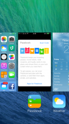
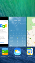
Look at the attached screenshots. In the first screenshot, you can see that the Passbook icon is lined up with the Passbook app but the Weather icon is not lined up perfectly with the Weather app. As I scroll, the Weather icon is now lined up with the Weather app.

It's a very nice feature in my opinion. It also means the two app icons either side of the one in the centre don't have their icons cut in half.
 

Attachments

  • IMG_3215.PNG
    IMG_3215.PNG
    1 MB · Views: 135
  • IMG_3216.PNG
    IMG_3216.PNG
    1.1 MB · Views: 123

darngooddesign

macrumors P6
Jul 4, 2007
18,112
9,765
Atlanta, GA
...It's a very nice feature in my opinion. It also means the two app icons either side of the one in the centre don't have their icons cut in half.

I'm assuming you can get to the side apps by pressing on their icons. If so its a shorter reach with a larger target than if half the icon were missing.
 

C DM

macrumors Sandy Bridge
Oct 17, 2011
51,392
19,459
Look at the attached screenshots. In the first screenshot, you can see that the Passbook icon is lined up with the Passbook app but the Weather icon is not lined up perfectly with the Weather app. As I scroll, the Weather icon is now lined up with the Weather app.

It's a very nice feature in my opinion. It also means the two app icons either side of the one in the centre don't have their icons cut in half.
The only thing is that icons, at least in part, go beyond the edges of their corresponding app cards right now, so sometimes an icon from a card on the left will almost be under the center card as well, making it at least somewhat misaligned and at least a bit confusing. There's hopefully some more work that will be done there to make the alignment logic better in future betas (and final release).
 

Night Spring

macrumors G5
Jul 17, 2008
14,623
7,798
Look at the attached screenshots. In the first screenshot, you can see that the Passbook icon is lined up with the Passbook app but the Weather icon is not lined up perfectly with the Weather app. As I scroll, the Weather icon is now lined up with the Weather app.

It's a very nice feature in my opinion. It also means the two app icons either side of the one in the centre don't have their icons cut in half.

Well, I guess they have it optimized a lot better for the iPhone 5. Attached is a picture showing how it looks on my iPhone 4S. In addition to the three icons showing in full, there are edges of two more icons showing, and the Dropbox icon and the phone icon are hanging halfway under the iBooks window.
 

Attachments

  • IMG_0112.PNG
    IMG_0112.PNG
    852.3 KB · Views: 102

virginblue4

macrumors 68020
Apr 15, 2012
2,017
682
United Kingdom
Well, I guess they have it optimized a lot better for the iPhone 5. Attached is a picture showing how it looks on my iPhone 4S. In addition to the three icons showing in full, there are edges of two more icons showing, and the Dropbox icon and the phone icon are hanging halfway under the iBooks window.

Fair enough, I just confirmed this on my girlfriends iPhone 4S. I was basing it on my experience on the iPhone 5.

I understand how it can get a little confusing, however, it looks great on the iPhone 5, so hopefully they fix it on the iPhone 4/4S.
 
Register on MacRumors! This sidebar will go away, and you'll see fewer ads.