Well... there you have it.
A friend of mine bought today a top of the range MacBook Air...
After years of windows he thought this would be the next 'big thing'
Absolutely hated the UI.. "looks like some kid with crayons"!
Taking it back to the store without ever having a go at the Mac thing we all love.. (and hate?).
What the hell is going on?
This from Apple's Human Interface Design..
Make a great first impression with a beautiful app icon. Your app icon is the first experience users have with your app, and it can have a marked effect on their expectations. Think of your app icon as your calling card, and spend the resources necessary to ensure that it makes the right impression on users. Decide whether your app is best represented by a realistic or graphic style icon. For example, the Garage Band app icon is a beautiful rendering of a guitar.
![garage_band_icon_2x.png]()
Aim for realism if you create the appearance of real-world materials. In some cases, real-world textures, such as wood, leather, metal, or paper, can enhance the experience of an app and convey meaning to users. If this makes sense in your app, make sure that the texture you create:
Loved Aqua...
I don't mind a flat UI on my phone... not on my desktop though.
I'm afraid I'm finding the flat UI depressing and a real turn off from using my Mac...
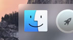
Compare the GarageBand icon with this abomination..
A friend of mine bought today a top of the range MacBook Air...
After years of windows he thought this would be the next 'big thing'
Absolutely hated the UI.. "looks like some kid with crayons"!
Taking it back to the store without ever having a go at the Mac thing we all love.. (and hate?).
What the hell is going on?
This from Apple's Human Interface Design..
Make a great first impression with a beautiful app icon. Your app icon is the first experience users have with your app, and it can have a marked effect on their expectations. Think of your app icon as your calling card, and spend the resources necessary to ensure that it makes the right impression on users. Decide whether your app is best represented by a realistic or graphic style icon. For example, the Garage Band app icon is a beautiful rendering of a guitar.
Aim for realism if you create the appearance of real-world materials. In some cases, real-world textures, such as wood, leather, metal, or paper, can enhance the experience of an app and convey meaning to users. If this makes sense in your app, make sure that the texture you create:
- Is authentic and expressive, and looks great at all resolutions
- Coordinates with the overall appearance of your app and does not look like it was added as an afterthought
- Enhances the user’s experience and understanding
Loved Aqua...
I don't mind a flat UI on my phone... not on my desktop though.
I'm afraid I'm finding the flat UI depressing and a real turn off from using my Mac...
Compare the GarageBand icon with this abomination..
Attachments
Last edited:
