Become a MacRumors Supporter for $50/year with no ads, ability to filter front page stories, and private forums.

thedeejay

macrumors 65816
Original poster
Aug 16, 2012
1,338
51
Toronto, Canada.
I don't know but it certainly feels like the "mechanics" that determine how this translucency works is different. I use an app called wallax to blur certain images and it let's you "preview" how the wall will look. When I did preview for a certain wall (with white background) the text was black. Worked when I did it prior to 7.1. Now it's white again and looks weird. Almost like it blends in. Have they changed it or a bug?

EDIT: I'm talking about how it recognizes the text selection for wallpapers. It seems to be a little off from pre-iOS 7.1 version that my iPad 2 is running. Weird..
 
Last edited:

Vanilla35

macrumors 68040
Apr 11, 2013
3,344
1,453
Washington D.C.
I don't know but it certainly feels like the "mechanics" that determine how this translucency works is different. I use an app called wallax to blur certain images and it let's you "preview" how the wall will look. When I did preview for a certain wall (with white background) the text was black. Worked when I did it prior to 7.1. Now it's white again and looks weird. Almost like it blends in. Have they changed it or a bug?

I have no idea how that app works, but I would assume it's very possible they tweaked contrast in 7.1. They made various appearance changes including making the greens of the Facetime, Phone, and Messaging app darker, included more options in "Increase Contrast" section of settings, etc.

It could very well be that the app you use needs to be optimized for 7.1, since something Apple did makes it broken.

As far as I can tell the transparency (of control center, and notification shade) looks about the same, or (very) slightly more transparent. But that alone wouldn't have a dramatic impact on the app you're using.
 

thedeejay

macrumors 65816
Original poster
Aug 16, 2012
1,338
51
Toronto, Canada.
I have no idea how that app works, but I would assume it's very possible they tweaked contrast in 7.1. They made various appearance changes including making the greens of the Facetime, Phone, and Messaging app darker, included more options in "Increase Contrast" section of settings, etc.

It could very well be that the app you use needs to be optimized for 7.1, since something Apple did makes it broken.

As far as I can tell the transparency (of control center, and notification shade) looks about the same, or (very) slightly more transparent. But that alone wouldn't have a dramatic impact on the app you're using.

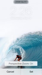
Didn't want to start a new thread but this is what I meant. Look at this. So terrible. It has changed the way it recognizes text for Wallpapers. It's white on white and you can't see ****. So bad.
 

Attachments

  • image.jpg
    image.jpg
    128.7 KB · Views: 120

BergerFan

macrumors 68020
Mar 6, 2008
2,170
63
Mos Eisley
I hate the way iOS 7 does this.
There should be a subtle drop-shadow hugging the bottom of each text character, and the text should stay white. One aspect of iOS 6 I do prefer.
 

thedeejay

macrumors 65816
Original poster
Aug 16, 2012
1,338
51
Toronto, Canada.
I hate the way iOS 7 does this.
There should be a subtle drop-shadow hugging the bottom of each text character, and the text should stay white. One aspect of iOS 6 I do prefer.

Exactly. I don't know what it is but certain wallpapers just don't look good anymore where before it was fine to use. I think the lock clock should be changed a bit.
 
Register on MacRumors! This sidebar will go away, and you'll see fewer ads.