Become a MacRumors Supporter for $50/year with no ads, ability to filter front page stories, and private forums.
Logo?
- Thread starter theimacguy
- Start date
- Sort by reaction score
You are using an out of date browser. It may not display this or other websites correctly.
You should upgrade or use an alternative browser.
You should upgrade or use an alternative browser.

If you're going for a minimalist sort of thing than I say it's great. 
- reaper
Edit: Just then the graphic appeared... and all was okay. Yeah, I think it's alright, you may want to crispen up the image though as it looks somewhat pixelated (at least on my computer).
- reaper
Edit: Just then the graphic appeared... and all was okay. Yeah, I think it's alright, you may want to crispen up the image though as it looks somewhat pixelated (at least on my computer).
When making logos for the web, save as GIF or, even better, PNG, those formats are MUCH better for graphics...
I can't 'see' the connection that the tagline promises. Perhaps:
a) Conjoin the W on top of the first M shoulder and write the 'in' above the 'ac'
b) turn the 'ac' upside down and place before the W
Just suggestions to tie-in the tagline. But if you are shooting for a Bold Hit Impact then it works perfectly.
a) Conjoin the W on top of the first M shoulder and write the 'in' above the 'ac'
b) turn the 'ac' upside down and place before the W
Just suggestions to tie-in the tagline. But if you are shooting for a Bold Hit Impact then it works perfectly.
Savage Henry said:I can't 'see' the connection that the tagline promises. Perhaps:
a) Conjoin the W on top of the first M shoulder and write the 'in' above the 'ac'
b) turn the 'ac' upside down and place before the W
Just suggestions to tie-in the tagline. But if you are shooting for a Bold Hit Impact then it works perfectly.
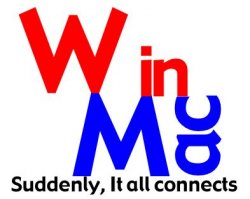
I took your advice. How does this look?
Attachments
Royal Pineapple
macrumors 65816


oh dear... *please* stick with your first design
what is this for again? is it just for fun or is it for something in particular?
what is this for again? is it just for fun or is it for something in particular?
Mitthrawnuruodo said:When making logos for the web, save as GIF or, even better, PNG, those formats are MUCH better for graphics...
how do you mean "better for graphics"?
it's all in the compression, baby.
.gif images compress the most (max 256 colors) but also create the smallest filesizes
.jpg and .png are different altogether
the pixelation on this image comes from a low-quality jpeg compression. i would have suggested a higher quality jpeg image (i know you did it because of the MR file upload thing).
none of them are "better for graphics"... they're all graphics file formats!
theimacguy said:I took your advice. How does this look?
I sorta meant a choice of these two .. but please accept my apology for the poor quality, I was in Powerpoint
a)
or b)
That kinda thing.
Attachments


Everybody's a critic ... even me.
Actually, I liked your initial design. It's simple, elegant, not gimmicky. However, it needs some polish. Here are my suggestions: (Sorry, I don't have Gadget, so I put mine in Century Gothic bold.)
1. Fix the kerning. See how the spacing between the letters is adjusted in my example? And don't just tighten the tracking on the entire name. Do each letter individually based on it's individual shape. For more information, Google "optical kerning."
2. Make the colors more Win and Mac like. The red and blue you picked are reminiscent of the platforms color pallet from five years ago. I updated with a more Mac-like blue and a red that evokes the "X" close box from XP. 'Course I had to adjust both color so they didn't clash. Doing this makes the logo seem more current -- which is essential for a tech company.
3. Savage Henry makes a fine suggestion about the interactivity between the Mac and Win elements. However, the drastic comps that followed, frankly, scared me. I propose a much more subtle interaction, but interaction none the less.
4. I think the tag line "Suddenly it all connects" needs to be anchored to left. Because of the backslash-like slant of the first descender in the "W," the centered construction looks off balance. The same "W" problem makes left alignment a no-go. However, the right alignment gives it an anchor, so it looks solid. Do note, however, that I let the period float past the right alignment. This is "visual aligning" and is similar in concept to optical kerning.
Anyway, you original logo was, IMHO, far superior to any other options above on this page.
Sorry to sound so preachy. :steps down from high horse:
Actually, I liked your initial design. It's simple, elegant, not gimmicky. However, it needs some polish. Here are my suggestions: (Sorry, I don't have Gadget, so I put mine in Century Gothic bold.)
1. Fix the kerning. See how the spacing between the letters is adjusted in my example? And don't just tighten the tracking on the entire name. Do each letter individually based on it's individual shape. For more information, Google "optical kerning."
2. Make the colors more Win and Mac like. The red and blue you picked are reminiscent of the platforms color pallet from five years ago. I updated with a more Mac-like blue and a red that evokes the "X" close box from XP. 'Course I had to adjust both color so they didn't clash. Doing this makes the logo seem more current -- which is essential for a tech company.
3. Savage Henry makes a fine suggestion about the interactivity between the Mac and Win elements. However, the drastic comps that followed, frankly, scared me.
I propose a much more subtle interaction, but interaction none the less.4. I think the tag line "Suddenly it all connects" needs to be anchored to left. Because of the backslash-like slant of the first descender in the "W," the centered construction looks off balance. The same "W" problem makes left alignment a no-go. However, the right alignment gives it an anchor, so it looks solid. Do note, however, that I let the period float past the right alignment. This is "visual aligning" and is similar in concept to optical kerning.
Anyway, you original logo was, IMHO, far superior to any other options above on this page.
Sorry to sound so preachy. :steps down from high horse:
Attachments

I like the first one best, actually. The upside-down bits are awkward and contrived-looking, and while not terribly difficult to read, require a level of conscious involvement that will not give the logo that instant and subconscious assimilation/understanding that results in good brand recognition.
The only other one that might work is Savage Henry's first PowerPoint effort, though I'd connect each of the two points of the W and M. Also, the "it" in "it all connects" should not be capitalized.
Here's my crappy MS Paint attempt to show what I mean:
(edit: superninjagoat's efforts blow my feeble try all to hell. The colors in particular are much, much better.)
Attachments
superninjagoat said:Actually, I liked your initial design.
...
Sorry to sound so preachy. :steps down from high horse:
{clap} {clap} {clap} {clap} {clap}
Exactly. You were able to put into words what I was thinking, but couldn't type out (I had an experiment running
). And you used the right terminology, too... Your post almost brought me to tears... such eloquence in your application of strict design principles. I like a combination between the original one, and superninjagoat's mod (it needs a smidge of refinement, i think the colors are a bit off, but better).
michaelrjohnson said:how do you mean "better for graphics"?
it's all in the compression, baby.
.gif images compress the most (max 256 colors) but also create the smallest filesizes
.jpg and .png are different altogether
the pixelation on this image comes from a low-quality jpeg compression. i would have suggested a higher quality jpeg image (i know you did it because of the MR file upload thing).
none of them are "better for graphics"... they're all graphics file formats!
For any graphics with few, uniform colours (or many colours but without graidiants or semi transparent shadows or similar) the compression done by the gif or png engine is much better tha the jpeg engine.
True, you can use the best quality jpeg's but the file size will be much bigger than both png's and gif's.
Now if you have something like a photography its a whole different ballgame...
I'll try to give an example using first an image with graidenting colour, and then a very flat image with just a couple of colours. Note the difference in quality on the first and file sizes on the second:
michaelrjohnson said:{clap} {clap} {clap} {clap} {clap}
Exactly. You were able to put into words what I was thinking, but couldn't type out (I had an experiment running
:blushes:
I like a combination between the original one, and superninjagoat's mod (it needs a smidge of refinement, i think the colors are a bit off, but better).
I agree with you on this. The blue needs more saturation, and the red more chroma. Just didn't take the time ...
btw theimacguy, I'm not sure I made myself clear in my first post, I like your choice of Gadget, and I'd keep it as the logo font if I were you.
Mitthrawnuruodo said:For any graphics with few...
yes, i guess interpreted the original mention of "graphics" as any image. so, yes, you are right (i was aware of that, though).
Amani said:IMHO, entry #14 has the best revision. Very clean and appealing.
Ditto, for the reasons superninjagoat stated.
Squire
Register on MacRumors! This sidebar will go away, and you'll see fewer ads.