Become a MacRumors Supporter for $50/year with no ads, ability to filter front page stories, and private forums.

sunking101

macrumors 604
Sep 19, 2013
7,416
2,657
Yes, I'm with OP, and I know what he is talking about, and for me it's just a way of Google saying, "I'm not going to follow your new design, so I'll just put a little edge on the bottom making it look like 3D" in other words ******* your new flat design Apple.

You'd think that Apple would redesign any app icons to fit their own design ethics. It wouldn't be hard to make a Google icon and I'm sure Google want their apps on the millions of Apple products out there, so why don't Apple refuse Google's apps until they conform? Don't get me wrong, this is no great issue for me but it does seem strange. There are one or two other icons which don't fit the Apple iOS7 design ethic, the Instagram and PhotoFusion ones for starters.
 

C DM

macrumors Sandy Bridge
Oct 17, 2011
51,392
19,459
Yes, I'm with OP, and I know what he is talking about, and for me it's just a way of Google saying, "I'm not going to follow your new design, so I'll just put a little edge on the bottom making it look like 3D" in other words ******* your new flat design Apple.
Or just Goole not even caring or paying attention to that and doing things they way they want to do them for whatever reason.
 

myrtlebee

macrumors 68030
Jul 9, 2011
2,677
2,242
Maryland
Messages goes from a yellowy-green to a richer green (in the 7.1 beta they did darken the colours a little), same with numbers, keynote is still cyan to blue, it's just got a much less dramatic gradient, and Pages is yellow to orange, but also a much less dramatic gradient. Look at GarageBand for comparison.

Photo booth is one icon that does sort of have a shaded appearance.

I'm also not claiming Apple's colour gradients never look like shading (App Store comes to mind) but this seems to be the logic behind them.

I have a degree in Art & Design. I know what I'm talking about and I stand by my comment. I just don't see what you are saying.
 

Seandroid

macrumors regular
Mar 21, 2012
157
90
Canada
I have a degree in Art & Design. I know what I'm talking about and I stand by my comment. I just don't see what you are saying.

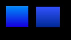
Excuse my Photoshop mobile job, but the square on the left has a cyan to blue colour gradient. The square on the right has a light source. It's got white added to the colour at the top and black added at the bottom. It's shaded. It has light and shadow.

The Apple gradients in the majority of the examples are gradients between colours, not shades, hence they are flat as flat can be and not supposed to represent shading.
 

Attachments

  • image.jpg
    image.jpg
    31.6 KB · Views: 191

myrtlebee

macrumors 68030
Jul 9, 2011
2,677
2,242
Maryland
Excuse my Photoshop mobile job, but the square on the left has a cyan to blue colour gradient. The square on the right has a light source. It's got white added to the colour at the top and black added at the bottom. It's shaded. It has light and shadow.

The Apple gradients in the majority of the examples are gradients between colours, not shades, hence they are flat as flat can be and not supposed to represent shading.

I still see shadowing and highlighting of one color, not a gradient of two or more colors, for the apps that I mentioned - just more pronounced than in your example on the right. Mail, Music, Videos, iPhoto, GarageBand, iTunes Store- those are all color gradients between two or more colors. (Add Camera and Settings to the shaded and highlighted, not gradient, list)
 

Seandroid

macrumors regular
Mar 21, 2012
157
90
Canada
I still see shadowing and highlighting of one color, not a gradient of two or more colors, for the apps that I mentioned - just more pronounced than in your example on the right. Mail, Music, Videos, iPhoto, GarageBand, iTunes Store- those are all color gradients between two or more colors. (Add Camera and Settings to the shaded and highlighted, not gradient, list)

Open them in Photoshop and use the eye dropper. They're colour gradients, they're just so subtle they do have a tendency to look like shading. Photobooth is an exception, and Settings/Camera are using greyscale the way the rest of the icons use colour.

Again, I'm not saying they don't /look/ shaded, some do, especially the icons that go yellow-> orange and cyan -> blue. (They're opposites and both yellow and cyan seem much lighter). Just that they aren't shaded. With the Messages, FaceTime and Phone icons, they used to be a subtle gradient from the yellower side of green to pure green, but it was less dramatic than the rest of them because it would have looked putrid going from yellow to green. This is why in 7.1 they compensated with shading.
 

Altis

macrumors 68040
Sep 10, 2013
3,166
4,897
Open them in Photoshop and use the eye dropper. They're colour gradients, they're just so subtle they do have a tendency to look like shading. Photobooth is an exception, and Settings/Camera are using greyscale the way the rest of the icons use colour.

Again, I'm not saying they don't /look/ shaded, some do, especially the icons that go yellow-> orange and cyan -> blue. (They're opposites and both yellow and cyan seem much lighter). Just that they aren't shaded. With the Messages, FaceTime and Phone icons, they used to be a subtle gradient from the yellower side of green to pure green, but it was less dramatic than the rest of them because it would have looked putrid going from yellow to green. This is why in 7.1 they compensated with shading.

I agree with what you're saying; it is absolutely true that they are color gradients. However, they also tend to increase in brightness (which you can also see in PS with the dropper tool). In addition, they tend to blend with a more yellow variant of the same color. This makes them appear brighter and warmer on one end than the other.

In effect, it is like having a very warm light source. The hue and brightness do change as a result, and most tend towards the same idea of going from the icon's color to a more bright and yellow color.

The thing is, some icons have this effect going one way, some going the other, and some not at all. Even using the same color; for example, put App Store and Mail next to each other - they have the same gradient but in opposite direction.

Not a huge deal, but it isn't too natural looking. This only really came up because people were acting like Apple is always consistent with their designs.
 

Seandroid

macrumors regular
Mar 21, 2012
157
90
Canada
I agree with what you're saying; it is absolutely true that they are color gradients. However, they also tend to increase in brightness (which you can also see in PS with the dropper tool). In addition, they tend to blend with a more yellow variant of the same color. This makes them appear brighter and warmer on one end than the other.

In effect, it is like having a very warm light source. The hue and brightness do change as a result, and most tend towards the same idea of going from the icon's color to a more bright and yellow color.

The thing is, some icons have this effect going one way, some going the other, and some not at all. Even using the same color; for example, put App Store and Mail next to each other - they have the same gradient but in opposite direction.

Not a huge deal, but it isn't too natural looking. This only really came up because people were acting like Apple is always consistent with their designs.

But that's a bit of a stretch, no? The whole statement I'm making is about how Apple's intention wasn't to create shading or a 3 dimensional effect. Personally, I still think a lot of the icons do kind of look like they have 3 dimensional shading but I think this is just kind of a result from being taught that gradients that look similar are supposed to symbolize dimensionality by things in the past. My opinion of pretty much all the icons changed when I started looking at iOS 7 thinking about how the colour changes aren't necessarily supposed to "mean" something as much as they make the icons extremely recognizable and individual. It makes it easy to use the phone. I can imagine every single icon in my head in no time.

That said, if we want to talk light source, the gloss and shine that were on the iOS 6 and before icons makes absolutely no sense. There's a light source and object creating a reflection on the icons, but somehow they all have drop shadows directly underneath them, and also somehow manage to reflect on the dock.

And iOS 6 had like a weird felt looking music icon, a lot of the phone functions had diagonal stripes, but a few of them didn't, the weather icon with the inexplicable decision to have text on it that doesn't live update when the rest of the icons with text do, yadda yadda yadda. I could go on!
 

Altis

macrumors 68040
Sep 10, 2013
3,166
4,897
But that's a bit of a stretch, no? The whole statement I'm making is about how Apple's intention wasn't to create shading or a 3 dimensional effect. Personally, I still think a lot of the icons do kind of look like they have 3 dimensional shading but I think this is just kind of a result from being taught that gradients that look similar are supposed to symbolize dimensionality by things in the past. My opinion of pretty much all the icons changed when I started looking at iOS 7 thinking about how the colour changes aren't necessarily supposed to "mean" something as much as they make the icons extremely recognizable and individual. It makes it easy to use the phone. I can imagine every single icon in my head in no time.

Can I ask how we know that it was not Apple's intention to create shading, or lighting? Using color gradients to effectively create a warm (yellow) light source is what they appear to have done. Using the photoshopped squares you produced above, imagine the square on the right being lit by a pure white light (which you are using as exclusive reference for lighting), while imagining the square on the left being lit by a yellow light. Light sources can change the color, as they often do. Hence, beautiful sunsets ;)

That said, if we want to talk light source, the gloss and shine that were on the iOS 6 and before icons makes absolutely no sense. There's a light source and object creating a reflection on the icons, but somehow they all have drop shadows directly underneath them, and also somehow manage to reflect on the dock.

In iOS 6 (and prior to), the icons were meant to be like glossy dome buttons. That's why many had the upper light semi-circle, and a shadow below: the protrusion of the button cast the shadow. It made plenty sense, although it wasn't used on all icons, so in that sense it wasn't entirely consistent. However, none of them went the opposite way to another. The dock was meant to be located and angled in such a way that it reflected... not really a physical issue here either.

And iOS 6 had like a weird felt looking music icon, a lot of the phone functions had diagonal stripes, but a few of them didn't, the weather icon with the inexplicable decision to have text on it that doesn't live update when the rest of the icons with text do, yadda yadda yadda. I could go on!

iOS 6 (and those prior to it) weren't perfect, for sure, but you'd think by now Apple would have refined their looks. It no longer matters how it looked the past 6 years, for they should have learned from all that and not make so many of the silly design choices they make today. People complain of skeumorphism in iOS 6, yet 7 has a papery texture in notes, turns off with a zap like an old CRT monitor, etc...

What matters is the design choices they are making currently, and where they are heading in the future.
 

haydn!

macrumors 65816
Nov 10, 2008
1,272
1,844
UK
To be fair, the iOS stock app icons aren't 100% 'flat'. Depth is shown in a number of different ways, subtle gradients on icons for phone, messages, camera etc, semi transparency on the weather and game centre app showing 'layers', drop shadows on the contacts and settings app...

I think iOS is more of a simpler design, with unnecessary detail stripped out. Google's design language is just the same.
 

sunking101

macrumors 604
Sep 19, 2013
7,416
2,657
To be fair, the iOS stock app icons aren't 100% 'flat'. Depth is shown in a number of different ways, subtle gradients on icons for phone, messages, camera etc, semi transparency on the weather and game centre app showing 'layers', drop shadows on the contacts and settings app...

I think iOS is more of a simpler design, with unnecessary detail stripped out. Google's design language is just the same.

This doesn't explain the bevel on the app border at the bottom, it is totally 3D - as are a few other app icons.
 

C DM

macrumors Sandy Bridge
Oct 17, 2011
51,392
19,459
Gmail updated to version 3.0....retains same 3D icon. Disappointed.
Go figure, Hangouts gets a major update and the icon changes, and days later Gmail gets a major version update and the icon remains the same (although in some parts of the App Store the icon has changed a few updates ago actually).
 

WJKramer

macrumors 6502
Jun 8, 2008
422
39
Go figure, Hangouts gets a major update and the icon changes, and days later Gmail gets a major version update and the icon remains the same (although in some parts of the App Store the icon has changed a few updates ago actually).


I have actually noticed this with several google app icons since iOS 7 debuted. The 3D bar comes and goes. Must be some internal struggle at google.
 

deuxani

macrumors 6502a
Sep 2, 2010
697
717
To be fair, the iOS stock app icons aren't 100% 'flat'. Depth is shown in a number of different ways, subtle gradients on icons for phone, messages, camera etc, semi transparency on the weather and game centre app showing 'layers', drop shadows on the contacts and settings app...


I think iOS is more of a simpler design, with unnecessary detail stripped out. Google's design language is just the same.


Yeah, in the Updates tab in the App Store the Gmail icon doesn't have the shade/bevel on the bottom. They are not very consistent, are they :)

Frankly I only care about the Google Maps icon. It's so ugly that I don't want it on my homescreen, even though I almost use it dailly.
 

haydn!

macrumors 65816
Nov 10, 2008
1,272
1,844
UK
This doesn't explain the bevel on the app border at the bottom, it is totally 3D - as are a few other app icons.

The bevel doesn't need to be explained or justified! App makers are entitled to brand their apps how they choose, some choose to mimic iOS7 entirely, some prefer their own take on 'simpler' design.
 

Todd B.

macrumors 6502
May 1, 2013
434
1
Since at least Ice Cream Sandwich?

Honestly, it still doesn't look good. Even the newest version looks like it was essentially designed by an engineer as an after thought; it's just black background, blue text, and inconsistent UIs.
 

C DM

macrumors Sandy Bridge
Oct 17, 2011
51,392
19,459
Honestly, it still doesn't look good. Even the newest version looks like it was essentially designed by an engineer as an after thought; it's just black background, blue text, and inconsistent UIs.
Beauty is in the eye of the beholder as they say.
 

C DM

macrumors Sandy Bridge
Oct 17, 2011
51,392
19,459
Lots of updates... Only Hangouts is modernized.Image
More and more of them are about a year later: Hangouts, Gmail, Chrome, Google Voice, and the main Google app itself. Still various others like Google Maps, Google Translate, Google Drive (and various related ones), YouTube, etc. are still with their old icons.
 

CSB2013

macrumors newbie
Sep 2, 2015
1
0
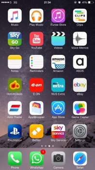
Download an app called Workflow. Create a workflow which opens the YouTube app. When you just the icon select the YouTube picture.

:)
 

Attachments

  • image.jpg
    image.jpg
    638.9 KB · Views: 169
Register on MacRumors! This sidebar will go away, and you'll see fewer ads.