Entering my favorite month of the year! Currently I'm using a still from one of macOS Sonoma's new aerial wallpapers. Once the novelty of Sonoma wears off I'm sure I'll go with my traditional Nightmare Before Christmas. 'Tis the season.

Become a MacRumors Supporter for $50/year with no ads, ability to filter front page stories, and private forums.
Post Your Desktop: October 2023
- Thread starter Traverse
- Start date
- Sort by reaction score
You are using an out of date browser. It may not display this or other websites correctly.
You should upgrade or use an alternative browser.
You should upgrade or use an alternative browser.
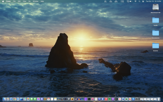
A new month and a new OS on my 2022 Studio:


Nice photo of Mrs. Costello...
Still on Ventura at the moment, tried Sonoma with OCLP 1.0.0, but it's not ready yet for me on my 2013 iMac.

Just having some fun, Sonoma Aquafied 

Loving the new Sonoma live wallpapers.

Last edited:
First of all, nice machine.. the m2 pro is a beast. Secondly, would you mind sharing this wallpaper? It's stunning.
edit nvm - found it:

Photo by Tj Holowaychuk on Unsplash
Long pier on a lake – Download this photo by Tj Holowaychuk on Unsplash
 unsplash.com
Last edited:
I love them, too! I'm playing around with some of them, there are so many to choose from! This is what I've got at the moment:Loving the new Sonoma live wallpapers.
View attachment 2290098
Attachments
At some point I had some gradients as backgrounds, but for the many past years, my desktop has literally just been a solid colour. It seems like I am the only one. I have a nice dark red, because apparently blue light will wake you up or make you sleep bad. But I had some darker turquoise-blues in the past and a nice darker green can be good too, or also dark grey.
I just feel like a photo or art design as background will just stand in my way. I like clarity and need to look fast at file names and such things. I also have additional information displayed below files or folders on my desktop, so I see how big they are, how many objects folders contain, etc. With artworks and photos, the probability is higher that there is going to be a bright spot e.g. behind that info or file name, and it will just worsen readability.
That's also why I liked @kvlq's desktop, because it's the only one that goes in that direction.
Given that we're about half-way through October I figured I better revert back to my traditional Halloween setup.

Probably one of my favorite stock wallpapers of all time. I get so much nostalgia from this wallpaper. High School, my old 15" MacBook Pro, going over to my friend's house because his parents bought a shiny new 27" iMac...good times.Back to the good old days! View attachment 2288524
One of my favorites for this time of year:

can you share it please?
can you share it please?

Where Halloween Smiles Are Born · Vlad.studio
Where Halloween Smiles Are Born – a wallpaper from Vlad.studio. Say CHEESE if you dare!
Register on MacRumors! This sidebar will go away, and you'll see fewer ads.