Become a MacRumors Supporter for $50/year with no ads, ability to filter front page stories, and private forums.
Quotes - better or worse?
- Thread starter arn
- Start date
- Sort by reaction score
You are using an out of date browser. It may not display this or other websites correctly.
You should upgrade or use an alternative browser.
You should upgrade or use an alternative browser.
I think they're much better. So much easier to follow than the old box. I also like how the round, soft nature of the new quote box offers a contrast to the squarishness of the forum. They complement each other well.
arn said:New Quote style...
better, worse, no preference?
arn
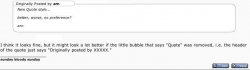
I think it looks fine, but it might look a lot better if the little bubble that says "Quote" was removed, i.e. the header of the quote just says "Originally posted by XXXXX."
job said:I think it looks fine, but it might look a lot better if the little bubble that says "Quote" was removed, i.e. the header of the quote just says "Originally posted by XXXXX."
Ditto.
job said:I think it looks fine, but it might look a lot better if the little bubble that says "Quote" was removed, i.e. the header of the quote just says "Originally posted by XXXXX."
You bet me to it, I was about to post that idea.
I do prefer the new style though, perhaps another possibility is to merge the "Quote" section and "Originally posted by..." section.
arn said:What if there is no Posted By?
arn
I think the "posted by" is somewhat necessary, since some people quote multiple sources - it's hard to keep up who said what sometimes
the Posted By is better...it doesn't take up any extra space, and if it's a long thread, it can really speed things up.
Re: Posted By
>Replying to who?
When it's a long thread, it would be hard to see who they're replying to.
Especially some of those really active front page threads.
It would almost be like somebody is replying and forgetting to mention who they're replying to.
>Replying to who?
When it's a long thread, it would be hard to see who they're replying to.
Especially some of those really active front page threads.
It would almost be like somebody is replying and forgetting to mention who they're replying to.
arn said:New Quote style...
better, worse, no preference?
arn
I just noticed it this evening arn. It looks very sophisticated. A very nice upgrade. It should contain the person that is being quoted. You just continue to amaze me arn, thank you!
")
I think what the others are trying to say is that the two consecutive bubbles are distracting. I like job's idea. Or maybe, make the text "Quote:" bold, so it is distinguished from the following "Posted by...."
It looks like Arn followed our advice; The quote bubble has gone.
EDIT: Huh, it's gone back to the original now. What's going on?
EDIT: Huh, it's gone back to the original now. What's going on?
wdlove said:I just noticed it this evening arn. It looks very sophisticated. A very nice upgrade. It should contain the person that is being quoted. You just continue to amaze me arn, thank you!
Arn, I have to hand it to you, great job. The new quote styles are very, very neat looking.
Any way to darken the background of the forum pages a few shades?
Cheers!
arn said:What if there is no Posted By?
As other's have said, definately keep the "Posted By" for clarity.
My 2 cents
I kinda think 2 bubbles is rather pleasant in appearance. Anyway, new (now not used) quote style is much nicer than the original whether you give it one bubble or two. Again, great work. You've managed to pull off a substantial upgrade with very little effort.
I kinda think 2 bubbles is rather pleasant in appearance. Anyway, new (now not used) quote style is much nicer than the original whether you give it one bubble or two. Again, great work. You've managed to pull off a substantial upgrade with very little effort.
Dunno, I sorta liked the bubbles.
Also, one thing I liked about the old style of quoting is the way italics and bold were used, instead of being:
It was:
which I think helped it to stand out a bit more from the regular text despite the box already around it. Italics don't seperate it as much as I think they should, the bold stands out more I think.
Anyhoo, just my thoughts.
BTW, the new colour arrangement is bloody awesome.
Also, one thing I liked about the old style of quoting is the way italics and bold were used, instead of being:
Kyle? said:My 2 cents
I kinda think 2 bubbles is rather pleasant in appearance.
It was:
Originally posted by Kyle?
I kinda think 2 bubbles is rather pleasant in appearance.
which I think helped it to stand out a bit more from the regular text despite the box already around it. Italics don't seperate it as much as I think they should, the bold stands out more I think.
Anyhoo, just my thoughts.
BTW, the new colour arrangement is bloody awesome.
You're the expert, so I guess that settles it.vniow said:BTW, the new colour arrangement is bloody awesome.
I agree with the bubbles. They are just cool. Anyways just kill these ugly smileys and bring back the old ones....
arn said:It wasn't easily editable to exactly what was wanted. I reverted to oldstyle for now... will mess with it more later.
arn
I hope that you will be able to bring back something similar in the near future. Now that it's gone, I miss the change. The old style just looks antiquated, so 20th Century.
Posted by sethypoo
I agree with vniow, I think that the quotes should be bold, not italicized.
but then if you have a bold word in you post it may stand out less.
edit-nevermind.
btw, there's a lot of quoting in this thread
Register on MacRumors! This sidebar will go away, and you'll see fewer ads.