L
Lau
Guest
Original poster
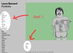
I was just going to whore this out using my garish signature, but hell, why not post it too. I've made a new portfolio website, and welcome criticism and suggestions, as well as cash in brown envelopes. ")
http://www.laurabarnard.co.uk
I felt my old site needed an overhaul, and also took it as an opportunity to learn some CSS. It now also has a fab new "Image o' the day" where there will be a new illustration/photo/image as a front page every morning so hopefully getting more daily visitors, desperate to see what excitement awaits them each morning . I'll be archiving the images weekly on the site.
Thanks for looking.
http://www.laurabarnard.co.uk
I felt my old site needed an overhaul, and also took it as an opportunity to learn some CSS. It now also has a fab new "Image o' the day" where there will be a new illustration/photo/image as a front page every morning so hopefully getting more daily visitors, desperate to see what excitement awaits them each morning
. I'll be archiving the images weekly on the site. Thanks for looking.