Become a MacRumors Supporter for $50/year with no ads, ability to filter front page stories, and private forums.
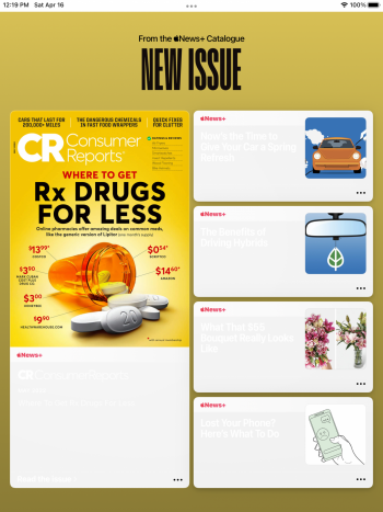
Apple News+ White text on white background?
- Thread starter Canyda
- Start date
- Sort by reaction score
You are using an out of date browser. It may not display this or other websites correctly.
You should upgrade or use an alternative browser.
You should upgrade or use an alternative browser.
I'm half convinced it's intentional because Apple News+ often brings up weird font color/background color combos that are very difficult to read. I mean, if it's a glitch, it's an IMPRESIVE glitch.Why do you think this is intentionally? Looks more like a glitch or something.
No. And it's not like this happens all the time, either - in fact, this is the first time I can recall a white-on-white display in AN+.I've never seen that in News. Do you have any accessibility settings turned on that might affect contrast negatively?
But the service does serve up a lot of white text on coloured backgrounds that are not awesome for readability.
Attachments
Register on MacRumors! This sidebar will go away, and you'll see fewer ads.


