It's because the choice was made to have visual consistency between a folder when it's opened and when it's closed.
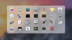
When you look at a folder on the springboard you can see every app even before you click on it.
Since I see no way to fit more than 9 icons in the shrunken view, that's what we're stuck with. You may say that this doesn't matter to you, but my point is that Apple made a conscious choice to switch from the old method to this new method, so it's clearly something they thought about. Not something they just didn't realize. You should probably give up hoping that it will change back.
(The ability to scroll pages within the folder is, I suspect, a compromise that they aren't thrilled with but have conceded as a matter of practicality.)

 3 x 3 is a piece of garbage. Whoever made the decision to cut it down to allow for an oft-disabled animation feature should have been fired for even suggesting the idea.