Become a MacRumors Supporter for $50/year with no ads, ability to filter front page stories, and private forums.

cyb3rdud3

macrumors 68040
Jun 22, 2014
3,331
2,079
UK
And round and round we go. Nobody disagrees in not liking a sea of bland, white, boring design. There is no need for that and most sites aren't like that at all. Where there is a need, especially when you do business and earn a living is to support standards, be inclusive, be secure and support access from any current end user device.

And not it really wasn't 'so much better' in 2010, it measurably simply isn't...

Don't confuse rankings with tracking or monetising people, the two aren't the same... SERPS are the same, keywords are equally important, backlinks and proper use of metadata is just as important. All the fundamentals work the same. DuckDuck enriches through bing, yahoo and yandex, so very important to be on all of those as it always is. Business information is often enriched with Apple Maps (yep really) and Bing places again. So same guidance applies. And then naturally there are the basics such as canonical URLs, proper use of heading and meta tags, clean and valid HTML (lol love to see the html from a 2010 browser pass that ;) especially on vista), open graph integrations, and speed, speed, and speed...Speed and accessibility play big parts...

Anyway, going round in circles and you are being left behind...Good luck to you fella...
 

Akrapovic

macrumors 65816
Aug 29, 2018
1,193
2,570
Scotland
...And far more boring. It's not nostalgia. I prefer the older UI design and older apps.

Get rid of flat UI design and we'll talk. I'm sick of everything being a sea of bland, white, boring design. How about focus all the updates on security and stability instead of UI redesigns every few weeks? Not everyone's a futurist who loves re-learning where their buttons got relocated to.

Everything was so much better in 2010. Today's 'modern' is a homogenized dystopia of boring and bland with zero differentiation. Heck, in 2010 you had a phone for everyone, now, you got literally two OSs left, and one size that's intended for sasquatches. To say nothing of how messed up websites have become what with the 'hero' images and aspect ratio hell. I mean come on, widescreen LCD monitors have been around for over a decade yet many of these so-called 'responsive' websites put all the content in the middle of the screen with tons of wasted space on the left/right. Almost like you are focusing on the 5 users left who use 4:3 monitors. Yet you insult me for wanting to get back to the real future, not this re-fresh of the 1980s era of UI design!

If we kept going where UI was heading in 2010, we'd probably have far better AR as well as possible holographic tech by now. If anyone's stagnating it's not I. You should be angry at Microsoft who started this flat UI war in 2012 October, and here we are going on over a decade without any real change for the better. Since you seem to understand demand and supply, perhaps you can clue me in on the demand for all UI to be boring and flat? Seems to me the designers had the final word and all the users who complained got told to go pound sand for the last 11 years.

Google rankings. come on man, most sane people who care at least something about their privacy have been using DuckDuckGo for the last decade. Everyone knows that website design has little to do with security and more to do with keeping users on the site, what with back button trapping and endless scrolling. If anything, designers such as yourself are to blame for everyone around me being glued to a smartphone screen everywhere like it were a bad drug addiction.
So if designers stopped using white, engineers would've made more progress on AR? Can you explain what designers are doing to hold up AR engineers?
 

cyb3rdud3

macrumors 68040
Jun 22, 2014
3,331
2,079
UK
You know, I can understand some folks liking smaller phones but some of us love the bigger screens.
Yup, I like them all sizes...I use a 12 Pro downsized from an 11 Pro Max, but also still got the iPhone :) And a Samsung Flip phone, etc. Responsive web (and email) design is a blessing as it works nicely across all of them with different screen sizes...
 
  • Like
Reactions: decafjava

MacBH928

macrumors G3
May 17, 2008
8,352
3,735
When I used smartphones, I liked how they basically combined a MP3 player, camera, browser and all into one device. Helped even better when skeuomorphism was still there, as the phone then literally became those devices when you launched those apps and made it fun.

Today? let's make all phones impractical tablets which are still too small for long-term media consumption (strain your eyes) too impractically large for use as a proper phone/messaging/media player, let's remove all the buttons making camera even harder to use (you used to be able to use the volume rocker as a shutter) and let's make all the UI a boring white, grey or otherwise flat look and then make all the apps look as boring and basic as possible. Take basically all the joy out of owning a smartphone.

I too believe a smartphone should remain a smart phone with a smaller screen . Unfortunately, thats not what the people want. back then every one owned his own laptop. Today people replaced their laptop with the smartphone. Some people use the smartphone to work on business so yeah, the people have spoken.

Looks like I might be going down that line too since I feel the GUI buttons are too small and apps became too complex for a small screen. The problem is that I like to operate the phone one hand and the current "standard" sizes are too big for one hand operations.


On one Linux laptop two such extensions (ClassicTube and Old Google Search) did just that with YouTube and Google, but why aren't there any to fix the forums and other sites? I would love to De-Xenforo this site and Re-vBulletin it.

Simplicity is nice but Xenforo has some nice functioning additions like the multi quote buttons, breaking of quotes, and searchable users when using the @ symbol. There is more.
 

Tozovac

macrumors 68040
Original poster
Jun 12, 2014
3,020
3,226
I started this thread focusing on websites. As progress, design trends, and fads tend to do, things slowly morphed over time and spread to apps and operating systems. But to where suddenly certain aspects felt noticeably different than ‘before,’ and not all of it in a good way. Like the nightly news and maybe life itself, it’s the negatives that stand out more than the positives. Despite certain improvements, many of the changes seemed much less easy to work with and sometimes even counter-productive and self-defeating in certain aspects. Some of the motivation for change was striving to make a small screen work better for more people. Some was the unfortunately unavoidable urge of a designer wanting to design. Or a company wanting to compete and needing to differentiate itself from the market leader but resulting in a compromised experience. Regardless of the motives, web/app/OS design will keep changing.

I never preferred leather stitching, brushed aluminum, and wood grain. But it never bothered or distracted me to irritation, and I still love intuitive design that prioritizes human nature over forced minimalism, which is rare these days imho. When I run into the occasional digital interface that instantly feels easy to use, it really stands out. I’ll always prefer walking up to a physical device (microwave, thermostat, remote control, self-checkout) that’s instantly intuitive to operate. 99% of the time that’s accomplished by a non-flat, non-monochromatic interface that’s ‘all there out in front” and not hidden.

I noticed on Facebook this app that’s almost comically iOS6-like but damn, how instantly obvious are certain aspects of the information that’s presented. To me the controls are much more obvious and engaging/inspiring than most anything on my iPhone, and the information as well. Frustratingly to some I’m sure, things look more like what’s on my desk than my iPad’s generally monochromatic, low-contrast and flat design calendar app. If this were in iOS app, I would certainly at least give it a try and see which I preferred to use over time, it or the calendar app.


Sure there are some nips and tucks that could be done to make the presentation a little more “modern and fresh” but while retaining an interface that instantly feels more intuitive and engaging to me at least.

I just wanted to share something unique that made me feel like I wanted to use it, instead of something I had to adapt to. I haven’t felt that in a long time!
 

cyb3rdud3

macrumors 68040
Jun 22, 2014
3,331
2,079
UK
LOL Flashback to Lotus Notes right back to 1989. Looks retro, and in my opinion tries to be something it isn't; a paper diary. I love paper diaries, they are great, but not replicated as is. But hey if you like it, go buy it and support the developer.
 

it wasnt me

macrumors regular
Apr 18, 2019
206
122
the internet, mostly
back then every one owned his own laptop. Today people replaced their laptop with the smartphone.

A few years ago, I made the assumption that the internet (including the web) would split in two halves, one "consumer internet" and one "creator internet", with each of those requiring different hardware.

Consumers who only want to be sprinkled with all kinds of media and, at most, post something within the length of two SMS messages every now and then never needed much more than a portable screen, while we who actually create stuff (I have two blogs and I participate on several "social media" platforms) need a real computer.

That assumption turned out to be true.
 
  • Like
Reactions: Nermal

floral

macrumors 65816
Jan 12, 2023
1,010
1,230
Earth
I feel like you just got a bad website. A lot of websites today are still compact and fluid, instead of whatever that watch website is.. though I do have a soft spot for those pre-2000s websites that were nearly all text with a few images for flavor. It was so charming and simple, but now if you view a website you get bombarded with "look at me, look at this, buy this, look at that, discount expires today, 200-something people looking at this, why don't you join them" like a merry-go-round of attention-grabbers. Just give me a website that looks like the internet hasn't even discovered what Flash Player is yet, and we'll call it even.

May I add, putting a ton of images and labels both slows down the site substantially, and also makes most of it vanish on devices that can't load them properly :confused:
 

cyb3rdud3

macrumors 68040
Jun 22, 2014
3,331
2,079
UK
Hey - Lotus Notes is not the worst e-mail client I have ever used!
We all work differently, I never liked it. Just doesn't work with how my brain is 'wired'. One of my favourites was IBM VM Mail. I loved the efficiency of not sending the message to everyone but just sharing the pointers.
 
  • Like
Reactions: it wasnt me

Tozovac

macrumors 68040
Original poster
Jun 12, 2014
3,020
3,226
LOL Flashback to Lotus Notes right back to 1989. Looks retro, and in my opinion tries to be something it isn't; a paper diary. I love paper diaries, they are great, but not replicated as is. But hey if you like it, go buy it and support the developer.
Yep I agree, a bit too much of a flashback stretch overall. But, there are definitely some cues I would prefer to see that differentiate information from the controls and from the background. The difference between looking retro, but instantly intuitive to me, versus modern and clean, but not so instantly clear.
 
  • Like
Reactions: cyb3rdud3

cyb3rdud3

macrumors 68040
Jun 22, 2014
3,331
2,079
UK
Yep I agree, a bit too much of a flashback stretch overall. But, there are definitely some cues I would prefer to see that differentiate information from the controls and from the background. The difference between looking retro, but instantly intuitive to me, versus modern and clean, but not so instantly clear.
Are you sitting down? :)


I can agree with that. 👍:)
 

MacBH928

macrumors G3
May 17, 2008
8,352
3,735
LOL Flashback to Lotus Notes right back to 1989. Looks retro, and in my opinion tries to be something it isn't; a paper diary. I love paper diaries, they are great, but not replicated as is. But hey if you like it, go buy it and support the developer.

I would choose functional over pretty convoluted pretty face. Apple in Steve Jobs days hit the sweet spot between the two. iTunes and iMovie, those were pretty capable, eye pleasing, and any one could use them!

A few years ago, I made the assumption that the internet (including the web) would split in two halves, one "consumer internet" and one "creator internet", with each of those requiring different hardware.

Consumers who only want to be sprinkled with all kinds of media and, at most, post something within the length of two SMS messages every now and then never needed much more than a portable screen, while we who actually create stuff (I have two blogs and I participate on several "social media" platforms) need a real computer.

That assumption turned out to be true.

I am scared the creators niche hardware will cease to exist.
 
  • Like
Reactions: Nermal

cyb3rdud3

macrumors 68040
Jun 22, 2014
3,331
2,079
UK
I would choose functional over pretty convoluted pretty face. Apple in Steve Jobs days hit the sweet spot between the two. iTunes and iMovie, those were pretty capable, eye pleasing, and any one could use them!
It doesn't have to be the two extremes like that. Some of us are pretty and functional! ;)
 

Tozovac

macrumors 68040
Original poster
Jun 12, 2014
3,020
3,226
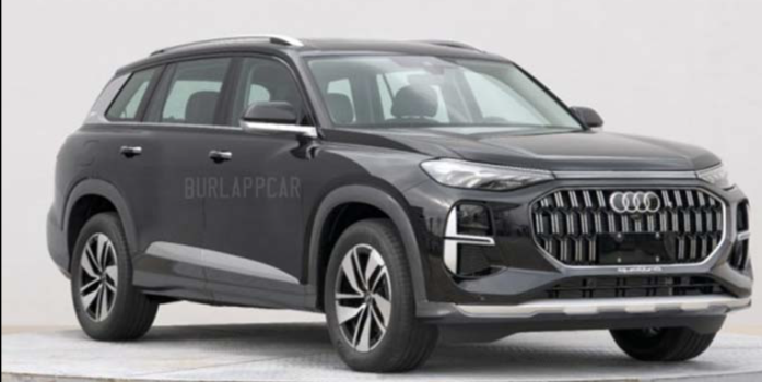
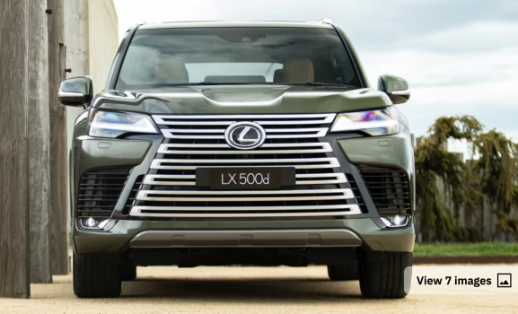
Screenshot 2023-04-29 at 7.50.19 AM.png Screenshot 2023-04-29 at 7.54.49 AM.png Screenshot 2023-04-29 at 7.52.35 AM.png

Oh BMW. Earlier it was Audi who went from sheer elegance to an in-your-face badge grille that's gotten bigger and bolder than more and more pretty.

Then it was Lexus who followed the fad tried to be different stylish with the inelegant spindle grille that's more the pursuit of shock and awe than the pursuit of perfection.

Now most anything out of BMW is more clown car than James Bond in running shoes...

I enjoy when my subjectivity aligns with a renowned expert's opinion. Confirms I'm not alone.


can anyone answer why websites today tend to have so much wasted space, large text, large photos, and seemingly no organization to steer the user?

I am reminded time and time again with how so much of "design" nowadays across so many different consumer products nowadays seems to be more about "putting an extreme amount of new design into the product" than "putting out a new product that was designed extremely well." It might just be an unavoidable sign of the times (or human nature) that: just when things got great, sometimes you have no choice but to just muck it up instead of enjoying where you're at.

So many aspects of pop music, cars, computer hardware/software have segued into being less timeless and more random/throwaway. Pop music is random repetitive throwaway "songs" where two or four measures are repeated for 3 minutes. many computer interfaces/websites/apps are still flat design with too much anti-obvious and catered to a small touch screen instead of focused to the hardware its presented on), tech hardware adds more by taking away (less buttons, less bezels, less ports, less upgradeability, less physical durability, but more and more flash). Gone is a sense of good design that took years of learning and refinement and training to create, and "in" is what seems like spaghetti on the wall that didn't look like it took a lot of work to create, catering to short attention spans...

I feel I could change a few bent sheetmetal lines in today's BMWs, Audis, and Lexuses and few would notice, just like I feel I could change a few aspects of Apple's iOS interface today and few would notice. But I could not imagine improving upon the BMW E46 design in any way...

Thankfully there are signs that iOS, Mac OS, websites, and apps are backtracking towards design focused on intuitiveness, efficiency, and simplicity, and replacing the vague, minimalist, and space-wasting themes that inspired this thread a few years ago...
 
  • Love
Reactions: ghanwani

ghanwani

macrumors 601
Dec 8, 2008
4,629
5,813
^ Big E46 fan here. Owned one for 211k miles over 11 years. It was the perfect car. I consider it the last real BMW.

Totally get your observation on the “loud, in your face” design that has pretty much become the norm nowadays.

Sadly, I don’t think it’s going to get better.
 
Last edited:
  • Sad
Reactions: Tozovac

dmccloud

macrumors 68030
Sep 7, 2009
2,990
1,727
Anchorage, AK
View attachment 2195095 View attachment 2195097 View attachment 2195096

Oh BMW. Earlier it was Audi who went from sheer elegance to an in-your-face badge grille that's gotten bigger and bolder than more and more pretty.

Then it was Lexus who followed the fad tried to be different stylish with the inelegant spindle grille that's more the pursuit of shock and awe than the pursuit of perfection.

Now most anything out of BMW is more clown car than James Bond in running shoes...

I enjoy when my subjectivity aligns with a renowned expert's opinion. Confirms I'm not alone.


I am reminded time and time again with how so much of "design" nowadays across so many different consumer products nowadays seems to be more about "putting an extreme amount of new design into the product" than "putting out a new product that was designed extremely well." It might just be an unavoidable sign of the times (or human nature) that: just when things got great, sometimes you have no choice but to just muck it up instead of enjoying where you're at.

So many aspects of pop music, cars, computer hardware/software have segued into being less timeless and more random/throwaway. Pop music is random repetitive throwaway "songs" where two or four measures are repeated for 3 minutes. many computer interfaces/websites/apps are still flat design with too much anti-obvious and catered to a small touch screen instead of focused to the hardware its presented on), tech hardware adds more by taking away (less buttons, less bezels, less ports, less upgradeability, less physical durability, but more and more flash). Gone is a sense of good design that took years of learning and refinement and training to create, and "in" is what seems like spaghetti on the wall that didn't look like it took a lot of work to create, catering to short attention spans...

I feel I could change a few bent sheetmetal lines in today's BMWs, Audis, and Lexuses and few would notice, just like I feel I could change a few aspects of Apple's iOS interface today and few would notice. But I could not imagine improving upon the BMW E46 design in any way...

Thankfully there are signs that iOS, Mac OS, websites, and apps are backtracking towards design focused on intuitiveness, efficiency, and simplicity, and replacing the vague, minimalist, and space-wasting themes that inspired this thread a few years ago...

A lot of the design trends stem from developers attempting to emulate Google's 'Material Design' motif, since that style has become trendy for some reason. Another consideration is that UI/UX best practices have also evolved to some degree to maximize accessibility for those with visual impairments. Personally, I avoid Material Design like the plague, because it does not translate well when applied outside of a smartphone/tablet interface. MD is designed for a touch interface first and foremost, and the move to touchscreen laptops on the Windows side has only encouraged this behavior. Personally, I use my PCs differently than my smartphone or tablet, so I don't need, want or care about having a touch interface on a Windows or Mac machine.
 

kage207

macrumors 6502a
Jul 23, 2008
971
56
A lot of the design trends stem from developers attempting to emulate Google's 'Material Design' motif, since that style has become trendy for some reason. Another consideration is that UI/UX best practices have also evolved to some degree to maximize accessibility for those with visual impairments. Personally, I avoid Material Design like the plague, because it does not translate well when applied outside of a smartphone/tablet interface. MD is designed for a touch interface first and foremost, and the move to touchscreen laptops on the Windows side has only encouraged this behavior. Personally, I use my PCs differently than my smartphone or tablet, so I don't need, want or care about having a touch interface on a Windows or Mac machine.
I am a developer and a few of my projects used Material UI as our style. Yes, this isn't Google's Material but lends a lot of the same ideas and concept into it's UI.

It just made things really easy to test in the early days of a library called `react-testing-library`. That has since been renamed to something else. I forget off the top of my head. But I believe this is why you saw rapid adoption of that. It was at the time `react` and `angular` development took off.

Anyways, the point I'm trying to make is that this Material UI looks super similar to the Material Design on Android but for websites. Most people I think could easily confuse the two, there's some tells (styles a bit vastly different) but not many.
 

dmccloud

macrumors 68030
Sep 7, 2009
2,990
1,727
Anchorage, AK
I am a developer and a few of my projects used Material UI as our style. Yes, this isn't Google's Material but lends a lot of the same ideas and concept into it's UI.

It just made things really easy to test in the early days of a library called `react-testing-library`. That has since been renamed to something else. I forget off the top of my head. But I believe this is why you saw rapid adoption of that. It was at the time `react` and `angular` development took off.

Anyways, the point I'm trying to make is that this Material UI looks super similar to the Material Design on Android but for websites. Most people I think could easily confuse the two, there's some tells (styles a bit vastly different) but not many.

Part of the confusion (in my opinion) stems from the fact that Google is all too happy to let said confusion propagate, because in their view it drives eyeballs to their products. Meanwhile, the developer community as a whole has not done a lot to delineate between the two either. Most end users won't know what to look for to tell the difference between the two, and even fewer would be able to look at the underlying code and understand enough to see differences there either.

The other consideration is that just like with fashion, styles and tastes changes over time. Using something line the Internet Archive or the Wayback Machine and take note at what websites looked like in the late 1990s/early 2000s - compared to today, most of them look like sheer trash now. Even websites such as NYT have evolved significantly in the last 20 years, and that's a good thing, especially as internet speeds have evolved from dialup to broadband, often in the 1GBps and higher range.
 
  • Like
Reactions: decafjava

cyb3rdud3

macrumors 68040
Jun 22, 2014
3,331
2,079
UK
They have completely destroyed the design of patent search on the USPTO website. The old one was super easy and intuitive to use. This one, I cannot even figure out where to go.

Old one

New one (completely unusable on a mobile device)
LOL The old one was bad, very bad. The new one is even worse. So bad that it would be illegal to do that in most modern civilizations due to accessibility laws. I've never seen anything like it, well I have about 25 years ago.
 

ghanwani

macrumors 601
Dec 8, 2008
4,629
5,813
LOL The old one was bad, very bad. The new one is even worse. So bad that it would be illegal to do that in most modern civilizations due to accessibility laws. I've never seen anything like it, well I have about 25 years ago.
The first one may have been bad to look at but it was very easy to figure out how to use. I just can’t figure out how to get the results I was getting with the old one. Plus it looks like 💩 on my 13” laptop.
 
Register on MacRumors! This sidebar will go away, and you'll see fewer ads.