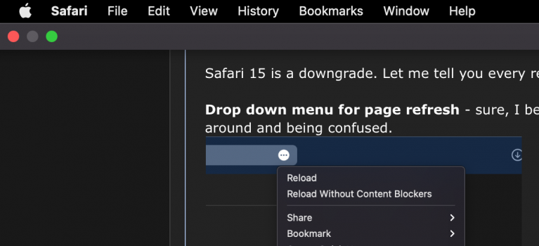
Safari 15 is a downgrade. Let me tell you every reason why:
Drop down menu for page refresh - sure, I bet 90% of people don't regularly use this, but it's annoying. It'll leave a lot of people looking around and being confused.

Putting the cursor to the top to access the Menu Bar covers the tabs and buttons - this is something that used to be just the third party browsers on macOS and a reason why I exclusively used Safari. I hate the jarring transition from the tab bar to THIS.

There's no tab title? (on the active tab) - While this isn't a dealbreaker, it is odd. Sometimes the tab title can contain information that is useful, like the sound icon or the notifications on a tab; which you can definitely argue are less important on the active tab. Even so, it leaves a void just seeing the URL.

The URL sitting to the left just looks weird too? Maybe I just need a few days...

Anyways, I don't love this. I hope Apple addresses these things and gives us an option to use the old style tab bar in particular.
Any thoughts on this?
Drop down menu for page refresh - sure, I bet 90% of people don't regularly use this, but it's annoying. It'll leave a lot of people looking around and being confused.
Putting the cursor to the top to access the Menu Bar covers the tabs and buttons - this is something that used to be just the third party browsers on macOS and a reason why I exclusively used Safari. I hate the jarring transition from the tab bar to THIS.
There's no tab title? (on the active tab) - While this isn't a dealbreaker, it is odd. Sometimes the tab title can contain information that is useful, like the sound icon or the notifications on a tab; which you can definitely argue are less important on the active tab. Even so, it leaves a void just seeing the URL.
The URL sitting to the left just looks weird too? Maybe I just need a few days...
Anyways, I don't love this. I hope Apple addresses these things and gives us an option to use the old style tab bar in particular.
Any thoughts on this?
Attachments
Last edited:
