Become a MacRumors Supporter for $50/year with no ads, ability to filter front page stories, and private forums.

Do you like the dark mode in MacOS 10.14?

  • Yes

    Votes: 66 64.7%
  • Nope

    Votes: 36 35.3%

  • Total voters
    102

groxx

macrumors newbie
Original poster
Jun 5, 2018
14
1
I haven't installed it on my Mac yet, but I thought that having dark text on light background is generally better than vice versa? Pretty much every website and book use dark letters on white background. I think using the dark mode will be more straining on the eyes.

What's your thoughts? For those who've already installed the beta, how does the dark mode look/feel?
 
  • Like
Reactions: vddobrev

overmind

macrumors newbie
Apr 2, 2013
5
0
Why would it be more straining on the eyes? The bezels on most Macs are black. You can "replicate" it somewhat, with having a black background, and opening a website with a white background. Do you find it more straining on the eyes?

I am using it right now, and I don't find it straining at all. I've been waiting for a "native" dark mode for years now, so its a really nice addition to Mojave. The only thing that I dislike, is that the Dynamic wallpaper is disabled while in Dark Mode. There also seems to be no transparency on the toolbars (Finder, Safari etc.) while in Dark Mode.
 

Cryates

macrumors 68040
Nov 19, 2013
3,312
5,209
Websites use black text on a white background because reading is easier on the eyes in that format. The same reason e-readers default to black text on a white background. White text (on a presumably black background) reflects light and scatters onto the other words, thus black text is preferred for reading.

With MacOS dark mode it's just changing the UI elements and you aren't reading across these elements, but giving subtle glances at the content. Don't think this move to dark mode will change websites, which we primarily read on.

Also, one thing you'll notice is most apps that deliver a dark mode don't use true white text, but soft grey. Most also use a dark (like charcoal) grey background, instead of true black. I'm not in front of my Mac right at this second, but I'm pretty sure Apple is using a soft grey text color in dark mode. Using a soft grey will make text easier to read on the darker backgrounds, because it does not reflect as much light.

All that said, dark mode implemented the way Apple has done it will in theory be easier on the eyes.
[doublepost=1528205969][/doublepost]
Why would it be more straining on the eyes? The bezels on most Macs are black. You can "replicate" it somewhat, with having a black background, and opening a website with a white background. Do you find it more straining on the eyes?

I am using it right now, and I don't find it straining at all. I've been waiting for a "native" dark mode for years now, so its a really nice addition to Mojave. The only thing that I dislike, is that the Dynamic wallpaper is disabled while in Dark Mode. There also seems to be no transparency on the toolbars (Finder, Safari etc.) while in Dark Mode.
I explained it in the post above, but the OP is looking at this more from a reading perspective than a productivity perspective. From a reading perspective, yes, white text on a black background is harder on the eyes. But reading elements are not the elements that Apple is changing.
 
Last edited:
Jul 4, 2015
4,487
2,551
Paris
For reading menus and text-on-black maybe. But nobody does that for long enough to make much difference.

For looking at images, it should be less straining and more defined.

The backlight is always the same output regardless if you use dark mode or not. Adjust it for your comfort.
 

Sovon Halder

macrumors 6502a
Dec 3, 2016
563
181
India
For reading menus and text-on-black maybe. But nobody does that for long enough to make much difference.

For looking at images, it should be less straining and more defined.

The backlight is always the same output regardless if you use dark mode or not. Adjust it for your comfort.
This.

Also, if you are indeed reading in a dark room or environment, I find that having white text on a dark background is far less straining than vice versa. This is the most obvious benefit I can think of for myself. Whether I am watching a movie on a separate window or working on something else, as soon as I come back to finder, I've always been blasted with bright lights (even though they were 2 or 1 bar in brightness scale). It happened countless times. And it is quite literally painful. That doesn't happen anymore and I am so grateful for this update, it's system-wide. I use a LED light strip (color set to red) most of the time at night in my living room. And this dark mode has made my experience so much better.
 

tresmith

macrumors 6502
Jul 25, 2014
430
200
I like dark mode but it should really be called black mode. lol

I didn't realize how black things would be. It was a little overwhelming at first.
 
  • Like
Reactions: Mr Todhunter

1050792

Suspended
Oct 2, 2016
2,515
3,991
I highly dislike this so called "Dark mode" it should have been called Grey Mode instead, text looks unreadable in the dark textures or even in the Safari search bar, iTunes suffers from the exact same thing.
 

Sovon Halder

macrumors 6502a
Dec 3, 2016
563
181
India
I highly dislike this so called "Dark mode" it should have been called Grey Mode instead, text looks unreadable in the dark textures or even in the Safari search bar, iTunes suffers from the exact same thing.
Really?

Can you post few screenshots?
 

1050792

Suspended
Oct 2, 2016
2,515
3,991
Really?

Can you post few screenshots?
Captura de ecrã 2018-09-26, às 16.06.30.jpg Captura de ecrã 2018-09-26, às 16.08.42.jpg
 

Martyimac

macrumors 68020
Aug 19, 2009
2,445
1,678
S. AZ.
Tried it for a day, I am back on light mode. Can't give you specific reasons, I just didn't care for it.
 

1050792

Suspended
Oct 2, 2016
2,515
3,991
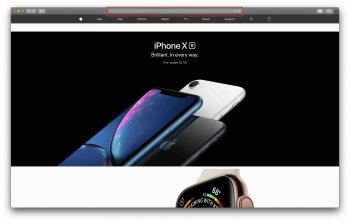
Not sure why your iTunes background looks a bit more grey-ish. This is what I see.. View attachment 789151

As for the safari screenshot, this is not typical. Because everything is slightly translucent, when you scroll down to iPhone Xr section, the white div above goes behind address bar and make the whole thing grey-ish.

View attachment 789152
I don't know also, your iTunes looks much darker than mine aswell.
 

Clix Pix

macrumors Core
I like most aspects of dark mode but find reading extensive amounts of text such as in an email message was problematic, but then discovered in Mail Preferences that one can turn off the dark mode for email messages. The sidebars still remain in dark mode, but when one opens an email it is back to the former light mode, which works much better for me.
 

Einkoro

macrumors member
Jun 18, 2007
78
49
Canada
I’m not a fan of dark mode. The contrast seems terrible with all the grey shades and the contrast between documents/pages and the rest of the UI feels downright painful to look at. The transparency also lightens it far too much and makes it even more difficult to read.
 

n-evo

macrumors 68000
Aug 9, 2013
1,778
1,500
Amsterdam
I don’t care much for Dark appearance. This is what I posted in another thread:

I tried it for a while but I just ended up going back to the light appearance. I just think Dark interfaces in general look more hectic on larger screens. Especially because I have to work with a lot of content like photos and videos. Everything with color just blasts at me in a system-wide dark interface environment. Same goes for the light text everywhere. For some reason it just gets to me after a while.

I'm fine with it on smaller screens, like my iPhone, where I just see one window / app at a time. Especially at night.
 

lockerc18

macrumors 6502a
May 17, 2012
553
209
I don't care for the dark mode theme, but I did like the ability to make the menu bar dark. That has evidently been taken away, and I don't understand why Apple would do that. Is there a way to make just the menu bar dark again?
 
  • Like
Reactions: Snorkledorf

rezwits

macrumors 6502a
Jul 10, 2007
811
414
Las Vegas
IMO, some people can do FULL BLACK BG with WHITE TEXT, while others can and have done FULL WHITE BG with BLACK TEXT.

The thing is if you look at Apple Books (in Mojave), THAT is dark mode done right!

I don't really think people, (like stated up above), can do 100% Black bg with 100% White text tho for more than an hour or so in either day time or night time depending on the person, without some strain. But a dark grey with the right "darkness/lightness" of text is proper...
 

littlepud

macrumors 6502
Sep 16, 2012
443
278
Dark mode itself is OK, but most apps and websites are not (yet) set up to take advantage of it. What results is an overall dark UI with a bright white window which causes MORE eye strain. I prefer to just leave everything on light mode for now.
 

flur

macrumors 68020
Nov 12, 2012
2,371
1,160
I miss the old "dark mode" where only my top menu was dark. If I could go back to that, I would in a heartbeat. If there's a way to make that menu dark and keep everything else in light mode, please let me know.

Simplenote is entirely black with white text in dark mode. That's a no-go for me, definite eye strain happening there.
 
Register on MacRumors! This sidebar will go away, and you'll see fewer ads.