Become a MacRumors Supporter for $50/year with no ads, ability to filter front page stories, and private forums.

Signal bars or dots?

  • Signal bars

  • Dots


Results are only viewable after voting.

Vanilla35

macrumors 68040
Apr 11, 2013
3,344
1,453
Washington D.C.
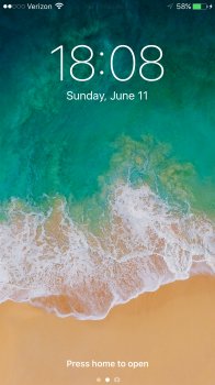
Should've stuck with bars. Dots are overused in the UI:
  • Multiple pages of icons were already represented by a line of dots.
  • Updated apps already had blue dots beside them.
  • Ellipsis buttons '...' are pretty common now.
Ordinarily not a big deal, but imagine phone tech support asking a new user how many 'dots' they have.

I always thought the dots were just a bad design choice for that reason. Not a huge deal at the top left, but it was definitely the opposite of intuitive, when it first came out.
 

Strelok

macrumors 65816
Jun 6, 2017
1,471
1,721
United States
Bars, and by a lot.

I don't care much for the design of bars vs dots, but one necessity for me is the fact that the dots needed to be blank when not filled in.

I'll show an example below.

My previous jailbroken status bar theme on iOS 8 (below):

unnamed1-jpg.703445


Current iOS 8/10 dots:

View attachment 703446

I personally found the border of the empty dots to be kind of hard to read at a glance, with a small screen and crowded area up top. I like the jailbreak theme's implementation better.

Either way, I welcome bars back again, which to be honest is even better. I don't have terrible memories of super old android, so I'm not opposed to it.

Seems pretty clear to me, but it might be the background that helps.
 

Attachments

  • fullsizeoutput_1d2.jpeg
    fullsizeoutput_1d2.jpeg
    983.9 KB · Views: 525

epca12

macrumors regular
Jun 11, 2017
244
67
UK
Not as clean, but the bars are more compact and in line with the wifi icon so I prefer it
 

Vanilla35

macrumors 68040
Apr 11, 2013
3,344
1,453
Washington D.C.
Seems pretty clear to me, but it might be the background that helps.

Pictures shown are as good as it gets (blown up screenshot, and black background). Add any other background color, and a sunny day, IRL viewing distances, and it can become less easy to read at a glance. Bars are intuitive and easy to discern. Like I said, imo the jailbroken theme solves the issues by itself. Bars make it even better though.
 

jwolf6589

macrumors 601
Dec 15, 2010
4,826
1,590
Colorado
IOS 6 and earlier used a signal strength bar which was replaced with dots in IOS 7 and what apple has been using ever since. Why has IOS 11 gone back to using the signal strength bar instead of the dots? I like the dots better as its easier to tell my signal strength that way than the bars.
 
  • Like
Reactions: Mintz9

willmtaylor

macrumors G4
Oct 31, 2009
10,314
8,198
Here(-ish)
  • Like
Reactions: Mintz9

fmalloy

macrumors 6502
Nov 5, 2007
405
245
Not only that, instead of 5, there are 4!
I'm glad somebody else noticed that!

So now we have less granularity and a less detailed signal strength indicator which is so important.

So they took away our headphone jack, home button, and now one bar.
 

C DM

macrumors Sandy Bridge
Oct 17, 2011
51,390
19,458
The 5 dots of course which represents the unique look of an apple ...the signal bars looks like an android which is horrible!
You mean they look like what Apple used to look like for quite a while before the dots and what pretty much all other phones (well before and beyond Android) looked and look like.
 

C DM

macrumors Sandy Bridge
Oct 17, 2011
51,390
19,458
The lined up dots should continue as no other company can imitate the look ...and i personally prefer that look on my apple phone
Any company can imitate the look, they just didn't decide to do it. Even Apple decided to go back to the more standard and known look. As far as preference, well, that's certainly a personal thing.
 

Mintz9

macrumors newbie
Nov 1, 2017
7
0
Any company can imitate the look, they just didn't decide to do it. Even Apple decided to go back to the more standard and known look. As far as preference, well, that's certainly a personal thing.

I agree but id still perfer the 5 dots for any apple gadgets
 

Mintz9

macrumors newbie
Nov 1, 2017
7
0
Dots are much better, this bars looks like android and its ugly.
Totally agree
[doublepost=1509605531][/doublepost]
7 major versions of iOS have signal bars. Only 4 had dots.
So what? here we are not counting the majority of ios upgrades.. but its all about what you are comfortable with though...i'd always prefer dots instead of bars
 
Last edited:
Register on MacRumors! This sidebar will go away, and you'll see fewer ads.