Become a MacRumors Supporter for $50/year with no ads, ability to filter front page stories, and private forums.

Tozovac

macrumors 68040
Original poster
Jun 12, 2014
3,021
3,228
It applies to companies of all sizes. They all now use frameworks like Bootstrap and React which to an extent dictate the UI (especially Bootstrap) and therefore websites all look and behave the same. Developers these days see design as a hindrance rather than an art form (sorry to sound pretentious but I used to take real pride in my web design.)

Thanks. I'll have to look up typical Bootsrap-created sites then, to address my curiosity. You don't sound pretentious at all, btw. You sound like a customer like me who values a quality experience -- someone who's not happy sitting idly by and settling for whatever websites are thrown at you, with all the trendy Apple-like minimalist flat-design website full of design clichés that all the lemming developers are creating nowadays just because Apple & everyone else is using them.

It's truly fascinating to me because the worst of the worst of those iOS/OSX designs are also bleeding past websites and into Windows software for a corporate environment, like Skype which my company uses now in place of the older MS messenger app -- the Skype app is easter egg blue with tiny white font that is damn near impossible to read on a 15" laptop screen. And our electronic document managemetn system was just "upgraded" to a new vendor using....you guessed it....a light blue, medium blue, grey and white interface with lots of white fonts used. Just utterly fascinating that large companies full of smart people have settled with designs/layouts like this. Utterly fascinating...
 

eddjedi

macrumors 6502a
Sep 7, 2011
628
851

Tozovac

macrumors 68040
Original poster
Jun 12, 2014
3,021
3,228
Although old that is a brilliant article, and having been a developer in the "glory years" I completely agree we are going backwards.

I could write a similar article about development detailing how we have somehow ended up coveting bloat and lack of support rather than efficiency and cross-compatibility.

What do you mean by bloat? I think I can guess but wasn't sure.

Amazing article, wasn't it? It's as if Apple and the vast majority of app/web/OS designers apparently bought into a fear of not wanting to insult the user via intuitive UI's...or unique layouts that help the user, not challenge him/her, and which are at least slightly creative and have some individuality (like things used to be).

Before: Stick to proven UI principles then have at it & be creative.

Now: Stick to iOS7 2013's re-imagined UI principles using blue/white flat-design with circle icons, hamburger-icons, minimalist-arrowheads, etc. to create layouts that now all pretty much look alike. Blindly follow Jony Ive/Apple's UI reinvention for better or worse...just follow Apple and don't anger Jony.

http://www.businessinsider.com/jony-ive-offended-by-parody-soundboard-website-2015-9

Oh and don't forget the token hero image.


The only reason the world is able to work within most of today’s websites is because we’ve just learned how to navigate all the compromises and poorly-decided UI elements cascaded from iOS 7.
 
Last edited:
  • Like
Reactions: arkitect

eddjedi

macrumors 6502a
Sep 7, 2011
628
851
What do you mean by bloat? I think I can guess but wasn't sure.

Ask any young developer the first thing you do when creating a website, the answer will be something along the lines of install nodeJS and a package manager. There's thousands of files you probably don't need in your project before you've written one line of code. The theory for development these days is start with everything in your site (or "app" as they insist on calling them now) and strip it back (if you can be bothered) rather than start with nothing and add only what you need.
 

Tozovac

macrumors 68040
Original poster
Jun 12, 2014
3,021
3,228
My mom called me in a panic just now because she must have accidentally deleted everything in her yahoo email inbox. She gave me her login info and I got into her email on my iPad to look around and try to rescue her lost messages. I have never been more disgusted with the state of today’s websites when perusing her email account on my iPad. The entire screen was white space with the least amount of information as possible. No lines or borders to help put things into context, the least amount of information possible as if this was some kind of a pixel preservation contest. Each message was described with three things: Sender, subject, and time pr date. No time sent for messages older than one day, no size, no indication of attachment, nothing else. Seriously, what the hell is wrong with how poorly things are represented online so often nowadays?? I don’t care if behind the scenes the amount of bloat is 100 times what it was five years ago, or if Yahoo Marketing, the Board of Directors, and the entire Yahoo world headquarters cafeteria staff required all kinds of pop up menus for information to be gathered from users, what truly matters is the final product. Why are so many webpages so damn awful when we should be getting better each year? Who here can actually defend the screenshots below? Look at this garbage. How can anybody let this out? Not even the search box is correct. Also when we searched for one missing message to find out where where it had gone, the search results didn't even tell you what folder it was in. Is this 1994 when were first learning how to present information on the Internet, or is this 2017? Are we in the twilight zone?

CD0AEC33-B8C8-45E7-94FF-0F26FA7DFB50.jpeg


F43C9A62-E278-4EB1-9604-DC0182610B8E.jpeg
 
Last edited:

Tozovac

macrumors 68040
Original poster
Jun 12, 2014
3,021
3,228
Even Facebook updates like this are godawful compared to ~4 years ago when "quality" came first ahead of "reinvention for the hell of it."

Screen Shot 2017-12-17 at 6.08.04 PM.png

  • Super thin white font that nearly disappears into the background, making you think it's not important (though it's pretty important information), check.
  • Lots of wasted space, check.
  • Token gradient in the wasted space ala iOS 7, check.
  • Dumb arrangement of information presented that makes it harder to figure out what you're looking at than before this "improvement," check.

Come on people. Why does so much suck nowadays in apps, websites, operating systems, etc. So much more than just 4 years ago? Where are things going to go in a few years when mandatory unnecessary adjustment is deemed required again?
 
Last edited:

cyb3rdud3

macrumors 68040
Jun 22, 2014
3,344
2,089
UK
I much prefer today’s clean simple and responsive layouts. They work well on all browsers and all devices, and not least are much more inclusive from an accessibility perspective as well.

It really makes me laugh when I see websites of old, didn’t like them them and still don’t like them today.
 

BarracksSi

Suspended
Jul 14, 2015
3,902
2,663
I much prefer today’s clean simple and responsive layouts.
I don't. I ****ing hate them.

Very few manage to do them right, and even then, "doing it right" seems just a minor slip away from becoming yet another piece of crap.

Check Tozovac's post from just a couple weeks ago. WTF is that? Is it supposed to be useful? Does Yahoo hate its users this much? I feel like I need to close out and delete my long-dormant Yahoo account out of spite.

We've given up the functionality of desktop and laptop browsing -- big screen, mouse pointers, hardware keyboards -- for scroll-friendly, content-lite, analytics-bloated mobile "pages".

I've simply stopped trying to go to some websites because both mobile and desktop versions have gotten un-navigable. Whoever it was that railed on Apple's new support site -- I'm with you, 1000%, on it being much worse than it ever was.

Here's an example. One of my interests is fancy wristwatches. Go to these two sites, both of which were written with "mobile-first" design *gag*puke*, and tell me which one is actually useful:
https://www.rolex.com/
https://www.tagheuer.com/en-us

See how close the line is between decent and ****? Rolex's has an awful lot of white space, but at least the content fits on the screen, and the menu* makes some sense. TAG's is just garbage; it's like the car Homer Simpson designed -- nothing fits, nothing looks balanced, nothing is discoverable.

I just got into web development in the past year and a half, and I don't like what I'm seeing. If I'm lucky, I can help drag some people back into making things that are usable and appropriate for the platform.

( * oh, and **** "hamburger menus")
[doublepost=1514907949][/doublepost]
And damn you, Medium, for wasting a third of my browser window with dickbars.
 

olup

Cancelled
Oct 11, 2011
383
40
I'd rather not mix my personal stuff with my MR rants.

And I'm not going to get into a dick-measuring contest over web design, either.
Understood, as someone who actually works in that profession you should know better than crap all over other people's work.
 

BarracksSi

Suspended
Jul 14, 2015
3,902
2,663
Understood, as someone who actually works in that profession you should know better than crap all over other people's work.
BWAHAHAHAHAHAHAHAHAHAAAAAA

You've got to be kidding me. Am I not supposed to say when something sucks? Am I supposed to just shut up and take it?

I don't give a damn how much work they did when the result was garbage. If they do, then it's wasted effort, isn't it?

Website design can be BETTER than that.
 
  • Like
Reactions: Tozovac

olup

Cancelled
Oct 11, 2011
383
40
BWAHAHAHAHAHAHAHAHAHAAAAAA

You've got to be kidding me. Am I not supposed to say when something sucks? Am I supposed to just shut up and take it?

I don't give a damn how much work they did when the result was garbage. If they do, then it's wasted effort, isn't it?

Website design can be BETTER than that.

It can indeed, but instead of running your mouth on a forum, write them an email and let them know, how much you think their site sucks.
 

BarracksSi

Suspended
Jul 14, 2015
3,902
2,663
It can indeed, but instead of running your mouth on a forum, write them an email and let them know, how much you think their site sucks.
When I can get good enough to show them a redesigned version that I'd be satisfied with, I'll send them a link and attach my resume. In the meantime, they can be publicly flogged, because their disdain for the user shows as soon as they decide that their trash is good enough to post live.

Speaking as a longtime web user (I used to browse via VAX/VMS text terminals because they were so much faster), I hate what I see these days.

Speaking as a still-noob developer, I also hate what I see, with the additional frustration of seeing how much junk runs behind the scenes (isn't there some plugin that automatically retweets a fast food ad whenever it's used?). It's like I now have an idea of how the sausage is made, except that I see devs filling the sausage with beach sand and parts of shredded Chevy small-block V8s.
 

Tozovac

macrumors 68040
Original poster
Jun 12, 2014
3,021
3,228
It can indeed, but instead of running your mouth on a forum, write them an email and let them know, how much you think their site sucks.

I do this often. Have done it for sites like inthestudio.net, cnet.com, apple.com (their help area is just so awful now), and any site with !@#$!% light grey font. I also do that for awful 3rd party iOS app developers, like the current Burner app, LIFX app, tapatalk app, dropbox app, instagram app, etc., all poisoned with flat-design low-contrast light-color-text borderless crap that's not resulted in any discernible user-experience improvement to have justified their so-unnecessary reinventions.

Each and every time, the response is a gentle thank you and "we'll be sure to pass your feedback on to our developers," etc. etc. etc. And then nothing changes over time. Your suggestion is usually a black hole of uselessness, quite unfortunately. Make that, light grey flat-design circle of uselessness.
 
  • Like
Reactions: arkitect

Altis

macrumors 68040
Sep 10, 2013
3,167
4,897
It isn't just web design, it's all UI/UX experiences.

Apple's UI is becoming worse by the update, it seems. There are just too many examples to list, but off the top of my head:

- Input blocking: After years since iOS 7, I still cannot time most actions right without having them blocked. I tap, wait, and when it looks like everything's settled, I tap/swipe and wait, only to find it blocked the input. It does this every other input I make... absolutely terrible experience. The more of a hurry I'm in, the more I just have to spam inputs. And with all the new lag in iOS 10/11, I sometimes can't tell if it's input blocking or just taking forever.

- App switching "preview": when you switch to an app and it shows you a picture of the app, but the picture is often old and not at all what the app looks like now. I often switch to an app, get ready to use it only to have it suddenly revert back to a fresh app open. Why bother showing me a photo of the app if it isn't how the app is now? I don't care how it might well once have looked!

- The iPad Pro 12.9" App store, the "Download" button is a tiny little Cloud icon (if it's been purchased on the account already) about the size of my pinky nail... that's it. The icon blends in with the background since it's just a font-colored cloud outline trace on background-colored (white), so it's nearly indistinguishable from everything else. iOS is like this all over, now.

- The volume indicator used to be translucent so you could keep using it while it faded, but with the blurry one, you can't see behind it at all -- and it looks awful to boot.

- Now fixed, but for the longest time, the Alarm Clock in iOS was eye-bleeding white with thin, light-grey text... as if you're supposed to use that when you first open your eyes and it's dark in the room.

- (Not just Apple) Why is everything stark white with light grey text, these days? I have to use a plugin in Chrome to change it all to black background. It's really hard on the eyes when it gets dark in the room.

- Putting UI elements (and home page app icons) at the top of the display. This one should be obvious.

- More of a hardware design but I'll put it under UX: The power button being directly across from the volume buttons, so when you try to sleep the device, you end up squeezing both sides and pressing a volume button too. iOS prioritizes the volume so your device stays awake and changes volume instead.

- Notification Center: Grouping things by date instead of by App; I shouldn't have to dismiss each group of emails by date, one after the other. It makes absolutely no sense to do this -- why would I dismiss them by date? Oh, clear all of Thursday's email notifications, but leave all of Wednesdays... :rolleyes:

- Stuffing too many gestures in so they overlap. For example, when I try to scrub into a song from the lock screen, I often end up changing to the Camera or to the ever-so-useless "Today" page -- though sometimes it does both scrub and change the page.

- Circular Contact Photos / Avatars: Even on this site, Google/YouTube, Apple, etc... why?? Why would anyone want a circular photo? That only works, and still looks terrible, if it's a headshot. Every other picture will get cut off and look awful. All for what -- so you can show a little extra background colour? You are trading useful avatar photo space for background waste. There's no upside, and yet everyone's adopted it without a single thought. Even @Tozovac 's avatar looks silly now (no fault of yours!) :p

Anyways, I could go on, but the standards for UI/UX design seem to be plummeting. Companies that used to take pride in it are just flushing it down the toilet.
 

Tozovac

macrumors 68040
Original poster
Jun 12, 2014
3,021
3,228
It isn't just web design, it's all UI/UX experiences.

Apple's UI is becoming worse by the update, it seems. There are just too many examples to list, but off the top of my head:

- Input blocking: After years since iOS 7, I still cannot time most actions right without having them blocked. I tap, wait, and when it looks like everything's settled, I tap/swipe and wait, only to find it blocked the input. It does this every other input I make... absolutely terrible experience. The more of a hurry I'm in, the more I just have to spam inputs. And with all the new lag in iOS 10/11, I sometimes can't tell if it's input blocking or just taking forever.

- App switching "preview": when you switch to an app and it shows you a picture of the app, but the picture is often old and not at all what the app looks like now. I often switch to an app, get ready to use it only to have it suddenly revert back to a fresh app open. Why bother showing me a photo of the app if it isn't how the app is now? I don't care how it might well once have looked!

- The iPad Pro 12.9" App store, the "Download" button is a tiny little Cloud icon (if it's been purchased on the account already) about the size of my pinky nail... that's it. The icon blends in with the background since it's just a font-colored cloud outline trace on background-colored (white), so it's nearly indistinguishable from everything else. iOS is like this all over, now.

- The volume indicator used to be translucent so you could keep using it while it faded, but with the blurry one, you can't see behind it at all -- and it looks awful to boot.

- Now fixed, but for the longest time, the Alarm Clock in iOS was eye-bleeding white with thin, light-grey text... as if you're supposed to use that when you first open your eyes and it's dark in the room.

- (Not just Apple) Why is everything stark white with light grey text, these days? I have to use a plugin in Chrome to change it all to black background. It's really hard on the eyes when it gets dark in the room.

- Putting UI elements (and home page app icons) at the top of the display. This one should be obvious.

- More of a hardware design but I'll put it under UX: The power button being directly across from the volume buttons, so when you try to sleep the device, you end up squeezing both sides and pressing a volume button too. iOS prioritizes the volume so your device stays awake and changes volume instead.

- Notification Center: Grouping things by date instead of by App; I shouldn't have to dismiss each group of emails by date, one after the other. It makes absolutely no sense to do this -- why would I dismiss them by date? Oh, clear all of Thursday's email notifications, but leave all of Wednesdays... :rolleyes:

- Stuffing too many gestures in so they overlap. For example, when I try to scrub into a song from the lock screen, I often end up changing to the Camera or to the ever-so-useless "Today" page -- though sometimes it does both scrub and change the page.

- Circular Contact Photos / Avatars: Even on this site, Google/YouTube, Apple, etc... why?? Why would anyone want a circular photo? That only works, and still looks terrible, if it's a headshot. Every other picture will get cut off and look awful. All for what -- so you can show a little extra background colour? You are trading useful avatar photo space for background waste. There's no upside, and yet everyone's adopted it without a single thought. Even @Tozovac 's avatar looks silly now (no fault of yours!) :p

Anyways, I could go on, but the standards for UI/UX design seem to be plummeting. Companies that used to take pride in it are just flushing it down the toilet.

I'm turning you into the Macrumors police for stealing/borrowing/plagiarizing every complaint I've made in this & other threads for the past few years. :)

You speaketh all truth. There is WAY too much unnecessary plastic surgery in website design, app design, OS/iOS design, UI/UIx design, etc., mostly because of two reasons, one of which should have been more easily avoided than the other:

1. Jony Ive's selfish need to share *his* vision of what iOS UI should be, since he despised Scott Forstall; users don’t need no stinkin’ green felt or shiny brushed metal to know how to use a game board or push a “play” button, so OBVIOUSLY users don’t need no stinkin’ intuitive UI cues...

2. Human nature's tendency to too-often dabble when unnecessary, whether driven by Marketing, a visionless CEO, or just personal inability to know when to leave well enough alone.

Currently we have a rag-tag poorly-implemented patchwork of made-up UI reinventions, few of which are obviously better than how they were before 2013, but most/all of which are further poorly implemented by 3rd party developers trying to play by the rules of the game which make so little sense.

I have, in at least 3-4 posts, asked certain users who disagreed with my complaints to show a few valid before/after examples of where the UI element before iOS7 was obviously broken and in need of repair, and how the iOS7 to iOS7 version of the UI element fixed the issue and is better. No one has ever responded, I assume because nobody was able to produce any examples. Hey if people actually like the new version better, especially how it looks, then great for them. But it’s interesting that no one can show how new version is functionally better, and/or how the old version was functionally worse.

How ironic it is that much of 2013's iOS 7's flat/unintuitive UI content was a blatant copy of the Windows phone & android OS's, both of which were -- by necessity -- poor copies of the then-excellent iOS UI?
 
Last edited:
  • Like
Reactions: Altis

cyb3rdud3

macrumors 68040
Jun 22, 2014
3,344
2,089
UK
I don't. I ****ing hate them.

Very few manage to do them right, and even then, "doing it right" seems just a minor slip away from becoming yet another piece of crap.

Check Tozovac's post from just a couple weeks ago. WTF is that? Is it supposed to be useful? Does Yahoo hate its users this much? I feel like I need to close out and delete my long-dormant Yahoo account out of spite.

We've given up the functionality of desktop and laptop browsing -- big screen, mouse pointers, hardware keyboards -- for scroll-friendly, content-lite, analytics-bloated mobile "pages".

I've simply stopped trying to go to some websites because both mobile and desktop versions have gotten un-navigable. Whoever it was that railed on Apple's new support site -- I'm with you, 1000%, on it being much worse than it ever was.

Here's an example. One of my interests is fancy wristwatches. Go to these two sites, both of which were written with "mobile-first" design *gag*puke*, and tell me which one is actually useful:
https://www.rolex.com/
https://www.tagheuer.com/en-us

See how close the line is between decent and ****? Rolex's has an awful lot of white space, but at least the content fits on the screen, and the menu* makes some sense. TAG's is just garbage; it's like the car Homer Simpson designed -- nothing fits, nothing looks balanced, nothing is discoverable.

I just got into web development in the past year and a half, and I don't like what I'm seeing. If I'm lucky, I can help drag some people back into making things that are usable and appropriate for the platform.

( * oh, and **** "hamburger menus")
[doublepost=1514907949][/doublepost]
And damn you, Medium, for wasting a third of my browser window with dickbars.
I don’t know...both sites look fine to me on my iPad....I don’t have issues with either Rolex, nor Tag....Well not their websites at least, I’m not a fan of Tag as they simply don’t suit me generally...
 

Tozovac

macrumors 68040
Original poster
Jun 12, 2014
3,021
3,228
- Circular Contact Photos / Avatars: Even on this site, Google/YouTube, Apple, etc... why?? Why would anyone want a circular photo? That only works, and still looks terrible, if it's a headshot. Every other picture will get cut off and look awful. All for what -- so you can show a little extra background colour? You are trading useful avatar photo space for background waste. There's no upside, and yet everyone's adopted it without a single thought. Even @Tozovac 's avatar looks silly now (no fault of yours!) :p

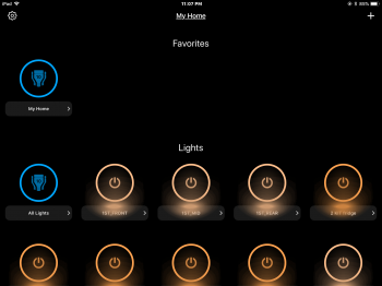
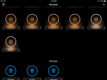
I’ve detested the stupid overuse of circles starting with iOS 7 for years now. Worst of all is when third-party app developers feel obligated to use circles to keep up a certain theme instead of designing an app for optimum use. The app I used to control home automation lights is just the worst, with so much wasted space and reduced functionality just to use more damn circles.

CF5E97E1-0E3F-42E3-9812-336374C59E0B.png

958549AB-9F15-4247-8DFC-11F9EC34F39D.png

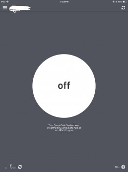
Even worse, if there can be a worse example, is the simplisafe app. They updated the app to a flat design with an amazing amount of unnecessarily wasted space. But, circles!!

FF2D8392-DF16-4F89-BACE-A65E3B87B496.jpeg

( * oh, and **** "hamburger menus")

Hamburger munus are ridiculous. They just hide information and increase guesswork as well as number of taps required to do something that should be right in front of you. Same thing for ellipses-in this amazing quest to invent a new breed of UI elements, everybody has forgotten that ellipses stood for something else once, often resulting in user confusion. Of course, the app or site developer is often to blame, ultimately, but look again at the simplisafe app’s lower part of the screen. Just amazing how they let such a confusing, sloppy mishmosh out for use. All that available space to make things more clear, yet an ellipses icon is placed right next to where ellipses are used trailing after the “5” — a bunch of incomplete information right next to each other but surrounded by sloppily unused, available space, adding to the confusion. Sure, these are apps, but too many websites use the same dumb cues.

Why? Can anyine defend how this is good design? To me it looks like a seventh grader created it.
 
Last edited:

Tozovac

macrumors 68040
Original poster
Jun 12, 2014
3,021
3,228
While we're piling on: Does anyone else feel the "colored (usually red) underline placed some distance away from a chosen option" method of indicating a chosen option is yet another one of those substandard forced-reinvention UI elements? (another yuck option from Google's Material Design crap).

The line is usually far enough away that it's not instantly obvious what's going on, and those micro-pauses of having to take a little more time to figure something out than was required 4 years ago just add up and add up. Even worse, that method keeps creeping into other screens such as cable television on-screen menus, car/truck radio screens, etc. that are not touch-screen and hardly lend themselves to that selection method; too often when moving the underline cursor on the TV screen, it's not easy to see where it moved since you didn't touch the screen, and frustration ensues.

Can anyone guess why there's such hate for time-tested well-proven methods of indicating a chosen option such as shading the option itself instead of placing a line far under the option, if not placing the option itself in a button shape and shading the chosen button? Why all the continued forced reinvention?
 

Tozovac

macrumors 68040
Original poster
Jun 12, 2014
3,021
3,228
Shading the option itself really isn’t a good idea from an accessibility perspective.

Thx. Could you elaborate?

What accessibility issue exists below, where it's clearly obvious that "Bugs" is selected to the left, and "Actions" is selected to the right? It's easy to tell at first glance, where an underline never provides as clear & "instant" of an indication.

03-orange.png
 

cyb3rdud3

macrumors 68040
Jun 22, 2014
3,344
2,089
UK
Thx. Could you elaborate?

What accessibility issue exists below, where it's clearly obvious that "Bugs" is selected to the left, and "Actions" is selected to the right? It's easy to tell at first glance, where an underline never provides as clear & "instant" of an indication.

03-orange.png
I may have misunderstood as I thought we were talking about web development and you are showing an app. And many an app is totally rubbish from an accessibility perspective.

I’m talking about guidance to comply with W3C AA or AAA standards.
 

Tozovac

macrumors 68040
Original poster
Jun 12, 2014
3,021
3,228
Gotcha, ok. Google’s Material Design UI reinventions are just so aggravating and confusing than pleasing to use.

Below is what I mean, where takes that little bit of extra work too often to consciously recognize what’s selected with google’s UI on websites and apps. Just stupid.

C36921EF-0390-4C54-A34B-18DC80E45C37.png


A good article giving google some criticism that it deserves:

https://medium.freecodecamp.org/material-design-and-the-mystery-meat-navigation-problem-65425fb5b52e

I know this is an ios app below and not a website, but since websites look too awfully like mobile apps at the moment, what do any of you think:

When you see the ios images directly below for the ios 6 Pandora app, is it rather pleasing to anyone else here to instantly be able to recognize what is pressable (“Back”...”Copy”) and what is information only (“Pandora”), as well as instantly know what type of button is going to take you to a different screen (“Back”) and which button is going to give you an option that will bring you back to the existing screen (“Normal”)?

03-orange.png


Compare that to the mystery guessing that’s required too often today on websites and apps...See the Google Material Design and Apple iOS 7-11 screenshots below... Can you instantly know whether pressing on “Title” is going to do something or not? Or on the bottom left, is Option B and Option C even pressable, since they are shaded out?

Why is it such a good idea to veer from decades of good UI design in which we’ve been conditioned to instantly know that something shaded out is non-selectable? In this case, how can you effectively show what is non-selectable?

C5826402-F168-490F-83A5-43FB2C96253F.png


iOS flat design and google material design’s poisoning of website UI and design just plain sucks so bad.
 
Last edited:
Register on MacRumors! This sidebar will go away, and you'll see fewer ads.