Become a MacRumors Supporter for $50/year with no ads, ability to filter front page stories, and private forums.

Tozovac

macrumors 68040
Original poster
Jun 12, 2014
3,020
3,226
Oh it's on purpose. o_O I think it is the dumbest trend ever. I put it right up there with modern achitecture and modern art. Basically, garbage. :eek:

"The hottest trend in Web design is making intentionally ugly, difficult sites

There’s an interesting trend in Web design these days: Making websites that look, well … bad.

The name of this school, if you could call it that, is “Web brutalism” — and there’s no question that much of the recent interest stems from the work of Pascal Deville.

I wish I could find it, but I could not after about five minutes of web searching. Somewhere there’s an article criticizing either the current flat-design all-white low-contrast space-wasting function-hiding less-intuitive fad in iOS, or criticizing the current flat-design all-white low-contrast space-wasting function-hiding less-intuitive fad in website design, but it also referred to architecture brutalism: It noted the odd situation of how often brutalism is favored and defended more by the architect or architecture student or architect “scholar” than the common citizen viewing said “creations.” I couldn’t agree more with that fascinating observation. I truly believe this awful design fad we are going through is driven more for the creator’s ego and joy than for the benefit of the users’ function, and that just shouldn’t be.

The creator guess his or her chance to try to do the most with the least, as if there’s a real need for that or there was a world pixel shortage or decorative brick famine, while users have to deal with the consequences.
 

Tozovac

macrumors 68040
Original poster
Jun 12, 2014
3,020
3,226
@Tozovac - could you give one or two examples proper design? Or is the internet completely ruined at this point?


You could’ve easily found an answer by reading some of my posts one or two pages up, but I’m glad to answer.

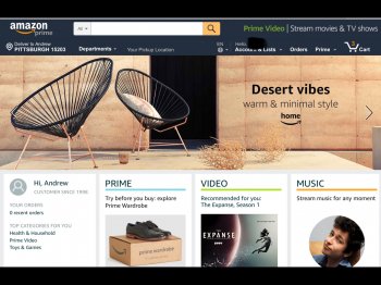
Amazon is still good, not everything is all light blue on white, and they haven’t unnecessarily changed their format around for years. Actionable commands seem obvious. The search box is actually a box, and not a small representation of a spy glass requiring you to press twice to search, once to open a search box and a second time to enable the cursor, one of the biggest crimes against good design in many of today’s tidied up, unobtrusive, simplified websites. When you look at an item, you can see most all you need up top right away on the page, to get a sense of things and then can scroll down for additional info. Although, quite frighteningly, occasionally I’ll see an item where the Amazon page is completely redone in stark white with light blue “buttons.” I hope this is not foreshadowing of things to come.

eBay too, though I’ve run into pages represented in some new type of white and blue font flat design interface with everything all jumbled up from how it’s been for years, very unnecessarily changed for the worse.

AE9786C1-8E91-4ABC-9051-E232C8E38F7B.jpeg

C1B48E4B-E566-4F11-AEFC-C3EF56093C78.jpeg

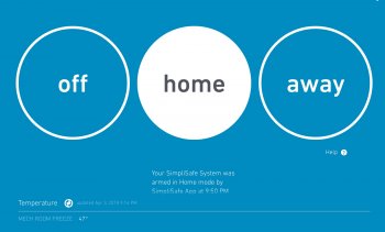
A third example of a well laid-out and easy to use site was the simplisafe website. Sure, it was blue, light blue, white, and gray, but it was done in an efficient way that works well, not just to meet the blue and white and gray fad. Lots of info you need, right in front of you upon initial page load.

5D5E1B4E-A55A-4870-9FE6-E8D0442C02CF.jpeg

Until they ruined it by upgrading to this. Amazingly effective use of available space, isn’t it? Don’t you love how easy it is to read the text at the bottom?

6F6A7F04-B0C7-4A2B-98F9-54A228F32D3B.jpeg

How are those?
 
Last edited:

Tozovac

macrumors 68040
Original poster
Jun 12, 2014
3,020
3,226
https://steeltubeinstitute.org/hss/hss-information/faqs/miscellaneous/

Another awful site. Too much wasted space, too much scrolling required to get oriented and started with using the home page, too much thin, narrow white font on pastel backgrounds, too much flat design and the resulting pauses & guesses & trials to find out what's clickable vs. info-only, and that blasted general low-contrast appearance that looks too much like what a "dead end" or "expired" website looked like 5+ years ago; for the first ~15-20 years of websites, dead-end/expired websites were given a certain appearance using grey text and/or bland, flat, low-contrast pages to indicate "nothing to see here." And even on active websites, grey text meant a non-available option or, if present in a white box, it meant "fill data in this box." Now that appearance seems to be an industry standard.

Does anyone think this is the pinnacle of good design, with no room to improve further? Or is this just all the lemmings following one another blindly?

When might this flat low-contrast space-wasting one-size-and-appearance-fits-all fad pass? Soon I hope. Until then, I'll keep wasting time scrolling & clicking & guessing on sites like this example.
 
Last edited:

cyb3rdud3

macrumors 68040
Jun 22, 2014
3,341
2,088
UK
I wouldn't go as far as saying it is the pinnacle of good design, but I like more about it than I dislike...It is a good, fast responsive design that works on all devices for me.

I don't like the white text, and hate the 'lines' but other than that it works for me.
[doublepost=1524835143][/doublepost]
You could’ve easily found an answer by reading some of my posts one or two pages up, but I’m glad to answer.

Amazon is still good, not everything is all light blue on white, and they haven’t unnecessarily changed their format around for years. Actionable commands seem obvious. The search box is actually a box, and not a small representation of a spy glass requiring you to press twice to search, once to open a search box and a second time to enable the cursor, one of the biggest crimes against good design in many of today’s tidied up, unobtrusive, simplified websites. When you look at an item, you can see most all you need up top right away on the page, to get a sense of things and then can scroll down for additional info. Although, quite frighteningly, occasionally I’ll see an item where the Amazon page is completely redone in stark white with light blue “buttons.” I hope this is not foreshadowing of things to come.

eBay too, though I’ve run into pages represented in some new type of white and blue font flat design interface with everything all jumbled up from how it’s been for years, very unnecessarily changed for the worse.

View attachment 758435

View attachment 758437

A third example of a well laid-out and easy to use site was the simplisafe website. Sure, it was blue, light blue, white, and gray, but it was done in an efficient way that works well, not just to meet the blue and white and gray fad. Lots of info you need, right in front of you upon initial page load.

View attachment 758433

Until they ruined it by upgrading to this. Amazingly effective use of available space, isn’t it? Don’t you love how easy it is to read the text at the bottom?

View attachment 758434

How are those?
ROFLMAO I hate three of them, look so old fashioned, way too busy and makes it very hard to find things...And I like one of them...Not hard to guess which are in which category....
 
  • Like
Reactions: Tozovac

Tozovac

macrumors 68040
Original poster
Jun 12, 2014
3,020
3,226
I wouldn't go as far as saying it is the pinnacle of good design, but I like more about it than I dislike...It is a good, fast responsive design that works on all devices for me.

I don't like the white text, and hate the 'lines' but other than that it works for me.
[doublepost=1524835143][/doublepost]
ROFLMAO I hate three of them, look so old fashioned, way too busy and makes it very hard to find things...And I like one of them...Not hard to guess which are in which category....

Ha, are you kidding? Hard to find on the two pages I consider to be intuitive and an efficient use of space? How so?

Plus, and this is an honest question, what is the expectation for a website to not be old-fashioned? Is the expectation that frequent radical change is always necessary? For me, changes in fashion & cars & paint colors will always change, and that's OK, as those are "soft" needs that help add flavor to life. Someone's style of pants does not prevent them or others from performing a work or recreational task efficiently and even enjoyably, generally. And there may be those who expect (demand?) a radical website or OS change every few years, because that works for them.

But expecting website design to change drastically year-by-year with the unfortunate foregoing (and occasional random reinventing) of certain UI and functional cues that "just work" is kind of like radially changing the design of a hammer every 5 years. What does that accomplish? Sure, subtle stylistic details of websites or hammers or gas station pumps will change over the years, but how much sense does it make to radically reinvent things like those?

Looking at the simplisafe website examples above, one I hate and you like, and vice versa; what was functionally wrong with the "old" design and how did the new design fix the wrongs? Honestly curious! I've yet to read any examples of how the new ways of website design is functionally better other than to hear they work better on mobile devices' small screens, which is arguable itself but also tosses out any consideration to desktop/laptop use optimization, to save a few bucks supposedly.
 
Last edited:

cyb3rdud3

macrumors 68040
Jun 22, 2014
3,341
2,088
UK
Ha, are you kidding? Hard to find on the two pages I consider to be intuitive and an efficient use of space? How so?
No kidding at all, those pages are a visual styling mess in my opinion. It's a good thing that search on both Amazon and Ebay work well enough as without it I'll have trouble finding anything...Just way too busy.
 

Tozovac

macrumors 68040
Original poster
Jun 12, 2014
3,020
3,226
No kidding at all, those pages are a visual styling mess in my opinion. It's a good thing that search on both Amazon and Ebay work well enough as without it I'll have trouble finding anything...Just way too busy.

Style is one thing. Function is another. How are the "old" sites functionally difficult to navigate, and is it really better to rely upon looking for the hamburger icon and pressing 2-3x to get to where you can get with 1 click currently? Don't you have to search and guess & trial when you hit the hamburger icon and then start digging thru submenus from there? It's even worse when a site has a hamburger icon, a gear icon, an ellipses icon, and a "face/head" icon, all with many buried functions one must hunt for.

If you stylistically prefer a simple appearance requiring more clicks to get to where you need, then there's no arguing with that. Stylistic preferences for one's self can never be argued. The issue is the one-size-fits-all approach forced upon users though, when over-simplified mobile-centric sites requiring more hunting & clicking is the only option presented, both for mobile and home/larger screens.
 
Last edited:

cyb3rdud3

macrumors 68040
Jun 22, 2014
3,341
2,088
UK
Style is one thing. Function is another. How are the "old" sites functionally difficult to navigate, and is it really better to rely upon looking for the hamburger icon and pressing 2-3x to get to where you can get with 1 click currently? Don't you have to search and guess & trial when you hit the hamburger icon and then start digging thru submenus from there? It's even worse when a site has a hamburger icon, a gear icon, an ellipses icon, and a "face/head" icon, all with many buried functions one must hunt for.

If you stylistically prefer a simple appearance requiring more clicks to get to where you need, then there's no arguing with that. Stylistic preferences for one's self can never be argued. The issue is the one-size-fits-all approach forced upon users though, when over-simplified mobile-centric sites requiring more hunting & clicking is the only option presented, both for mobile and home/larger screens.
Considering the success in the markets of many of such services, supported by UX labs I have to respectfully disagree with the last paragraph. I've worked on many Tier-1 banking digital on boarding systems and the new approaches is a real differentiator that customers prefer and even switch accounts for. Mobile first is a very good philosophy and strategy, proven through key demographic studies as well. The times of sitting behind a PC to do your stuff online are gone.
[doublepost=1524838359][/doublepost]PS. The hamburger should only be displayed if the menu structure is too large for the screen. If it appears on the desktop then, in my opinion, something is already wrong or just way too many menu options...
 

Tozovac

macrumors 68040
Original poster
Jun 12, 2014
3,020
3,226
Considering the success in the markets of many of such services, supported by UX labs I have to respectfully disagree with the last paragraph. I've worked on many Tier-1 banking digital on boarding systems and the new approaches is a real differentiator that customers prefer and even switch accounts for. Mobile first is a very good philosophy and strategy, proven through key demographic studies as well. The times of sitting behind a PC to do your stuff online are gone.
[doublepost=1524838359][/doublepost]PS. The hamburger should only be displayed if the menu structure is too large for the screen. If it appears on the desktop then, in my opinion, something is already wrong or just way too many menu options...

Considering the number of times relatives text or call me in frustration trying to understand how to maneuver thru an app or website on their no-longer-intuitive ipad (yes I'm blending in mobile apps into a discussion on less-than-ideal websites, since iOS has similarly moved into this grey/blue/white flat-design one-approach-works-for-all direction as websites have) which never happened before 2013, honestly, and considering the aggravation I feel when having to fumble and discover how to get certain things done when a website becomes "new and improved" into the caricature "white text on blue background flat design," I'd have to respectfully disagree that we're in an optimized scenario.

As far as abandoning desk/laptops - Touch/tap mobile devices will always be best for Content while type/mouse laptop/desktops will always be best for Productivity. Just like only some of our meals (pizza, fast food) is best enjoyed by hand while most of our big meals need the right hand-held input devices (cutlery). Is it possible that the quantity of time spent by consumers taking in content on a mobile device is haphazardly being over-prioritized over the quality of time spent being productive on a larger lap/desktop device?

Unless you tell me you yourself perform 100.00% of your computing needs on a mobile device (like the Apple commercial where the "smart and connected" girl doesn't even know what a computer is), it's awful hard to buy your justification. :)

I'll see later if I can find examples of hamburgers & ellipses & face icons on a website or app, where it takes guessing to get oriented and complete actions needed. I'm blending in apps here since so many websites are making their mobile/online website parrot their mobile app, Simplisfe being the absolute worst in that regard, wasting a ton of screen space in the process.
 
Last edited:

cyb3rdud3

macrumors 68040
Jun 22, 2014
3,341
2,088
UK
I’m sorry, but I take result from ux labs with a cross section of society any day over a relative from you calling for your help. Empirical evidence is very important otherwise it is merely opinion.

That is why not only I but in general the w3c-aa standards already confirm that low contract difference (your example of white text on a light background) is not only a bad idea but excludes many people from an accessibility perspective.

As an architect and developer ofcourse I’m not 100% mobile device. My wife is though. However this yet again is not about me or those around me. Look at the web traffic, get to know your audience, and get the details of what technology they use.

And more importantly than that. Take digital onboarding of a service. From an onboarding perspective the vast majority these days will definitely start on a mobile device, and hopefully finish as well. Although interestingly studies show that the USA big corporate are way behind. Anyway those service get done from a responsive device. But then take the processing of that data; perform the KYC/AML or other checks. That is a repetitive activity where you can train people, and require many more functions. Generally that is done from a desktop and besides accessibility standards (again important by law in countries outside the USA, still find that strange) there are fewer constraints.

Or in short, evidence is valued over opinion. Accessibility is very important.
 

Tozovac

macrumors 68040
Original poster
Jun 12, 2014
3,020
3,226
I’m sorry, but I take result from ux labs with a cross section of society any day over a relative from you calling for your help. Empirical evidence is very important otherwise it is merely opinion.

That is why not only I but in general the w3c-aa standards already confirm that low contract difference (your example of white text on a light background) is not only a bad idea but excludes many people from an accessibility perspective.

As an architect and developer ofcourse I’m not 100% mobile device. My wife is though. However this yet again is not about me or those around me. Look at the web traffic, get to know your audience, and get the details of what technology they use.

And more importantly than that. Take digital onboarding of a service. From an onboarding perspective the vast majority these days will definitely start on a mobile device, and hopefully finish as well. Although interestingly studies show that the USA big corporate are way behind. Anyway those service get done from a responsive device. But then take the processing of that data; perform the KYC/AML or other checks. That is a repetitive activity where you can train people, and require many more functions. Generally that is done from a desktop and besides accessibility standards (again important by law in countries outside the USA, still find that strange) there are fewer constraints.

Or in short, evidence is valued over opinion. Accessibility is very important.

So your empirical input (from others you likely never have met) is more insightful than my empirical input from myself and others from whom I repeatedly hear grief every few months or after most iOS updates and "improvements" as well as after a website is redesigned and "improved" to look like a mobile app. Gotcha. :)
 

cyb3rdud3

macrumors 68040
Jun 22, 2014
3,341
2,088
UK
So your empirical input (from others you likely never have met) is more insightful than my empirical input from myself and others from whom I repeatedly hear grief every few months or after most iOS updates and "improvements" as well as after a website is redesigned and "improved" to look like a mobile app. Gotcha. :)

Blimey, do you even comprehend how a UX lab gets conducted? But hey, it is makes you happy to base your decision on those who share their grieve with you then fair enough. Likewise there is in my option absolutely nothing wrong with having the opinion that you have. Where the mistake comes is to extrapolate that to others and assume they are the same.

When people do this stuff for a living, and on a large transactional scale for digital on boarding and conversion there is a lot of money spent in testing it. Especially for those services that have USP's other than being the cheapest or the only place...and then there are law and regulations to content with as well.
 

Tozovac

macrumors 68040
Original poster
Jun 12, 2014
3,020
3,226
Or in short, evidence is valued over opinion. Accessibility is very important.

How is evidence gathered? Unless it's gathered by impartial robots, isn't input provided by others based off their opinions?

Using the Simplisafe website example: beyond your sentiment that it "looks old fashioned," what was the accessibility problem with their desktop site for desktop/laptop users? Unless a company is specifically making their desktop site to be a 100% repeat of the mobile website solely due to financial reasons, and assuming that financial burden is so onerous, I just can't see how the oversize button space-wasting website layout is an improvement over the "old fashioned" site, as you called it, as an example of my sentiment that too many websites are unnecessarily dumbed-down and made more cumbersome to use in the process.

Simplisafe has gone on record saying their new website, which is a virtual parrot of the mobile site, was done to "unify the webapp and smartphone app interfaces so that our customers only need to learn how to navigate the Dashboard once." Do companies really think users aren't smart enough to easily use two slightly different but well-designed apps/websites that more effectively use the available screen space and input system (touch vs. mouse)? Maybe I should be more impressed than I am that I am continually able to make my way around each new restaurant, store, and business I enter without falling into a crying pool of tears.

Your citing "old" and "fashion" only further supports my argument of too much change for the sake of change these past few years. Even today's "modern, fresh, clean" look will get old...then what will brilliant web/UIx designers tasked with creating something "new and different" subject users to?
 

cyb3rdud3

macrumors 68040
Jun 22, 2014
3,341
2,088
UK
Have you ever run or participated in a UX lab? Considering your response I would find an affirmative answer really hard to believe.

It’s a totally objective experience and measurement of the user journey, their behaviour, time it takes for action and more importantly time it takes for none action, whilst tracking their eyes, measuring vital signs, brain activity. You name it. Seriously dude, that is science and comparison. Not subjective opinion.
 
  • Like
Reactions: Akrapovic and fig

Tozovac

macrumors 68040
Original poster
Jun 12, 2014
3,020
3,226
Have you ever run or participated in a UX lab? Considering your response I would find an affirmative answer really hard to believe.

It’s a totally objective experience and measurement of the user journey, their behaviour, time it takes for action and more importantly time it takes for none action, whilst tracking their eyes, measuring vital signs, brain activity. You name it. Seriously dude, that is science and comparison. Not subjective opinion.

I haven’t, but I would love to. I would love to see if I am the only person who fumbles more often now with navigating a typical site than most.

Given that so many websites today require scrolling the screen up and down just to see all the options, even when there are few options relatively, I would love to see how a UIx lab judges scrolling behavior. Must be that more is better, with some justification that scrolling lets the user engage more and gauge context while in my mind, a truly good website would be arranged efficiently such that a majority of its content is quickly available on the first screen load without requiring scrolling, at least for an iPad or desktop experience.

A friend of mine sent me a link tonight when he was happy that the value of his car for insurance purposes rose. Here’s the link:

https://www.nadaguides.com/Cars/1992/Acura/NSX/2-Door-Coupe/Values

I wanted to value my own car, so I hit “change make” up top and started walking through the options.

Good God was the following experience annoying. With everything so spread out and borderless;contextless, and with certain advertising links mixed in with the selections you needed to make for valuating your car also mixed in with links for ratings of your car and other information about your, it took me much longer than it should have to wade through the process. Every option was light blue font with no differentiation between what was an option for your task at hand (valuing your car) versus something secondary to the process. Completely confusing and inefficient. But, it kept with the fad of the day of a borderless, spread out, low-context, button-cue-free UI.

Try valuing a a car and let me know what you think. I’d love to see if a UIx lab was performed for this site. Regardless of its results, it’s an awful site and a good example of what I complain about in too many awful websites today. I don’t complain because it’s fun — websites weren't always this annoying, just after they all started lemmings followomg a certain similar fad. Would you consider this to be a good website?
 
Last edited:

cyb3rdud3

macrumors 68040
Jun 22, 2014
3,341
2,088
UK
A lot of things I don't like about that page, I agree about the colours, and then a non-flat little box on the right. I wouldn't say that is typical of a good current day site though. It is picking the right tools and then bastardising them.

Saying that, it was easy to pick a card and get the details up. As such whilst I don't like it, it is functional and works.
 

Tozovac

macrumors 68040
Original poster
Jun 12, 2014
3,020
3,226
A lot of things I don't like about that page, I agree about the colours, and then a non-flat little box on the right. I wouldn't say that is typical of a good current day site though. It is picking the right tools and then bastardising them.

Saying that, it was easy to pick a card and get the details up. As such whilst I don't like it, it is functional and works.

Funny how that non-flat box draws your eye towards that actionable item, isn't it? :) Just like they used to be useful for before the madness of flat design washed them and Intuitive Design all away. :)

A spork is functional and works, but I would never trade out my drawer of silverware forks and spoons for sporks. That page is a poster child example of the issues I have with a majority of websites today. A lot of wasted white space, large images at the top of the screen uselessly taking up space and preventing any opportunity to place on one screen all the info needed for the task at hand, no bordering for context, lots of confusion as to what’s important, what’s an ad, what’s a link to other areas of the site......a lot of light blue text, confusing flat design to where anything looking like a button automatically draws your eye (like they’re designed to do!)....too much requiring the user to do a lot of scrolling around, and just very little subliminal differentiation of actionable vs. info-only to help the mind quickly, almost subconsciously, focus and proceed with the task at hand. Too many micro-delays that add up over time into outright annoyances. Yes, you can get the job done at most websites today, but at a noticeable level of inconvenience and in efficient and inefficiency that was not so readily present just a few missed years ago.

Oh, and of course there’s the dreaded sticky header that at least goes away after a while. Apple iOS won’t give me back fixed headers in safari, but damn fixed headers abound. Grrrrr.

Once again I wonder, who decided that a good website needed to just be white, with light blue text, all spread out, and flat? Then why do so many agree with this approach? Maybe it’s no wonder Scientology has lasted this long. :)
 
Last edited:

cyb3rdud3

macrumors 68040
Jun 22, 2014
3,341
2,088
UK
it only drew my attention because it doesn't fit it and looks horrible. No other reason than that.

All they've done wrong is not use a designer and mess with something good themselves to try and make it look a little bit different. And it is clear that who ever did that has no design, but worse no accessibility and UX background. It is just a bad site UI that is all.

There is nothing wrong with the bootstrap framework nor the material design framework. That is where a lot of these sites stem from. The advantages outlay the disadvantages since you get a fully responsive, and accessible website out of the box. Where it goes wrong is when people start tinkering with little elements that they don't really understand.

I for one really wouldn't want to go back to the bad old days where sites aren't inclusive, can't be used with assistive tools, don't scales on multiple devices, heck don't scale on a single device, and are way too busy.

But ultimately it doesn't matter, a website is there for a purpose. If it doesn't fulfil that purpose than customers will go elsewhere if there is a better proposition.
 

Tozovac

macrumors 68040
Original poster
Jun 12, 2014
3,020
3,226
I for one really wouldn't want to go back to the bad old days where sites aren't inclusive, can't be used with assistive tools, don't scales on multiple devices, heck don't scale on a single device, and are way too busy.

But ultimately it doesn't matter, a website is there for a purpose. If it doesn't fulfil that purpose than customers will go elsewhere if there is a better proposition.

Problem is, however, all this mobile-first focus results in many, many websites on an iPad or desktop being silly wasters of space and just not as easy to use as what they replaced. So yes, you gain the ability to scale and fit things on a mobile device to your liking, but not without many trade-offs to the larger screen devices.

Second problem though is that there aren’t very many alternatives as you suggest. 2013-15’s random reinventions of mobile/website UI design seems to of had a double whammy effect of putting bad tools then into truly experienced users who create even worse inventions using sub-optimized tools focusing first and foremost on the smallest of screens instead of equipping designers having varying degrees of skill with the most robust tools for the job/screen at hand.
 

Michael Scrip

macrumors 604
Mar 4, 2011
7,931
12,488
NC
Here's a new entry added to my gripe-list.

My small regional bank just merged with a larger regional bank. And that means a new website. Hooray.

The old website had the login and password fields visible on the homepage. It allowed LastPass to auto-fill in my desktop browser. And it took one click to log in.

However... the new website makes you click on a "Log In" button and an animated CSS/Javascript login box slides down from the navigation bar. Seriously?

Then... since the fields weren't visible at the start... it doesn't auto-fill my login name anymore. I now have to click the little LastPass icon to have it fill in my login name.

But it gets worse.

Once I do all of the above to have LastPass fill in my name... I click and it takes me to a 2nd screen to fill in my password!!!

All told... it now takes me five clicks to log into my bank in a web browser... where it used to take one click on the old website.

Why do we need multiple pages for logins? It really screws up these automated password managers.

I've tried various way to make LastPass negotiate this nonsense using custom fields and whatnot. But it's not working.

Gosh... why make sites harder to use?

EDIT:

My new bank's iOS app uses the old-school picker to make selections... Yuck!

wQFtQuE.gif
 
Last edited:

cyb3rdud3

macrumors 68040
Jun 22, 2014
3,341
2,088
UK
I hate that as well. Although auto login is not good practise, please switch it off :) I do agree with the rest of the post.
 

Michael Scrip

macrumors 604
Mar 4, 2011
7,931
12,488
NC
I hate that as well. Although auto login is not good practise, please switch it off :) I do agree with the rest of the post.

It's good practice to have a long, complex password which necessitates the need for a password manager...

...yet the website makes you jump through a bunch of hoops in order to use one.

That's the part that bothers me. :p
 

cyb3rdud3

macrumors 68040
Jun 22, 2014
3,341
2,088
UK
It's good practice to have a long, complex password which necessitates the need for a password manager...

...yet the website makes you jump through a bunch of hoops in order to use one.

That's the part that bothers me. :p
I was referring to auto fill, that is from a security perspective a seriously bad idea. Using a password manager itself isn’t. I mean you wouldn’t want to give your password to potentially the wrong site would you?
 
Register on MacRumors! This sidebar will go away, and you'll see fewer ads.