Become a MacRumors Supporter for $50/year with no ads, ability to filter front page stories, and private forums.
Status
The first post of this thread is a WikiPost and can be edited by anyone with the appropiate permissions. Your edits will be public.

gwhizkids

macrumors G4
Jun 21, 2013
11,757
18,538
I don’t have that side bar on iPadOS 14 (there’s only a narrow overlay maybe 2-3 % of the screen width), so that must have been from iPadOS 15 on.

This is the iOS subforum, by the way, there is a separate iPadOS subforum.

Virtually no one goes to the iPad forum. I question even why it’s separate. I realize there are differences but not enough to justify a separate venue, IMO.
 

MozMan68

macrumors demi-god
Jun 29, 2010
6,074
5,162
South Cackalacky
Virtually no one goes to the iPad forum. I question even why it’s separate. I realize there are differences but not enough to justify a separate venue, IMO.

I actually created the first separate thread a couple of years ago, but only because iPadOS was brand new and thought any differences should be discussed.

I didn’t do it after that initial thread as like you have stated, I just didn’t think it was worth separating out.
 

gank41

macrumors 601
Mar 25, 2008
4,043
4,585
I actually created the first separate thread a couple of years ago, but only because iPadOS was brand new and thought any differences should be discussed.

I didn’t do it after that initial thread as like you have stated, I just didn’t think it was worth separating out.
I don’t contribute much over there but it is nice to have everything in its own category.
 
  • Like
Reactions: klasma and Populus

gwhizkids

macrumors G4
Jun 21, 2013
11,757
18,538
I actually created the first separate thread a couple of years ago, but only because iPadOS was brand new and thought any differences should be discussed.

I didn’t do it after that initial thread as like you have stated, I just didn’t think it was worth separating out.

It was definitely a good idea, but as the features in both OSes largely track each other, if only separated by a year, it doesn’t make much sense to have them in different places. If anything, have iPadOS in a separate thread, but in the iOS forum, which could be called the iOS/iPadOS forum.
 

imdog

macrumors 6502
Jun 20, 2017
339
768
Disneyland
One of my favorite iOS updates in a long time, I love the look & sounds of some of the new things. Such a satisfying experience, I love the animations for AirDrop/NameDrop etc it feels like you're in the future
 
  • Like
Reactions: Populus and Brad7

klasma

macrumors 603
Jun 8, 2017
5,822
16,469
Virtually no one goes to the iPad forum. I question even why it’s separate. I realize there are differences but not enough to justify a separate venue, IMO.
Ok, I was confused at first by the post until iPadOS was mentioned at the end, and I do look into the iPadOS subforum for related information.
 

Canyda

macrumors 65816
Sep 7, 2020
1,017
1,242
One of my favorite iOS updates in a long time, I love the look & sounds of some of the new things. Such a satisfying experience, I love the animations for AirDrop/NameDrop etc it feels like you're in the future
I updated my work phone to iOS 17 this week (they told us to wait so it could be tested, etc) and the first time I put my work phone and my personal phone in my pocket together I got the weird NameDrop transfer sound and it freaked me out.
 
  • Haha
Reactions: imdog

dburkhanaev

macrumors regular
Aug 8, 2018
203
110
What I don't understand here is it seems almost everything this person was complaining about, from seeing pictures to pronouns, remain completely optional. I have contacts where the only thing I have on them is their name and a phone number. I get a blank card with their initials as a monogram, and that's it. If they call me, that's exactly what I see. There is no additional info, because I don't have any additional info. So this whole idea of "having third party control" or w/e seems odd because this already existed? Unless I didn't understand what they were having issues with.

But from what I've seen, all the new things added with iOS 17 in regards to contacts are totally optional and never have to be used if unwanted.
It’s not optional, and I’m not the only one to notice See here on MacRumors

It can be a monogram only. That doesn’t let you set a photo in the center of the screen and away from the Phone.app call UI. You have to take a photo and use an app to put it on a rectangular background and use the modified photo as a contact card to get the minimal effect of seeing your contacts photo and not have the entire UI hijacked. It’s full screen photo, monogram, or both. But not name, small 1/3 screen photo, untouched call UI.

I don’t understand how you don’t see that your whole screen got hijacked if you want to see your friend/families photo during a call. I don’t care about business contacts. But it would be nice to trim the UI elements back or have a classic style photo card that keeps certain elements inline with prior versions of iOS that did caller ID and contact cards much cleaner and a bit less distracting.

If you like the changes Apple made, that’s okay. I live with it. I’m not at the point of buying Android. But I don’t like it. I shouldn’t have to take 1,000 degrees and metric ton of denial based copium because I don’t like it and I’d like more customization to tone down the caller card and phone app interactions a little.

There’s a heavy heap of narcissism going on in contacts & phone app for iOS 17. It’s not all optional. I’ve set monogram for a few users now. I had to. Their photos often had bright colors that didn’t frost well behind the phones UI. It made the thinner buttons have less contrast and made the user experience worse. I would have preferred to see their smiling face when they call me. But I’m not taking their photo and making a custom card that centers their photo in the middle of the phone app and contact poster for when the phone rings.

I don’t think one “classic” style contact poster or in place of that, a toggle for classic style for the phone app in settings, is a bad option. It would also give more choice.
 

dburkhanaev

macrumors regular
Aug 8, 2018
203
110
Sonce you obviously did not follow the trail of this specific topic of conversation and picked my comment out of context and went totally flying off the handle like an adolescent…. (proving my comment to be bang on the money) It’s an OPTIONAL field. Obviously there was demand for it (I’ve seen posts over the last few years from people wanting it), so why berate Apple for giving the option, when it’s not compulsory?

That’s the point, but then that gets ignore by people that want a reason to complain about Apple being ‘Woke’ - which comes back to my point: Manufacted outrage.

I’m not using that optional feature and it doesn’t bother me being there. Same as other OPTIONAL things in iOS that I don’t use and don’t care about.

It seems like you’ve hopped on this bandwagon to specifically attack me, and gaslight others into thinking I’m a nasty person, because you didn’t like my comment to you on a different matter, though, so to be honest, I’m doubtful as to if your opposing opinion is genuine or just out of spite towards me. I don’t waste much time on people that bring baggage from other discussions to re-hash them under another thread, so I’ll not be replying to you further.
You’re way late to conversation here. The moment that was seen as optional I was the first to call mea culpa. So far back, I’d have to dig to reference it at this point.

The non-optional matter of contention is with the contact posters and the way phone app now treats contact photos by letting them take over the whole screen, sometimes bleeding out the Phone.app call UI buttons. This needs refining.
 

Ansath

macrumors demi-god
Original poster
Jun 9, 2018
4,460
4,827
England
You’re way late to conversation here. The moment that was seen as optional I was the first to call mea culpa. So far back, I’d have to dig to reference it at this point.

The non-optional matter of contention is with the contact posters and the way phone app now treats contact photos by letting them take over the whole screen, sometimes bleeding out the Phone.app call UI buttons. This needs refining.

You’ve decided to reply to me 3 weeks after the post you quoted, so your way late to reply….. everyone else had moved on long ago mate.

If you wanna harp on, go for it.
 
  • Like
Reactions: MozMan68

aria26

macrumors newbie
Sep 7, 2023
25
31
does anyone noticed a difference on haptic feedback? notifications coming from apps like twitter and instagram feels like the taptic engine is broken with ios 17.1. maybe it is related with my phone i didn't understand. using 15 pro max
 

Gorshkov

macrumors newbie
Dec 6, 2023
7
1
It’s not optional, and I’m not the only one to notice See here on MacRumors here

It can be a monogram only. That doesn’t let you set a photo in the center of the screen and away from the Phone.app call UI. You have to take a photo and use an app to put it on a rectangular background and use the modified photo as a contact card to get the minimal effect of seeing your contacts photo and not have the entire UI hijacked. It’s full screen photo, monogram, or both. But not name, small 1/3 screen photo, untouched call UI.

I don’t understand how you don’t see that your whole screen got hijacked if you want to see your friend/families photo during a call. I don’t care about business contacts. But it would be nice to trim the UI elements back or have a classic style photo card that keeps certain elements inline with prior versions of iOS that did caller ID and contact cards much cleaner and a bit less distracting.

If you like the changes Apple made, that’s okay. I live with it. I’m not at the point of buying Android. But I don’t like it. I shouldn’t have to take 1,000 degrees and metric ton of denial based copium because I don’t like it and I’d like more customization to tone down the caller card and phone app interactions a little.

There’s a heavy heap of narcissism going on in contacts & phone app for iOS 17. It’s not all optional. I’ve set monogram for a few users now. I had to. Their photos often had bright colors that didn’t frost well behind the phones UI. It made the thinner buttons have less contrast and made the user experience worse. I would have preferred to see their smiling face when they call me. But I’m not taking their photo and making a custom card that centers their photo in the middle of the phone app and contact poster for when the phone rings.

I don’t think one “classic” style contact poster or in place of that, a toggle for classic style for the phone app in settings, is a bad option. It would also give more choice.
Your point about having to sacrifice the caller's actual smile for a frosted backdrop or custom-made poster to avoid UI clash is valid. It would be great if Apple offered more flexibility.
 

zorinlynx

macrumors G3
May 31, 2007
8,182
17,719
Florida, USA
Your point about having to sacrifice the caller's actual smile for a frosted backdrop or custom-made poster to avoid UI clash is valid. It would be great if Apple offered more flexibility.
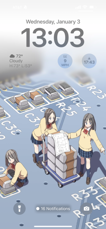
Anyone else annoyed that when you set a lighter colored wallpaper you can't see the time and signal bars on the top easily? Is there a way to fix this? IMG_1064.png
 
  • Like
Reactions: redbeard331

contacos

macrumors 601
Nov 11, 2020
4,772
18,507
Mexico City living in Berlin
Can we talk about why editing the Home Screen is still such a mess on iOS?

Every time I try to move an app to the folder on another page, this crap happens. I literally have to put the folder on another screen first, to be able to add an app inside cuz it keeps flipping back and forth. Infuriating and I am not exaggerating.

This could easily be avoided by finally letting us put those damn apps anywhere on the screen after 17+ years! Does android have a patent on that or something?

 
  • Like
Reactions: pacorob

adrianlondon

macrumors 603
Nov 28, 2013
5,021
7,569
Switzerland
Anyone else annoyed that when you set a lighter colored wallpaper you can't see the time and signal bars on the top easily? Is there a way to fix this?
Had the same issue. I edited the wallpaper (in Preview on my Macbook) and added a black bar across the top. Not the most elegant solution but at least I can see the icons now.
 

klasma

macrumors 603
Jun 8, 2017
5,822
16,469
Anyone else annoyed that when you set a lighter colored wallpaper you can't see the time and signal bars on the top easily? Is there a way to fix this? View attachment 2332344
I use Smart Invert Colors (for websites that don’t support dark mode) and have it assigned to the accessibility shortcut (triple-click on power button). That also happens to be a workaround for the problem you mention.

By the way, do you have a source for that wallpaper?
 
  • Like
Reactions: Populus

scorpio vega

macrumors 65816
May 3, 2023
1,245
1,565
Raleigh, NC
Anyone else annoyed that when you set a lighter colored wallpaper you can't see the time and signal bars on the top easily?
I mean it makes sense...your background is nearly white and the text for the bars and time are also white.
This could easily be avoided by finally letting us put those damn apps anywhere on the screen after 17+ years! Does android have a patent on that or something?
Apple is about uniformity. Having a haphazard mess like Android doesnt fit that.
 
  • Haha
Reactions: klasma

zorinlynx

macrumors G3
May 31, 2007
8,182
17,719
Florida, USA
I use Smart Invert Colors (for websites that don’t support dark mode) and have it assigned to the accessibility shortcut (triple-click on power button). That also happens to be a workaround for the problem you mention.

By the way, do you have a source for that wallpaper?
Yeah, it's from here:


Instantly fell in love with it and want it as a wallpaper, but kinda want to be able to see my signal bars!
 
  • Love
  • Like
Reactions: Populus and klasma

zorinlynx

macrumors G3
May 31, 2007
8,182
17,719
Florida, USA
I mean it makes sense...your background is nearly white and the text for the bars and time are also white.
Well, other elements on the home screen turn dark with a lighter color wallpaper, notice the widgets and time are dark. And the notification text at the bottom has a dark shadow so you can read it. But that somehow doesn't apply to the status bar.

I reported it as a bug in any case. I hope it gets fixed so I can use lighter wallpapers like that one.
 

adrianlondon

macrumors 603
Nov 28, 2013
5,021
7,569
Switzerland
Well, other elements on the home screen turn dark with a lighter color wallpaper, notice the widgets and time are dark. And the notification text at the bottom has a dark shadow so you can read it. But that somehow doesn't apply to the status bar.

I reported it as a bug in any case. I hope it gets fixed so I can use lighter wallpapers like that one.

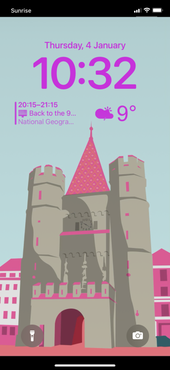
This is the lockscreen wallpaper I use on my iPhone 11 (it's a drawing from Basel, Switzerland where I live). Apart from the black bar across the top (which has the added benefit of hiding the notch) I also put a black bar on the bottom, as I think it looks slightly better.

I think I'll also log a bug/Feedback.

IMG_2411.png
 
Register on MacRumors! This sidebar will go away, and you'll see fewer ads.