I'm probably in the minority, but my favorites are the 2006 and 2012 iterations. The Cap'm icon has a nice gradient, but I think it looks slightly off as a whole for some reason.
Become a MacRumors Supporter for $50/year with no ads, ability to filter front page stories, and private forums.
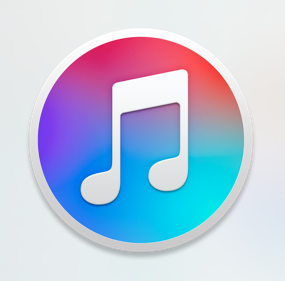
El Capitan's iTunes Icon
- Thread starter J.gerbes
- Start date
- Sort by reaction score
You are using an out of date browser. It may not display this or other websites correctly.
You should upgrade or use an alternative browser.
You should upgrade or use an alternative browser.
I actually really like that Mail icon, but will pass on the iTunes one. Source?
It is from free icon set Glacier
https://glaciericons.com
https://dribbble.com/shots/1933112-Glacier
Way out of date. And the colors are awful.
Perhaps it is "out of date" because it depicts a compact disc, but about colors being awful: Colors are way better than new iteration of the iTunes icon that Apple has just released, apparently made by preschoolers.
Last edited:
The new icon has been released. Seeing the final version does't change my mind, to me the red one still looks better on OS X.
Here is the updated timeline:

1024x1024:

Here is the updated timeline:
1024x1024:
The new icon has been released. Seeing the final version does't change my mind, to me the red one still looks better on OS X.
I was a fan of the first render released at WWDC. It made the iOS and MacOS icons complementary.
The iOS icon actually looks more like the newly released OS X icon. Colored note against a white background.I was a fan of the first render released at WWDC. It made the iOS and MacOS icons complementary.
Last edited:
The new icon has been released. Seeing the final version does't change my mind, to me the red one still looks better on OS X.
It certainly isn't my favourite itunes icon, but I prefer the final rendition over the first rendition released at WWDC. The multi-coloured background was just too much for my eyes!
The iOS icon actually looks more like the newly released OS X icon. Colored note against a white background.
Correct. Before the notes cutout from the original MacOS icon was what was featured on the iOS icon. So you had the color cut out of the MacOS icon and put on the iOS icon. I liked that better
")

I like this one too. Maybe they thought the rainbow background was too loud/busy. I don't really have a preference at this point. Not like my opinion matters to apple
Did apple give me the wrong icon then? The one I have isn't custom, it changed when I got the update and mine is the one shown off in WWDC 2015 with the rainbow background, as I said above.

Why does mine look like this?
Because that's the iTunes 12.2 icon... duh.
You guys know that if you prefer the older icons, you can change it right?
I love custom icons, so the default icon changing never meant anything. I do love the new 12.2 icon with the colored music note and border on white.
I love custom icons, so the default icon changing never meant anything. I do love the new 12.2 icon with the colored music note and border on white.
I'm happy with the change. It's inline with their use of gradients. With a wide variety in hues, only use a little. Something like blue to red, or a whole bunch of colors, is too much to fill a whole icon. Most icons go light blue to dark blue, light orange to dark orange, purplish-blue to blueish-purple, etc. But when it's such a wide difference in hues, it's overpowering to have it fill the whole icon, so just have a sliver of color. For example:
![os-x-10-11-white_2x.png]()
![ios-9-white_2x.png]()
![watchos-2-white_2x.png]()


I don't care about the logo as much as I care about iTunes being bloatware. How about making a simple app for.... you know, JUST TUNES instead of cramming iPod, iPad, iPhone support, a music, video and bookstore, etc. I just want music, nothing else.
Why so many colors? Doeswant you to spend 5 minutes looking at the app icon before opening it?
"I think there is a profound beauty in simplicity." - Jony Ive
Well this is the complete opposite of that. Too messy, too noisy. Same goes for the iOS Music app.
By that logic every icon should only have a color or two. How do you feel about Photos? That has way more colors.
I don't care about the logo as much as I care about iTunes being bloatware. How about making a simple app for.... you know, JUST TUNES instead of cramming iPod, iPad, iPhone support, a music, video and bookstore, etc. I just want music, nothing else.
Then only use iTunes for music playback. Do you realize no one is forcing you to go in the stores right?
It's the same for Photos. Too many colors and the icon doesn't have anything to do with the functionality of the app. Same with Game Center.By that logic every icon should only have a color or two. How do you feel about Photos? That has way more colors.
Then only use iTunes for music playback. Do you realize no one is forcing you to go in the stores right?
Large libraries crash often (10,000+ mp3s) and it's a resource hog as well. I prefer to use Vox although since Coppertino took over, it's been high on resources as well. OS X badly needs a solid MP3 player that focuses only on music.
iTunes is a complete mess.
Use QuickTime. It plays audio files quickly and efficiently. Although there isn't support for creating libraries, playlists, etc.Large libraries crash often (10,000+ mp3s) and it's a resource hog as well. I prefer to use Vox although since Coppertino took over, it's been high on resources as well. OS X badly needs a solid MP3 player that focuses only on music.
iTunes is a complete mess.
Use get info on any audio file and change open with to QT, then click change all…
What about the KUPO posted above me? I like that one.Because that's the iTunes 12.2 icon... duh.
Attachments
Register on MacRumors! This sidebar will go away, and you'll see fewer ads.