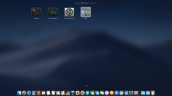
Hi, I'm using MacOS 10.14 on my 2012 iMac which is my main computer (risky, I know) and for some reason, I can't get the accent colour to show up at all in the menu bar, I was wondering if this is an issue that you've fixed or have you just not come across it? Thanks.
Become a MacRumors Supporter for $50/year with no ads, ability to filter front page stories, and private forums.
macOS 10.14 Mojave: All The Little Things
- Thread starter Galaxas0
- WikiPost WikiPost
- Start date
- Sort by reaction score
You are using an out of date browser. It may not display this or other websites correctly.
You should upgrade or use an alternative browser.
You should upgrade or use an alternative browser.
- Status
- The first post of this thread is a WikiPost and can be edited by anyone with the appropiate permissions. Your edits will be public.
Hi, I'm using MacOS 10.14 on my 2012 iMac which is my main computer (risky, I know) and for some reason, I can't get the accent colour to show up at all in the menu bar, I was wondering if this is an issue that you've fixed or have you just not come across it? Thanks.
It was never an issue for me, so sorry I can't be more helpful.
Hi, I'm using MacOS 10.14 on my 2012 iMac which is my main computer (risky, I know) and for some reason, I can't get the accent colour to show up at all in the menu bar, I was wondering if this is an issue that you've fixed or have you just not come across it? Thanks.
Me either.
Accents on buttons etc are changed but not the menu icon.
The long-time Mac OS X option for Blue or Graphite has been replaced by an accent color.
View attachment 764497 View attachment 764498
Open apps and those pinned to the Dock now have a separator between them.
View attachment 764496
I've been looking everywhere for a screenshot which shows an accent color besides red. Would you be so kind as to show a screenshot per color? I'm curious to see. Y'know, plenty of people reviewing this completely miss the feature, even though it's DIRECTLY below the Light / Dark buttons.
[doublepost=1528250444][/doublepost]Can someone post the new login window?
Page 6 of this thread has various other screenshots.
SO awesome. Thanks for showing some screenshots. I looked at several reviews which never even mentioned this feature (even though it's in plain sight).
[doublepost=1528250696][/doublepost]
You are using Dark Mode with the Dynamic wallpaper which will do nothing. Switch to Normal Mode and then choose Dynamic wallpaper for it to be of any use.
You can only use the dynamic wallpaper if you're in Light Mode? I understand that the UI has to alter, but I don't see why keeping it dark should force the wallpaper from altering. Well, anyway... not a huge deal.
[doublepost=1528250770][/doublepost]
![7jkvvBm.png]()
(Ignore the gap in the sidebar, it's not a bug, I just Photoshopped them out as they're personal files.)
It would be nice if the colored accent were to appear on a given selected Finder pane.
[doublepost=1528250914][/doublepost]
Desktop Stacks is becoming a much used and much loved feature already. Gotta love Apple for this. This is bringing me smiles each time I am using it.
[doublepost=1528176706][/doublepost]Something that might be of interest to people.
Dock now has Recently opened Apps. Don't know how many can it hold.
That is a MUCH more attractive 3D effect on those buttons. The utter flatness of the current ones is disgusting.
EDIT: or, perhaps, does it appear that way simply because the dark appearance makes things look more dramatic?
[doublepost=1528251153][/doublepost]
It seems that buttons look less flat with dark theme only. With light theme, they look same to me.
That is what I was thinking as well: the dark appearance makes the shadows look more dramatic. Well, either way, it looks substantially better.
[doublepost=1528251293][/doublepost]
Here is the new login/lock screen. Not hugely different but more optimized for retina displays. Profile picture is bigger and higher resolution, background isn't blurred, fades in and out, and the buttons are a bit different.
[doublepost=1528177865][/doublepost]
Inkserver is still 32 bit.
[doublepost=1528178005][/doublepost]There is also a new Legacy Software pane in System Information for things that need to be updated to work correctly in 10.14+
Good—good. Apple is actually going back to their older roots with some of these changes: accent colors; no stupid blurred login screen; software-updater back in its original location (Sys Prefs).
[doublepost=1528251550][/doublepost]
I went through and did the colors I left out in the original (except blue and graphite) for light and all expect default blue for dark.
View attachment 764790 View attachment 764791 View attachment 764792 View attachment 764794 View attachment 764795 View attachment 764796 View attachment 764797 View attachment 764798 View attachment 764799 View attachment 764800
Thanks for being the first to show them all! All those n00b tech-reviewers couldn't do such a simple thing as this (and they also left out several good features in their reviews, mainly focusing on Dark Mode).
Last edited:
I think, from the perspective of UI design, only certain colors would provide the right amount of readability / visibility / transparency. I'm not a UI person myself but it seems to me that not all colors would work or provide a good user experience, so that's why they limit the colors to a finite set. Just like for web pages, there is a concept of "safe colors".
I don't think any OS lets you choose any arbitrary color from the spectrum for systemwide UI elements, and I think it's for this reason.
Of course not all colors would work, but to us who treat our os and computer experience with great thoughtfulness and design, it would be awesome if we could truly create our own color schemes that work for our preferences like istatmenus lets you do
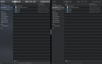
Split view has a grabber like on iPad. Not a fan of this tbh; too distracting in dark mode.
View attachment 764930
Splitview is horrible, IMO. I prefer using one of those applications with gives OSX a Snap®-like feature (Cinch, to name one).
Splitview is horrible, IMO. I prefer using one of those applications with gives OSX a Snap®-like feature (Cinch, to name one).
I use BetterTouchTool personally, but I agree.
The Back To My Mac setting in iCloud Settings seems to be MIA. Has Apple finally deprecated BTMM? It's been a clusterfsck all through the 10.13.x releases for sure.
First I'm hearing of that. Maybe they're re-tooling it and it wasn't yet ready for Beta 1?
Lovely. I may imagine things but remember seeing a picture of Steve and some candy colored aqua buttons ("look so good you'll want to lick them") on a keynote before OSX was released but I guess the just went for Blue/Graphite color options on final release. Now I hope for Dynamic Accent Colors so I don't have to choose.
Split view has a grabber like on iPad. Not a fan of this tbh; too distracting in dark mode.
View attachment 764930
Yes it is quite distracting and looks like a scroll bar. Also the gap is now much wider between split windows. Even on iOS 11 the split screen grabber is grey instead of white.
In my opinion there is no need for a grabber but it should atleast match the dark mode colours. Please provide feedback to Apple.
I don’t suppose you can drag a split view window off the screen to dismiss it, like on iPad?
Split view has a grabber like on iPad. Not a fan of this tbh; too distracting in dark mode.
View attachment 764930
I quickly painted some dark mode colour onto that split view grabber and it looks much less distracting.
1. Your original screenshot from Mojave
2. Colour match iOS 11 grabber
3. Colour match dark mode toolbar (left finder window)
4. Colour match lighter grey (finder window list)
5. Colour match darker grey (finder window list)
So far I'm not a huge fan of dark mode. Certain aspects are nice, but overall it's a little too dark for my tastes. Sadly, you cannot have the "light" theme with dark menubar and dock.
I want mine to be called bin but it's still labelled as trash in British English.'Trash' has been renamed to 'Bin' (not sure if it's because I'm using Australian English or not)
Or rubbish, or even rubbish bin. I'd also like Movies renamed to Films.I want mine to be called bin but it's still labelled as trash in British English.
Register on MacRumors! This sidebar will go away, and you'll see fewer ads.


