Become a MacRumors Supporter for $50/year with no ads, ability to filter front page stories, and private forums.

Tozovac

macrumors 68040
Original poster
Jun 12, 2014
3,012
3,220
Going back even further, blue-grey-white has been around forever. I still have an older Windows NT machine that throws out plenty of blue-grey-white screens. Granted those are easier to read since they haven't yet switched to sans serif fonts. Anyway, I don't think blue-grey-white is a new idea.

I don't disagree! However, it's the way it's been implemented (poorly) recently that stands out, IMHO. Salt has been around forever too but the minute a pizza maker poorly implements salt by over-dosing it in levels beyond what's been "typical" and "best in class" for decades, it's noticed!! Today, I contend that flat design using light blue/grey on white is far-overused than before ~2013 and in ways that no longer feel "right." When I go back to using an old iPad stuck on iOS 5, it's obvious Apple still used grey/light blue then too (in more ways than I recalled, actually) but the WAY it was used/implemented within the overall UIx was so very tasteful, useful, intuitive, that it didn't slap you in the face to where you noticed it. Once iOS 7 landed and borders/buttons and other context-enabling UIx cues were virtually obliterated, the over-reliance of light blue/white on stark white stood out rather obnoxiously. For instance, using blue text to indicate actionable/pressable whereas, before, a "button" would light up blue only after you pressed it to indicate it was pressed. Or, before, light greyed-out text/buttons/options indicated "not available" while now, light grey text (in place of a button) often indicates an option to press but which is just currently not pressed. The whole UIx world was flipped to suit Jony Ive's (and others') minimalistic trendy styles while completely undoing decades of UIx development based on learning & human nature, requiring re-learning all these less-intuitive (IMHO) UIx cues virtually completely bathed an overdose of light blue/grey as the prime theme instead of using blue a bit more sparingly and using light grey to indicate "non-options." Then it unfortunately bled into website and app design.

That's my story and I'm sticking to it. Go look at an iOS5/6 iPad/iPhone/iPod or Mavericks (or earlier) OSX and see how blue/grey is certainly used but was used SMARTLY instead of blindly across the board.
 

smirking

macrumors 68040
Aug 31, 2003
3,747
3,720
Silicon Valley
When I go back to using an old iPad stuck on iOS 5, it's obvious Apple still used grey/light blue then too (in more ways than I recalled, actually)

I think your self observation may yield a clue as to how we end up with so many people copying mediocrity. If you see something enough, it becomes normal. That definitely will influence designers, but even more it'll influence executives which is where I think most of the blame should go to. Designers don't get to make the final decision on what something looks like and too often they get little say because designers are rarely hired to create a vision. They get hired to implement an executive's vision and that executive usually doesn't take kindly to people who don't follow orders.

Years ago while I was still getting my feet wet as a freelancer, I got hired to create an app by a multi-national corporation. I was over the moon at the opportunity. They gave me some really bland specifications that would have resulted in a very mediocre product. Being young and hungry, I did way more than they asked and produced a far slicker app hoping to impress them and get more work.

They were furious. They didn't hire me to build something better. They hired me to build the exact pile of garbage that they asked me to build. I later learned that I was hired to be a strawman. They wanted something they could put up against the prototype they were building themselves to make their own prototype look good.

This is a slightly different angle on the usual story of a designer being kneecapped by executives because they intended for my work to look bad, but it's not that different from a typical situation that designers get put into.
 

Tozovac

macrumors 68040
Original poster
Jun 12, 2014
3,012
3,220
I think your self observation may yield a clue as to how we end up with so many people copying mediocrity. If you see something enough, it becomes normal.

Yup! Couple that with 2 things:

The unfortunately unavoidable need for human nature (and the blasted Marketing department) to constantly pick, pluck, meddle, and "improve" (or just change) a supposed "already good thing," along with:

The unavoidable lemming copy-cat nature of everybody else who's not Apple, and here's how we went from "it just works" to "change for the sake of change."

Just like the auto industry where all the lemmings unavoidably follow/steal/borrow/vandalize a supposed "hit"..... That's why we went from interesting/attractive and brand-unique grilles on cars before around 2005 to: Everyone copying some form of the Audi badge/shield grille, sometimes to caricature-like levels, then resulting in Audi themselves turning into a caricature of themselves. (similar to today's white/flat/bland web/app/OS designs lemmingly copying Apple's Ive-infused flat/white/blue designs starting 2013, after Ive/Apple lemmingly copied Microsoft Phone/Android around 2013, which themselves were safely-different (and not great at the time, IMHO) caricatures the once-great pre-2012 Apple iOS/OS design. Oh the irony)

Before mid-2000's: Audi rose from have joke-levels of reliability & marketability in the 80's to the world's new underdog darling, the new BMW must-have, via a beautiful, timely classic fascia design such as:
jehady9u.jpg


~2005: Audi takes their once beautiful grille and unnecessarily splits it into a badge/shield look, supposedly in homage to the Audi of old, but more likely due to Marketing needing something fresh/new/different. (Couldn't there have been a reason why Audi veered from the badge/shield grille way back when...?)
2006-audi-a4-frontside_aua4sed061.jpg


A decade later, with the badge/shield grille now to caricature-levels. Note, interestingly, that the form-first approach of the "matured" (i.e., unnecessarily over-dabbled-with) badge/shield grille's form has reduced the effectiveness of the bumper's function...before, a smooth bumper with function-first in mind could withstand gentle bumps without leaving so much as a mark on either car, while now the sculpted non-flat-surface badge grille is much less likely to serve a bumper function and without leaving a scratch or mark on either car. (Parallel to iOS7's form-first approach leeching the awful form-first-function-last aspect onto websites/apps/OS's etc).
maxresdefault.jpg


And the lemmings competition follows but with slightly-revised ridiculousities (like Android/Google/Microsoft copying Apple's once best in class UIx before 2013). Pure form-first, function-last:

2018_lexus_ls500_007_956d6479662eaa5cf29e9b2a25f04d8359c53f98-e1516679828692.jpg


Even once-unique BMW couldn't resist ruining, I mean, revising their classic kidney bean grille with an Audi-like badge/shield theme in the early 2010's:
Usntitled.png


And then just like Apple's copying the worst of the competition (who copied Apple at their height), Audi brings on caricatures of others who are caricaturing Audi's earlier badge/shield grilles:
wp3qczw6pwnhjttpnwn4.png


So, in summary, both web/app/iOS/OS and auto design is so generally awful nowadays. Sigh. And we haven't even touched upon stupidity like floating roofs, fake fender vents, satin-trimmed-hard-interior bits (that are scratch-magnets) vs. softer leather/vinyl interior bits.

Edit: Hotmail’s interface is one of the worst blue/grey/white/flat “improved facelift” interfaces ever seen. Still befuddled how to use all the “features” I’ll never use, and still often stumble over using the much-reduced-usefulness unnecessarily redesigned interface. Sigh.
 
Last edited:
  • Like
Reactions: smirking

smirking

macrumors 68040
Aug 31, 2003
3,747
3,720
Silicon Valley
...awful idea that reading lots of low contrast grey text on a webpage is Good Design.

It looks like crap, but if they made the text darker, it would have thrown off other elements of the page and set off a chain reaction of changes that would need to be done to rebalance the color profile of the site. Perhaps it was a can of worms they didn't want to open, but it's also possible they really don't care if it's readable because they actually prefer that you don't read it.

I'd bet that the only reason it even exists is as an attempt for SEO value through keyword stuffing. The content isn't meant for you. It's for Google. If they valued that text at all, it wouldn't have been buried so far down the page.

Check out how wooden their Concerts page description sounds:
https://www.stubhub.com/concert-tickets/category/1/

From Woodstock to the Boston Pops, from Coachella and Lollapalooza to the Grand Ole Opry and the Telluride Bluegrass Festival, there’s nothing quite like the live concert experience. Today's music scene is packed with artists who have revolutionized long-established genres, and nothing showcases the talent of these singer-songwriters/composers/musicians better than seeing them live...

That doesn't sound like text written by people who are actually trying to sell you what they're offering. That sounds like the kind of copy you get in spam emails that insert random paragraphs from other works to confuse your spam filter so you'll see their links to buy Viagra.

Stubhub... not an awesome example of good design and if they had a bigger design budget, they might do something about it. That site has "dysfunction" written all over it, not "Jonny Ive Vision".
 
Last edited:

smirking

macrumors 68040
Aug 31, 2003
3,747
3,720
Silicon Valley
@Tozovac, do you use Windows much? Do you ever use Outlook 365?

If you end up in hell, that's going to be the email program you'll be forced to use. It's almost entirely rendered in the Windows 10 white/powder blue/light grey palette and I just spent many hours helping a friend figure out why he wasn't getting emails. Everything checked out, but he kept saying he wasn't getting anything.

It turns out that his mail program was working fine. He just didn't know he could scroll up to see emails that just came in because Outlook hides the scroll bar when your mouse isn't over it and even when your mouse is over it, it's so faint that you could miss it if you're not paying attention. He had been complaining for months about his email and each time I had to login to his server and search for mail server problems that might explain his delivery problems.

I only realized what was happening after downloading Outlook myself and using it my mail client for a while and to my utter surprise, I wasn't seeing test emails I was sending myself.

Your ire shouldn't be aimed at Jonny Ive. It should be aimed at Microsoft. They're the ones who are really driving the white/blue/grey trend.
 

Tozovac

macrumors 68040
Original poster
Jun 12, 2014
3,012
3,220
@Tozovac, do you use Windows much? Do you ever use Outlook 365?

If you end up in hell, that's going to be the email program you'll be forced to use. It's almost entirely rendered in the Windows 10 white/powder blue/light grey palette and I just spent many hours helping a friend figure out why he wasn't getting emails. Everything checked out, but he kept saying he wasn't getting anything.

It turns out that his mail program was working fine. He just didn't know he could scroll up to see emails that just came in because Outlook hides the scroll bar when your mouse isn't over it and even when your mouse is over it, it's so faint that you could miss it if you're not paying attention. He had been complaining for months about his email and each time I had to login to his server and search for mail server problems that might explain his delivery problems.

I only realized what was happening after downloading Outlook myself and using it my mail client for a while and to my utter surprise, I wasn't seeing test emails I was sending myself.

Your ire shouldn't be aimed at Jonny Ive. It should be aimed at Microsoft. They're the ones who are really driving the white/blue/grey trend.

Amen to that. I assume Outlook 365 looks like outlook/hotmail accessed via a web browser? My hotmail account which I still use from the mid-90's is truly unbearable to use when accessed via the web. Truly, gawd-awful and frustrating. I can't use it online, it's too frustrating. I access hotmail only thru my iPhone/iPad iOS default mail program and via iMail on my MBA.

I'm still mad at Jony Ive though, who, if he were the true Design Master he's purported to be, would not have copied the worst of Windows Phone & Android into iOS7. The trouble is, the world follows Apple's design still, not Microsoft's.
 

cyb3rdud3

macrumors 68040
Jun 22, 2014
3,296
2,052
UK
Yup! Couple that with 2 things:

The unfortunately unavoidable need for human nature (and the blasted Marketing department) to constantly pick, pluck, meddle, and "improve" (or just change) a supposed "already good thing," along with:

The unavoidable lemming copy-cat nature of everybody else who's not Apple, and here's how we went from "it just works" to "change for the sake of change."

Just like the auto industry where all the lemmings unavoidably follow/steal/borrow/vandalize a supposed "hit"..... That's why we went from interesting/attractive and brand-unique grilles on cars before around 2005 to: Everyone copying some form of the Audi badge/shield grille, sometimes to caricature-like levels, then resulting in Audi themselves turning into a caricature of themselves. (similar to today's white/flat/bland web/app/OS designs lemmingly copying Apple's Ive-infused flat/white/blue designs starting 2013, after Ive/Apple lemmingly copied Microsoft Phone/Android around 2013, which themselves were safely-different (and not great at the time, IMHO) caricatures the once-great pre-2012 Apple iOS/OS design. Oh the irony)

Before mid-2000's: Audi rose from have joke-levels of reliability & marketability in the 80's to the world's new underdog darling, the new BMW must-have, via a beautiful, timely classic fascia design such as:
View attachment 815896

~2005: Audi takes their once beautiful grille and unnecessarily splits it into a badge/shield look, supposedly in homage to the Audi of old, but more likely due to Marketing needing something fresh/new/different. (Couldn't there have been a reason why Audi veered from the badge/shield grille way back when...?)
View attachment 815892

A decade later, with the badge/shield grille now to caricature-levels. Note, interestingly, that the form-first approach of the "matured" (i.e., unnecessarily over-dabbled-with) badge/shield grille's form has reduced the effectiveness of the bumper's function...before, a smooth bumper with function-first in mind could withstand gentle bumps without leaving so much as a mark on either car, while now the sculpted non-flat-surface badge grille is much less likely to serve a bumper function and without leaving a scratch or mark on either car. (Parallel to iOS7's form-first approach leeching the awful form-first-function-last aspect onto websites/apps/OS's etc).
View attachment 815893

And the lemmings competition follows but with slightly-revised ridiculousities (like Android/Google/Microsoft copying Apple's once best in class UIx before 2013). Pure form-first, function-last:

View attachment 815894

Even once-unique BMW couldn't resist ruining, I mean, revising their classic kidney bean grille with an Audi-like badge/shield theme in the early 2010's:
View attachment 815904

And then just like Apple's copying the worst of the competition (who copied Apple at their height), Audi brings on caricatures of others who are caricaturing Audi's earlier badge/shield grilles:
View attachment 815898

So, in summary, both web/app/iOS/OS and auto design is so generally awful nowadays. Sigh. And we haven't even touched upon stupidity like floating roofs, fake fender vents, satin-trimmed-hard-interior bits (that are scratch-magnets) vs. softer leather/vinyl interior bits.

Edit: Hotmail’s interface is one of the worst blue/grey/white/flat “improved facelift” interfaces ever seen. Still befuddled how to use all the “features” I’ll never use, and still often stumble over using the much-reduced-usefulness unnecessarily redesigned interface. Sigh.
Pedestrian safety, regulations, inter alia have a lot more to do with that then what you are suggesting.
 
  • Like
Reactions: smirking

Tozovac

macrumors 68040
Original poster
Jun 12, 2014
3,012
3,220
Pedestrian safety, regulations, inter alia have a lot more to do with that then what you are suggesting.

What pedestrian safety law led to automakers lemmingly copying Audi’s grille? Just like Apple/android/Microsoft lemmingly following a whiteout low contrast light blue, light gray, minimalistic to the extreme UIX theme.
 

cyb3rdud3

macrumors 68040
Jun 22, 2014
3,296
2,052
UK
What pedestrian safety law led to automakers lemmingly copying Audi’s grille? Just like Apple/android/Microsoft lemmingly following a whiteout low contrast light blue, light gray, minimalistic to the extreme UIX theme.
Oh dear, silly me I forgot this is an echo chamber for you. Never mind me enjoy.

But if you are open to it, the clue is in the post you quoted ;)
 

smirking

macrumors 68040
Aug 31, 2003
3,747
3,720
Silicon Valley
Oh dear, silly me I forgot this is an echo chamber for you. Never mind me enjoy.

To his credit, I think Tozovac actually listens even if he rarely agrees. That's far better than the average MacRumors visitor. I wouldn't bother posting anything in this thread if I felt like it was a totally useless exercise.

I wasn't aware that there were safety regulations at play in the trend in car designs and once I started looking it up, it made sense. To make pedestrian strikes less lethal, cars had to have their hoods lifted up a little and widened out, which affected the grills, which in turn affected everything else down to the wheel diameters they could use... and so forth.

Of course a lot of copying does go on, but for people who haven't poured months of their life into addressing a design challenge, it's too easy to believe that everything is the way they are because of a bunch of hipsters who know better than us backslapping each other in a board room over their lack of imagination and fear of risk. That's so much more satisfying to believe than that the state of a product owes much to the current state of technology and other constraints that blocked out some ideas.
 
  • Like
Reactions: cyb3rdud3

cyb3rdud3

macrumors 68040
Jun 22, 2014
3,296
2,052
UK
To his credit, I think Tozovac actually listens even if he rarely agrees. That's far better than the average MacRumors visitor. I wouldn't bother posting anything in this thread if I felt like it was a totally useless exercise.

I wasn't aware that there were safety regulations at play in the trend in car designs and once I started looking it up, it made sense. To make pedestrian strikes less lethal, cars had to have their hoods lifted up a little and widened out, which affected the grills, which in turn affected everything else down to the wheel diameters they could use... and so forth.

Of course a lot of copying does go on, but for people who haven't poured months of their life into addressing a design challenge, it's too easy to believe that everything is the way they are because of a bunch of hipsters who know better than us backslapping each other in a board room over their lack of imagination and fear of risk. That's so much more satisfying to believe than that the state of a product owes much to the current state of technology and other constraints that blocked out some ideas.
Thank you for taking the time to actually look into something that you weren't familiar with. If we all do that these boards would be so much more productive. And that is where a lot of those kind of design elements originate from, it is no different with website design W3C-AA or ideally AAA compliance, Bobby compliance and so on. There are a lot of anti-discrimination laws and social inclusion laws that have to be applied. Its been going on for many years, I'm not naming any countries but I remember one project for a Tier 1 bank, and they literally said 'we don't care about this accessibility crap, our brand is like this and you have to implemented it like that'. When I explained that it is against the rules for the market they were trying to do business in they argued with me. Bunch of muppets :) I turned that conversation around to focus again on onboarding customers and the size of the market.

Responsive designs have changed the lives of all those with assisted needs, and not only that, they allow to tap into the not just mobile but multiple device markets with a single design. And there are so many more devices nowadays.

When looking globally, difference between desktop vs mobile is about 50/50.
StatCounter-comparison-ww-monthly-201801-201901.png
 

Tozovac

macrumors 68040
Original poster
Jun 12, 2014
3,012
3,220
But if you are open to it, the clue is in the post you quoted ;)

Thanks for the reply. Well, the clue really isn't in my post. Maybe we are just not understanding each other, which is cool.

There are plenty of automakers meeting today's pedestrian traffic req's but who aren't lazily lemmingly copying a large blacked out badge/shield grille like Audi, which is my main beef. Even worse than an Audi copycat is a lazy Audi copycat with poor taste (whoever designed the Lexus spindle grilles, realizing I'm inserting personal taste here. But man do I feel those grilles are ugly).

Responsive designs have changed the lives of all those with assisted needs, and not only that, they allow to tap into the not just mobile but multiple device markets with a single design. And there are so many more devices nowadays.

When looking globally, difference between desktop vs mobile is about 50/50.
View attachment 822256

I probably need to better understand what Responsive Design is before I keep slagging it. Can you point out for me or describe and example of what you consider to be Responsive Design and why it's better for a website than, say, a well-designed website that has some originality to it if not function-specific design cues that don't just follow the grid of large white squares or circles that take up loads of space, sometimes rather unnecessarily?

My understanding of responsive design is the use of simplistic & repetitive-appearing oversize Flat-design (often white) squares that take up much more room than (IMHO) would if created by, say, a UIx software expert with skills and ability to meet the typical Accessibility issues while not producing merely another circle/square grid lemming site/app?

Websites/apps that require a bit of scrolling to see all available options (for which, often aren't that many options -- it's surprising how much screen real estate can be wasted by 6-8 flat white squares or circles that are 4x larger than they really need to be) are starting to seem rather arbitrary and "lazy," as I'm convinced a good designer could (should) arrange things to fit on one page often, and if smartly possible, since not having to scroll could very well be more convenient and accessible than scrolling down a multiple-page-height screen for just 6-8 options.

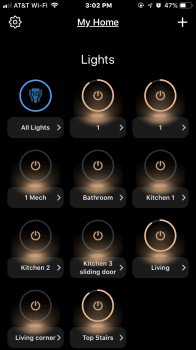
For instance, the LIFX iOS app is a bit frustrating because LIFX lazily followed the simple-large-circles-in-a-grid fad rather than choose an arrangement that might allow fitting more lights on a screen and maybe in a way that enables the user to visually group certain rooms/areas. As it is, it's another lemming that requires loads of scrolling to get to all lights and various Groups and Scenes, none of which are in a logical order due to the forced 3-per-row circles/grid arrangement.

Image-1.jpg

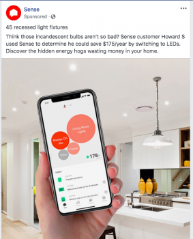
Or this Sense app I just saw on Facebook. Double ugh. More random pastel circles in a nonsensical arrangement and super low-contrast TINY white text and loads of TINIER grey text...lots of white wasted space, just to follow today's website/app circle/square white/low-contrast fad du jour. Hitting many the awful design fads du jour at once...

Screen Shot 2019-04-26 at 2.44.11 PM.png

This is the type of awfulness I refer to in today's website (and app) design that I'm just not convinced is a great/best way to do things, but which we're still stuck with at the moment.
 

cyb3rdud3

macrumors 68040
Jun 22, 2014
3,296
2,052
UK
Responsive Design is the official term for the capability that allows sites to auto adjust regardless of the device that is being used. It is essential to comply with W3C-AA or higher standards for accessibility. It is mandated by many decent governments around the world who care about social inclusion and access for all.
 
  • Like
Reactions: smirking

eddjedi

macrumors 6502a
Sep 7, 2011
628
851
This is Gmail (Google) in the Chrome browser (Google.) In long emails, the scroll bar goes behind that pop-out arrow thing which is already minimised (it cannot be made any smaller.) It is impossible to grab this scrollbar. How can a company as big and important as Google make such terrible UX choices in 2019!?

scrollbar.png
 
  • Like
Reactions: Tozovac

smirking

macrumors 68040
Aug 31, 2003
3,747
3,720
Silicon Valley
It is impossible to grab this scrollbar. How can a company as big and important as Google make such terrible UX choices in 2019!?

I ask myself this everytime I try and move a window around in Chrome and have to aim for that tiny sliver of window that will allow me to drag it.
 
  • Like
Reactions: Tozovac

Tozovac

macrumors 68040
Original poster
Jun 12, 2014
3,012
3,220
This is Gmail (Google) in the Chrome browser (Google.) In long emails, the scroll bar goes behind that pop-out arrow thing which is already minimised (it cannot be made any smaller.) It is impossible to grab this scrollbar. How can a company as big and important as Google make such terrible UX choices in 2019!?

View attachment 838259

As I’ve been crowing about for years now, this is what happens to websites, apps, and computer programs when supposedly smart designers blindly follow trendy made-up design principles based on a certain newer look rather than stick to time-proven functional-based interface principles that an egotistical short-sighted supposed design genius deemed to be unnecessarily too helpful (and developed by his predecessor he helped to boot and which, therefore obviously, can’t be as good as his often-unnecessarily-too-minimalist vision).

Responsive Design is the official term for the capability that allows sites to auto adjust regardless of the device that is being used. It is essential to comply with W3C-AA or higher standards for accessibility. It is mandated by many decent governments around the world who care about social inclusion and access for all.

Let’s just not confuse using “being decent” as an excuse for accepting compromised desktop (and even many mobile) applications and interfaces having space-wasting and/or less intuitive interface designs.
 
Last edited:

smirking

macrumors 68040
Aug 31, 2003
3,747
3,720
Silicon Valley
Let’s just not confuse using “being decent” as an excuse for accepting compromised desktop (and even many mobile) applications and interfaces having space-wasting and/or less intuitive interface designs.

And what you said suggests that it's possible to be decent (inclusive and responsive) and create good design at the same time... which has been my point all along. Responsive design is not bad design. Bad design is bad design and you shouldn't conflate mobile friendly with being bad desktop design.

Bad design was already endemic in the good ol' days. It's no worse now.
 
  • Like
Reactions: m00min and Tozovac

Tozovac

macrumors 68040
Original poster
Jun 12, 2014
3,012
3,220
And what you said suggests that it's possible to be decent (inclusive and responsive) and create good design at the same time... which has been my point all along. Responsive design is not bad design. Bad design is bad design and you shouldn't conflate mobile friendly with being bad desktop design.

Bad design was already endemic in the good ol' days. It's no worse now.

There were some bad designs before, but I truly do think there's more "bad design" now than before, though. Now, I find there's MUCH more flat design that too often lends to reduced intuitiveness. Similarly, now there's MUCH more unnecessarily all-light-blue monochromatic design across the board coupled with hiding often-used functions off-screen (buried under hamburger icons just to have an "uncluttered" presentation set to follow a certain theme) requiring more clicks/hunting...while before, designers seemed to have more "freedom" to seek a function-first over form-first layout. Maybe that's just me. :)
 

jagolden

macrumors 68000
Feb 11, 2002
1,530
1,401
I think there are a number of factors.
The first is the use of prebuilt templates.
The second is websites being built by people with no visual design or interface training (it’s just part of their job description).
The third is, repeat the first two items, over and over.

Since the early ‘80’s, in the graphic design (and then web design) world, the thinking has been "you have a computer, you’re a designer", and any trained and experienced designer will tell you it’s so much more than that. Unfortunately design has pretty much become commoditized.

I once had a coworker tell me what beautiful design his daughter creates using some Hallmark Greeting Card software she’d bought. I was so freakin’ insulted that he would compare the package design and marketing materials I was producing to some generic card design software.
 

Tozovac

macrumors 68040
Original poster
Jun 12, 2014
3,012
3,220
I think there are a number of factors.
The first is the use of prebuilt templates.
The second is websites being built by people with no visual design or interface training (it’s just part of their job description).
The third is, repeat the first two items, over and over.

...

Unfortunately design has pretty much become commoditized.

Well, here's an interesting thought. As using templates has been called up often in this thread, why not peel the onion back just one more layer...who at these template companies is calling the the shots to produce these space-wasting flat-design unintuitive light grey text on white websites and iOS/OSX/Windows apps which too often hide frequently-used commands behind layers of clicks?? What happened to UI experts? Have they all lemmingly turned 180 into doing what everyone else is doing??

At my annual physical yesterday, the nurse was pitching a fit over the new office software with light grey text too hard to read.

At work we were "upgraded" to Windows 10 from 7. In the first day I ran into at least a dozen UI steps backwards requiring both extra clicks to find hidden functions and also extra hunting to try to figure out how to do what used to be so obvious & simple. I was constantly frustrated with white-out all-white border/menu that blends into the "content" portion of the window such that it's hard to differentiate different programs at times (all having the same light-white border now)... I fixed it by adding a darker color for the border.

When is this fad going to end and return to the glory years of, say 2005-2013 when web/app design was at its best...when designers didn't think too hard...when Jony was throttled by Steve?

https://www.nectarsleep.com/p/compare/nectar-vs-casper/
Light gray text on white. Why? How is this seen as “good?”
 
Last edited:
  • Like
Reactions: adrianlondon

Eightarmedpet

macrumors regular
Dec 23, 2013
215
247
London's famous London
There are simple tests that designers can run to check if text and backgrounds pass accessibility guidelines, give it a google.
That page you linked to is pretty average to sub par but if you are having trouble reading that text I’d hazard a guess you have some sort of visual impairment, that doesn’t excuse the design though as the above mentioned guidelines are created to cater for folks like yourself.
When you talk about the glory days of design all you’re really giving is your unsubstantiated subjective opinion- “I liked this more”. It means nothing.
Designers these days are more aware of the need to test journeys, interactions and visuals on a variety of people, the site you linked does not look like one that has undergone such a considered design process.
 

adrianlondon

macrumors 603
Nov 28, 2013
5,014
7,528
Switzerland
I can read the grey text perfectly fine, but it's still a crappy website with loads of wasted space and paragraphs of text all squashed into the centre for no reason. It seems as if people design a website for the iPhone SE and then call it a day.
 

Trusteft

macrumors 6502a
Nov 5, 2014
835
867
I am old enough to have user experience with websites since the beginning of WWW. There were always some really bad designs.
The design choice I HATE with more modern sites is the never ending scrolling design. HAAAAAAAAAAAAAAAAAAAAAAAAAAAAAAAATEEEEEEEEEEEEEEEEEEEEEEEEEEEEEEEEEEEEEEEE IIIIIIIIIIIIIIT.
It makes me physically ill. Want to puke.
I am not even kidding.
Worse when they are in parts of the site which would make 1000% more sense to not have them. For example the basket of Amazon. GOD what a disaster with the save later part.

Apart from that, while there are some pretty bad designs out there, they tend to not be as bad as some of the worst of the 90s and early 00s.
50 million flash animations, 1.5 billion ads per page, anyone remembers the ads that were embedded to text? YIKES!
 

smirking

macrumors 68040
Aug 31, 2003
3,747
3,720
Silicon Valley
There were always some really bad designs.

Indeed, bad design did not suddenly become endemic. It always was. People can argue as to if it's worse now or then. I don't know if that's something that can be conclusively answered, but does it really matter when ultimately the reality is that in our lifetimes there never was and never will be a shortage of bad design to enjoy?
 
Last edited:
Register on MacRumors! This sidebar will go away, and you'll see fewer ads.