I personally think that 10.4 was the best version of Aqua overall (although 10.2 was the best of the original design). I do find that 10.5 brought a few welcome improvements, most notably uniformity and the 3D dock, but I still prefer the 10.4 look overall. I could live with 10.6-10.9 era sort-of-Aqua, but the flat monstrosity of this currentera is unbearable to me.
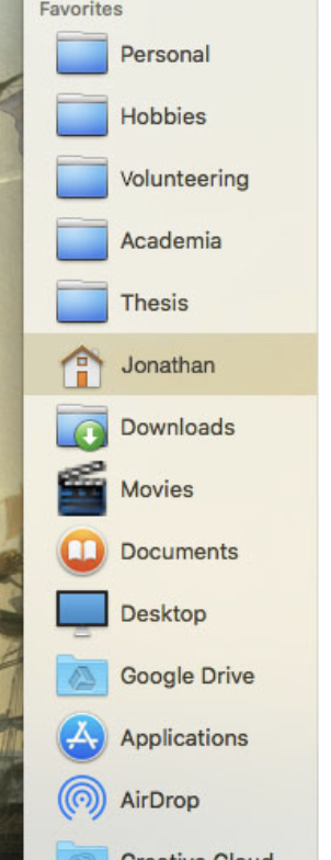
I’m happy to say that I now use the excellent Aqua Window Controls for MacOS High Sierra v4. I further use XtraFinder to get back the classic labels in the Finder (how could I ever survive without them!) and the colour icons in the sidebar (when has Apple become so grey and dull?). I use AquaBlend Smooth Blue icons with LiteIcon to bring back the perspective folder icons (the ‘modern’ hideously flat version gives me gloom!). I also keep the old icon of iTunes around as I find the current one to be too brash and bold (I also prefer the ‘old’ Finder icon, but I find that its colour pallet clashes too much with the current stuff to use it). I use cDock to bring back a 10.6-ish look to my dock (can’t quite achieve the 10.5 look). And, although not an essential item, I use Displaperture to bring back the round corners on the menu bar. And thank goodness my Mac still has its startup chime! (how could they ever trash that ubiquitous part of the Mac experience?).
All in all, these simple modifications makes my beloved Mac much more palatable on the eyes. But I still twitch every time I see the non-glossy and dull blue buttons, and I turn melancholic when I see a progress bar show up without the gorgeous blue barbershop Aqua look… Ah, well.
What do you guys use? What are your pet peeves?