Try and read the “Other” and “Productivity” text set against that awful gray background on the widgets screen. Stocks is the same way with red against that color of gray. Absolutely horrible on the eyes.
Become a MacRumors Supporter for $50/year with no ads, ability to filter front page stories, and private forums.
iPhone X Screen on iOS12 ... Saturated?
- Thread starter magicschoolbus
- Start date
- Sort by reaction score
You are using an out of date browser. It may not display this or other websites correctly.
You should upgrade or use an alternative browser.
You should upgrade or use an alternative browser.

I'm getting a very slight pink-ish tint on my 8 Plus, but bizarrely only when the phone has been in my pocket for a while. Maybe the heat from my leg? Doesn't do it if it leave it on my desk or whatever. Seems to go when True Tone is switched off though. Strange one.
Because I couldn’t copy and paste the text from the report I filed so I took a screenshot. Why not?Why an image instead of text?
I updated 3 devices OTA and I see no difference in screen appearanceI wonder if it’s an OTA Only thing
Anyone tried restoring from iTunes and setting up as new ?
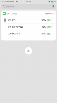
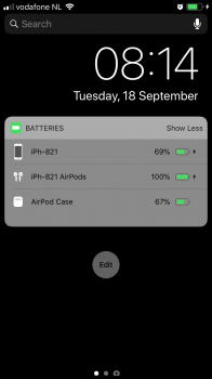
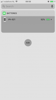
I think they've changed something in transparency behavior. Here are three screenshots taken with a 6s of a grey and black wallpaper with the battery widget. The widget icons aren't very visible on the grey one. Furthermore if Reduced transparency is turned off, any transparent surface becomes much, much darker than it would previously.


Attachments
Looks awful as standard on my X.
To work around it:
Settings > General > Accessabilty > Display accommodations > Reduce white point - mines currently at 56% you then have to up the brightness after.
Hopefully Apple will sort it properly, made my eyes go funny last night.
To work around it:
Settings > General > Accessabilty > Display accommodations > Reduce white point - mines currently at 56% you then have to up the brightness after.
Hopefully Apple will sort it properly, made my eyes go funny last night.
I thought I'd just chime in say my iPhone X also seems to have duller colours after iOS12 update. Hopefully they see this. Submit feedback if you're experiencing the same: https://www.apple.com/feedback/
Ok, so I found this:
https://reddit.com/r/iOSBeta/comments/9dqjy2/discussion_i_emailed_craig_about_wallpaper/
Does that make sense? Is this a wallpaper/home screen/lock screen thing only?
I’m not really nothing this, but then I’m using an older phone and my own custom wallpaper.
https://reddit.com/r/iOSBeta/comments/9dqjy2/discussion_i_emailed_craig_about_wallpaper/
Does that make sense? Is this a wallpaper/home screen/lock screen thing only?
I’m not really nothing this, but then I’m using an older phone and my own custom wallpaper.
Ok, so I found this:
https://reddit.com/r/iOSBeta/comments/9dqjy2/discussion_i_emailed_craig_about_wallpaper/
Does that make sense? Is this a wallpaper/home screen/lock screen thing only?
I’m not really nothing this, but then I’m using an older phone and my own custom wallpaper.
I'm not sure that's it. From what I can tell it's only certain transparent elements that have this issue. You can see in my screenshots above, the title bar of the battery widget seems to do transparency right, while the contents is a bit weird.
It feels as if the transparency values mix-max have been inverted, which would look the same or have a negligible difference with wallpapers (and maybe app backgrounds) that hit the middle values, but looks very off when outer values are hit.
That's a very interesting link by the way, thanks for sharing.
Edit: Can you try a very light gray wallpaper on lock or home screen, and check out if the battery widget icons are readable? Just out of curiosity.
Looks more like performance tweaks.So I just spent 20 minutes comparing my wife's iPhone X (iOS11) and my iPhone X (just updated iOS12) bought on the same day last November and here's what I'm seeing:
1. All whites are yellowed.
2. Contrast is dialed down.
3. Sharpness is softened.
4. Brightness is reduced (at the same 50% level).
Overall appearance compared to iOS11 is not as sharp, lifeless, yellowed.
I don't know the cause but what I can report is that:
1. iOS12 enables Increase Contrast by default vs. iOS11 which has it set to off.
2. My wallpaper (simple grey gradient) is a lot more lit up, where it used to fade to black it's now a dark grey.
3. Increasing brightness restores some of the pop but not enough to overcome the contrast/sharpness hit.
4. The whites stay yellowish no matter what I try.
This appears to be a move by Apple to either save battery or prevent OLED burn. Either way it's taken my best-in-class display and made it much weaker and harder to read.
My 7 looks great, and 'increase contrast' was not enabled by default. This was with a OTA update. I have a Xs arriving Friday so will see what the OLED looks like. I'm not seeing any issues tbh with the screen at all. Weird...
Funny thing is, ive been on the betas since beta 1 and the screen on my X looked terrible, washed out etc.
Since the GM (i wiped it using an IPSW) screen looks awesome now.
Since the GM (i wiped it using an IPSW) screen looks awesome now.
The X screen does really look like it has a yellow tint (using True Tone) and it’s not as sharp.
Apple really has to fix this; if it’s not fixed before ios11 is done being signed; I’m going back to 11. It looks like my phone has a tint to it.
I tried to get photos of my fiancé’s ios11 device... you have to see it with your eyes.
Apple really has to fix this; if it’s not fixed before ios11 is done being signed; I’m going back to 11. It looks like my phone has a tint to it.
I tried to get photos of my fiancé’s ios11 device... you have to see it with your eyes.
Register on MacRumors! This sidebar will go away, and you'll see fewer ads.