Become a MacRumors Supporter for $50/year with no ads, ability to filter front page stories, and private forums.
MacRumors Forum Upgrade - Xenforo 2.1
- Thread starter arn
- Start date
- Sort by reaction score
You are using an out of date browser. It may not display this or other websites correctly.
You should upgrade or use an alternative browser.
You should upgrade or use an alternative browser.
I find it a tad troubling that links are now the same color as plain text.
Hmm.. they arn't quite ,but we can make it stand out a little more
this is a link
This in image heavy threads? Does it jump around after you click?
Very possibly, as I have noticed the same thing as @Huntn - namely, that it doesn't jump to the post shown in the alert, but several posts above that, often close to the top of the page.
However, your observation about image heavy threads makes sense; before the update, some of those were slow to load.
We added a lazy loading plugin so image heavy threads might “pop in” as images load. I’ll test it a little moreVery possibly, as I have noticed the same thing as @Huntn - namely, that it doesn't jump to the post shown in the alert, but several posts above that, often close to the top of the page.
However, your observation about image heavy threads makes sense; before the update, some of those were slow to load.
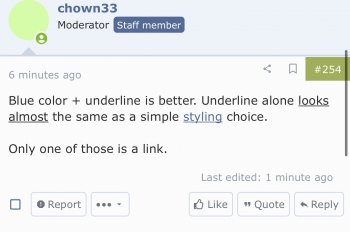
Are you saying they arnt blue? To me those two look very different.Blue color + underline is better. Underline alone looks almost the same as a simple styling choice.
Only one of those is a link.
Attachments
Forgot to answer about image heavy, maybe. No, not image heavy: https://forums.macrumors.com/thread...blowers-complaint-is-withheld.2198227/page-24This in image heavy threads? Does it jump around after you click?
In my Firefox browser (desktop) they're indistinguishable.Are you saying they arnt blue? To me those two look very different.
Last edited:
On desktop (at least here on my Mac), the normal text is #2c2c2c and the link color is #152a44, which is a (much) darker blue - almost, but not entirely, indistinguishable - from the normal text...Are you saying they arnt blue? To me those two look very different.
I can confirm those are exactly the colors I get for the text and links in my desktop Firefox here.On desktop (at least here on my Mac), the normal text is #2c2c2c and the link color is #152a44, which is a (much) darker blue - almost, but not entirely, indistinguishable - from the normal text...
Weird. I didn't change anything
edit: oh wait, I know why it changed. We had an old version in place we updated.
arn
To be honest, I wasn't at all sure where the fix may have happened. After my earlier post, and before the one with the blue-link screenshot, I'd done a "safe launch" of Firefox, although at that point links were still showing up as before (not noticeably blue). Then I was wandering around in other forums here, and also did a couple more quit/launch cycles (but no other safe launches), when I suddently noticed that a link was distinctly blue. I double-checked it in this thread, on the off change it might be some weirdly cached CSS resource, but the links were as blue as an azure sky of deepest summer.Weird. I didn't change anything
edit: oh wait, I know why it changed. We had an old version in place we updated.
arn
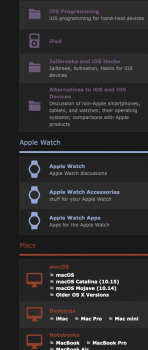
Hey hey hey! I saw what you did with the sub-forum icons. I like them, Watches for the Apple Watch Section, iMacs for the Mac section... Maybe the iOS sub-forum is a bit more messy. I personally would leave the iPhone icon for all the iOS section, same way as you have an iMac for all the Mac section. It gives a much cleaner image. A sense of uniformity.
My 2 cents.
My 2 cents.
Attachments
Hey hey hey! I saw what you did with the sub-forum icons. I like them, Watches for the Apple Watch Section, iMacs for the Mac section... Maybe the iOS sub-forum is a bit more messy. I personally would leave the iPhone icon for all the iOS section, same way as you have an iMac for all the Mac section. It gives a much cleaner image. A sense of uniformity.
My 2 cents.
Yep. Those are actually temporary until we get images made for the cats, but u may be right. Will mess with it later
Alrighty... now I'm on my laptop.. Lenovo X220. In Firefox, I have the squished icon.It might be because we have (relatively) long user names. If I "open image in new tab" or make the window smaller (to hide the user name) the avatar is just fine...
I opened my suckless.org browser, surf, and logged in to MacRumors and with that browser, I have the normal and proper icon.
However, each browser is in it's own workspace and full screen.
When I put both browsers side by side on the same workspace, the icon in Firefox turns normal. That's weird because the browser (Firefox) gets reduced to halfsize to share the window and you would think that would be what makes it squished. But the behavior is opposite. Very weird.
I like the individualized icons for the iPhone & iOS sections. They look simple, clean, and clear at different levels of zoom. The color is another cue (except for @Doctor Q (see what I did there?)).
The icons for all the Mac forums are too numerous to be identical. I think a few small changes can help there. For example, add some icons along the bottom edge of the screen to signify "Apps", a "?" on the screen for Buying Advice, and a MacBook icon for the Notebooks section.
The Mac Community icons are too busy. Instead of having 2 overlapping speech balloons, which I think looks like a palm-upward hand holding a speech balloon, just make them a single speech balloon. The Markeplace one can have a "$" inside its balloon, and Picture Gallery can have the outline of a picture frame. PRSI can have a crossed-swords icon in its balloon. Or a grenade.
Uploaded images don’t work well at all on mobile. I have to go to the actual link (little arrow going out of the square top right) to be able to zoom in and out properly. Just clicking on an image will only load half of it and trying to zoom in zooms in way too far.
Thank you for upgrading the forum software. The old, however nice, was getting a bit dated. I'm anxious to see where you take the design. I'm liking the new forum icons and such.
I do have an issue. If you click on a forum link, there is a white page that flashes on the screen before the new (dark) page loads. I doesn't happen all the time but it shock on the eyes.
I do have an issue. If you click on a forum link, there is a white page that flashes on the screen before the new (dark) page loads. I doesn't happen all the time but it shock on the eyes.
I removed the image since we don't allow public discussion of moderation. It looks like a bug with the way Tweets are displayed in signatures and the admins are aware of it.What's up with people embedding tweets into their signatures? It's annoying af. Please disable. I'm not making a political statement here, but here is an example:
You mean when u get an alert that your post has been merged?I truly don't like the "merged post" alert. Is there a way to get rid of it?
Yeah, I believe that’s what he’s referring to. I could do without that particular alert as well if it’s not too much trouble to disable.You mean when u get an alert that your post has been merged?
Register on MacRumors! This sidebar will go away, and you'll see fewer ads.


