Become a MacRumors Supporter for $50/year with no ads, ability to filter front page stories, and private forums.

C DM

macrumors Sandy Bridge
Oct 17, 2011
51,392
19,459
I think it would be difficult to add the control centre into IOS 6 without it looking pretty bad in comparison. The translucency makes it work really well in 7 as something you can just bring up without ever taking you too far away from what you were doing. In IOS 6 it would mean yet more stitched cloth (because it's more intuitive to see these options overlaid on a pair of trousers for some reason) and a more jarring switch away from the underlying app.
The notification center which functions in the same manner was there in multiple iOS versions and was just fine to use without anyone talking about how jarring it was or anything like that.

----------

He said it was "looks over function", which iOS 7 is not. Yes, iOS 6 could have had those features but it doesn't. Hence iOS 7 is more functional by having the aforementioned features.
The thread is about iOS 7 design, not about it's functionality or all of its changes. So, yes, in terms of its design Apple certainly went deeper in the looks over function direction sacrificing usability in places and some functionality mostly for aesthetics.
 

melissapete24

macrumors member
Feb 12, 2013
42
3
Pennsylvania
I don't think it looks cheap. I actually thought it looked more classy. I thought iOS 6 looked sort of juvenile. I am absolutely IN LOVE with the new OS! It's like...like...heavenly! LOL!!! :p
 

Solitude1984

macrumors 6502
Oct 10, 2013
270
0
Oh ... yeah ... took a minute ... yeah ... a big pile of poop ...

----------

I don't "love" iOS 7, just like I do not "love" my Lincoln or any other inanimate object. I love my wife, my family, my puppy. But love an inanimate piece of software?

I do, however, appreciate, or not appreciate a piece of software. I like iOS 7, for more than just the silly assed graphical interface, and currently have 7.1 B2 installed on both both iPads and iPhone 5.

If you absolutely must go there (from dictionary.com):

1. strong predilection, enthusiasm, or liking for anything: her love of books.

2. the object or thing so liked: The theater was her great love.

3. to have a strong liking for; take great pleasure in: to love music.

There are many definitions for the word "love". "Love" in this thread topic is not used incorrectly. Obviously you don't love an object the way you love your wife, but it's still a valid expression of your feelings toward something.

Anyway, back on topic.
 

Dented

macrumors 65816
Oct 16, 2009
1,119
899
Does anyone love the look of iOS 7?

The notification center which functions in the same manner was there in multiple iOS versions and was just fine to use without anyone talking about how jarring it was or anything like that.

The notification centre is quite a different thing though (and note it's fairly opaque in IOS 7 too) - when you go there it's generally for information quite separate to the app you're using and often as a launch pad to click one of those notifications and jump off to another app altogether.

The control centre I often go to when I'm browsing or in the middle of something just to flick wifi on, or change track, not to leave what I'm doing in any way. Everything in the control centre except the bottom four shortcuts is about making changes while you're doing something else, and can be seen as an extension of the workflow in whichever app you're using, and IOS 7 supports that notion; IOS 6 and it's heavy handed approach to pop ups and overlays wouldn't lend itself so well.

----------

The thread is about iOS 7 design, not about it's functionality or all of its changes. So, yes, in terms of its design Apple certainly went deeper in the looks over function direction sacrificing usability in places and some functionality mostly for aesthetics.


Sorry but that's just a crock. The fact that some don't like it or find it unfamiliar does NOT equate to it "sacrificing usability", and the last part of your sentence makes no sense at all - IOS 7 has more functions and is more functional, that's pretty much objective fact - what's this "some functionality" you think has been sacrificed? The only thing I can think of is the today view in calendar (coming back in 7.1) and perhaps the Facebook and Twitter buttons in the notification centre, but they never made a lot of sense where they were anyway, and it's not as if the ability to post to those services has been removed.
 
Last edited:

C DM

macrumors Sandy Bridge
Oct 17, 2011
51,392
19,459
The notification centre is quite a different thing though (and note it's fairly opaque in IOS 7 too) - when you go there it's generally for information quite separate to the app you're using and often as a launch pad to click one of those notifications and jump off to another app altogether.

The control centre I often go to when I'm browsing or in the middle of something just to flick wifi on, or change track, not to leave what I'm doing in any way. Everything in the control centre except the bottom four shortcuts is about making changes while you're doing something else, and can be seen as an extension of the workflow in whichever app you're using, and IOS 7 supports that notion; IOS 6 and it's heavy handed approach to pop ups and overlays wouldn't lend itself so well.

----------


Sorry but that's just a crock. The fact that some don't like it or find it unfamiliar does NOT equate to it "sacrificing usability", and the last part of your sentence makes no sense at all - IOS 7 has more functions and is more functional, that's pretty much objective fact - what's this "some functionality" you think has been sacrificed? The only thing I can think of is the today view in calendar (coming back in 7.1) and perhaps the Facebook and Twitter buttons in the notification centre, but they never made a lot of sense where they were anyway, and it's not as if the ability to post to those services has been removed.
Well, I personally don't really see a difference in the usability of notification center and control center, at least as far as what sort of background would be present. I (and I'm sure many others) use both in the middle of using other apps--that's part of their design, and in fact even more part of notification center design so that you could access notifications anywhere you are without interrupting what you are doing really--so from their functionality or usability or usefulness I really doubt that a pre-iOS 7 visual design would really change any of that for either one of them.

As far as usability, the overly white design with removal of selection or button outlines and use of light/pastel colors and thin fonts are all very much iOS 7 design elements that are more noticeable and more prevalent throughout the OS than the functional changes, and they are all some sacrifices on the side of usability (perhaps not to everyone, but certainly to more people than pre-iOS 7). Various changes to some apps like Calendar and Music for example, certainly have also changed their usability for the worse, at least to some degree for quite a few people.

Even, the very fact that Apple is bringing accessibility features to deal with more and more of these items (bold text, darken colors, reduce motion, increase contrast)--most of which didn't even really need to be there before--and making changes to bring back features that used to be present before--like some features in the Calendar app being brought back in iOS 7.1--is pretty much an indirect admission on Apple's part of all of that.
 
Last edited:

Dented

macrumors 65816
Oct 16, 2009
1,119
899
Well, I personally don't really see a difference in the usability of notification center and control center, at least as far as what sort of background would be present. I (and I'm sure many others) use both in the middle of using other apps--that's part of their design, and in fact even more part of notification center design so that you could access notifications anywhere you are without interrupting what you are doing really--so from their functionality or usability or usefulness I really doubt that a pre-iOS 7 visual design would really change any of that for either one of them.

As far as usability, the overly white design with removal of selection or button outlines and use of light/pastel colors and thin fonts are all very much iOS 7 design elements that are more noticeable and more prevalent throughout the OS than the functional changes, and they are all some sacrifices on the side of usability (perhaps not to everyone, but certainly to more people than pre-iOS 7). Various changes to some apps like Calendar and Music for example, certainly have also changed their usability for the worse, at least to some degree for quite a few people.

Even, the very fact that Apple is bringing accessibility features to deal with more and more of these items (bold text, darken colors, reduce motion, increase contrast)--most of which didn't even really need to be there before--and making changes to bring back features that used to be present before--like some features in the Calendar app being brought back in iOS 7.1--is pretty much an indirect admission on Apple's part of all of that.


Eh, whatever. I said I was going to give up on this silly thread and I should have listened to myself. I think it's probably best if you just carry on talking yourself around in circles until Apple release their official apology and roll us all back to IOS 6. Which thankfully for me and "many" others (to borrow your favourite assertion) will be the 12th of never :)
 

ROYCE 415

macrumors newbie
Jan 16, 2012
12
0
Love it. This is my first iPhone and I love how the brightness, flashlight and camera are easily accessible
 

Solitude1984

macrumors 6502
Oct 10, 2013
270
0
Eh, whatever. I said I was going to give up on this silly thread and I should have listened to myself. I think it's probably best if you just carry on talking yourself around in circles until Apple release their official apology and roll us all back to IOS 6. Which thankfully for me and "many" others (to borrow your favourite assertion) will be the 12th of never :)

I love iOS 7, but I still think C DM made some good points in the last post. There have certainly been some changes that have made the OS less functional in some ways. Maybe the changes don't affect you, but they certainly affect some people. That's not to say that the OS is bad or that Apple should apologize for anything. I think every OS has it's issues (apple or otherwise), and the best a company can do is make changes as they go along.
 

aiom

macrumors member
Jul 26, 2013
78
0
I love it. It's like switching from Gingerbread to Ice Cream Sandwich on Android. Having ICS, I thought ios6 was so ugly and gawdy, everything was sooo round and soft and dull, now it's brighter and sharper.
 

ZipZap

macrumors 603
Dec 14, 2007
6,080
1,448
I don't think it looks cheap. I actually thought it looked more classy. I thought iOS 6 looked sort of juvenile. I am absolutely IN LOVE with the new OS! It's like...like...heavenly! LOL!!! :p

What what whaaaaaat.

You're not allowed near apple stuff again.

Ridiculous.

----------

If you absolutely must go there (from dictionary.com):

1. strong predilection, enthusiasm, or liking for anything: her love of books.

2. the object or thing so liked: The theater was her great love.

3. to have a strong liking for; take great pleasure in: to love music.

There are many definitions for the word "love". "Love" in this thread topic is not used incorrectly. Obviously you don't love an object the way you love your wife, but it's still a valid expression of your feelings toward something.

Anyway, back on topic.

Yeah, ok.
 

Septembersrain

Cancelled
Dec 14, 2013
4,347
5,451
It reminds me quite a bit of some of a few plain vanilla Android UI themes/launchers. I'm not complaining. I do wish they would do a darker theme as an option though. The white can be very blinding at times.

I feel like it's a very fluid UI with a decent amount of color. With a few more options like theme choosing, it'd be just about perfect.
 

Mackan

macrumors 65816
Sep 16, 2007
1,426
94
It reminds me quite a bit of some of a few plain vanilla Android UI themes/launchers. I'm not complaining. I do wish they would do a darker theme as an option though. The white can be very blinding at times.

I feel like it's a very fluid UI with a decent amount of color. With a few more options like theme choosing, it'd be just about perfect.

Apple will never offer themes according to history. And the excessive white must be a designer thing (Jony Ive). He wants to enlighten the world in white.

A dark theme option is very reasonable to ask for though, so I hope it happens. Surely there must be bunch of people working at Apple that wants a darker theme as well, one might guess.
 

ct2k7

macrumors G3
Aug 29, 2008
8,369
3,436
London
It's welcome from iOS 6, however, I am not really a fan of the brightness of it. There's too much white, and the icons have much more to be desired for.
 

1rottenapple

macrumors 601
Apr 21, 2004
4,707
2,723
I loooooove iOS 7. I love the translucent slide out menus. It changes depending on nth back ground or what's on the screen. I think it's beautiful.
 

FieldingMellish

Suspended
Jun 20, 2010
2,440
3,108
OS7 is blinding in semi-dark or dark environments. That’s a step backward. Give me back the Corinthian leather and burled wood look, combined with glossy, gumdrop-like dimensional icons.
 

MrGuder

macrumors 68040
Nov 30, 2012
3,026
2,012
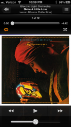
If they offered a dark theme...especially with the music app then I might consider upgrading to IOS7....if not I'll continue with IOS6 which works and looks great to me. I use the Music App so much that I love the black background and just they way the Music app works. It's the only thing keeping me from upgrading to IOS7.

Fix the Music App and add a dark theme option and I'll upgrade to IOS7...ok Apple? (who am I kidding there not listening to me, even though I did submit my feedback) :rolleyes:
 

The Doctor11

macrumors 603
Dec 15, 2013
5,976
1,408
New York
If they offered a dark theme...especially with the music app then I might consider upgrading to IOS7....if not I'll continue with IOS6 which works and looks great to me. I use the Music App so much that I love the black background and just they way the Music app works. It's the only thing keeping me from upgrading to IOS7.

Fix the Music App and add a dark theme option and I'll upgrade to IOS7...ok Apple? (who am I kidding there not listening to me, even though I did submit my feedback) :rolleyes:

Sorry but i don't remember the iOS 6 music app dark cuz I didn't use it to much. Can you please show so screen shots of it being dark. :)
 

MrGuder

macrumors 68040
Nov 30, 2012
3,026
2,012
Sorry but i don't remember the iOS 6 music app dark cuz I didn't use it to much. Can you please show so screen shots of it being dark. :)

Here you go...I love this look. I have a iPhone 5 on IOS 6.1.4

Can you show me what it looks like in IOS 7
 

Attachments

  • Music App IOS 6.png
    Music App IOS 6.png
    954.5 KB · Views: 111
Register on MacRumors! This sidebar will go away, and you'll see fewer ads.